Worst Logos Ever Made
Discover the worst logos ever made, why they failed, and what brands can learn from these costly design mistakes. Avoid rebranding disasters with smart tips.
Discover the worst logos ever made, why they failed, and what brands can learn from these costly design mistakes. Avoid rebranding disasters with smart tips.
We’ve all seen them—the logos that make you squint, tilt your head, or blurt out “What were they thinking?” The truth is, even the biggest brands sometimes get it terribly wrong. And when they do, the results can be hilarious, confusing, or downright damaging. From million-dollar redesigns that backfired overnight to AI-generated disasters, the worst logos ever made remind us that design isn’t just about looking good—it’s about communicating clearly and meaningfully.
But these blunders aren’t just eye-roll worthy; they’re loaded with lessons. Why did these logos fail? What made people so upset—or laugh so hard? And most importantly, how can you avoid making the same mistakes?
In this blog, we’re diving deep into the worst logo fails in branding history. We’ll unpack the reasons they missed the mark, explore what went wrong behind the scenes, and share practical insights so your logo doesn’t end up on one of these lists.
Before we laugh too hard at these logo disasters, it’s worth asking—how do they even happen in the first place? Most of the time, the intent is good. But somewhere between the brief, the boardroom, and the final draft, something goes off track. Here's a breakdown of what usually causes even the most well-meaning logos to completely miss the mark.
A logo isn’t just decoration—it’s your brand’s handshake. If it feels off, people won’t trust it. Remember GAP’s 2010 rebrand? They dropped their classic, recognizable logo in favor of something sleek and corporate-looking. The problem? It stripped away the warmth and legacy that customers associated with the brand. Within a week, public backlash forced them to scrap it. A logo should evolve, not erase identity.
Typography can make or break a logo. One misplaced curve or awkward spacing and your whole message gets lost. The London 2012 Olympics logo tried to be bold and abstract—but ended up chaotic. Its sharp edges, jagged numbers, and neon colors overwhelmed the eye. Some viewers even reported it triggered seizures. When a logo sacrifices readability for shock value, it's a problem.
You’d be surprised how many logos unintentionally suggest something NSFW. The Kudawara Pharmacy logo is infamous for this. Aimed at showing teamwork or connection, the icon unfortunately resembled something wildly inappropriate once people looked closer. It’s a reminder that every visual element—no matter how small—should be tested with fresh eyes before going live.
Trendy logos might look cool in the moment, but they often age like milk. Take Grok, for example—an AI startup that launched with a logo resembling a spinning black hole… or something far less flattering, depending on who you ask. It went viral for all the wrong reasons. A logo should stand the test of time—not be a meme within 24 hours.
Now that we’ve unpacked why logos fail, let’s look at the ones that did it on a spectacular scale. These aren’t just design missteps—they’re full-blown brand crises. Each of these logos made headlines, sparked memes, and in some cases, cost companies millions. Here's what went wrong, and what we can learn from each disaster.
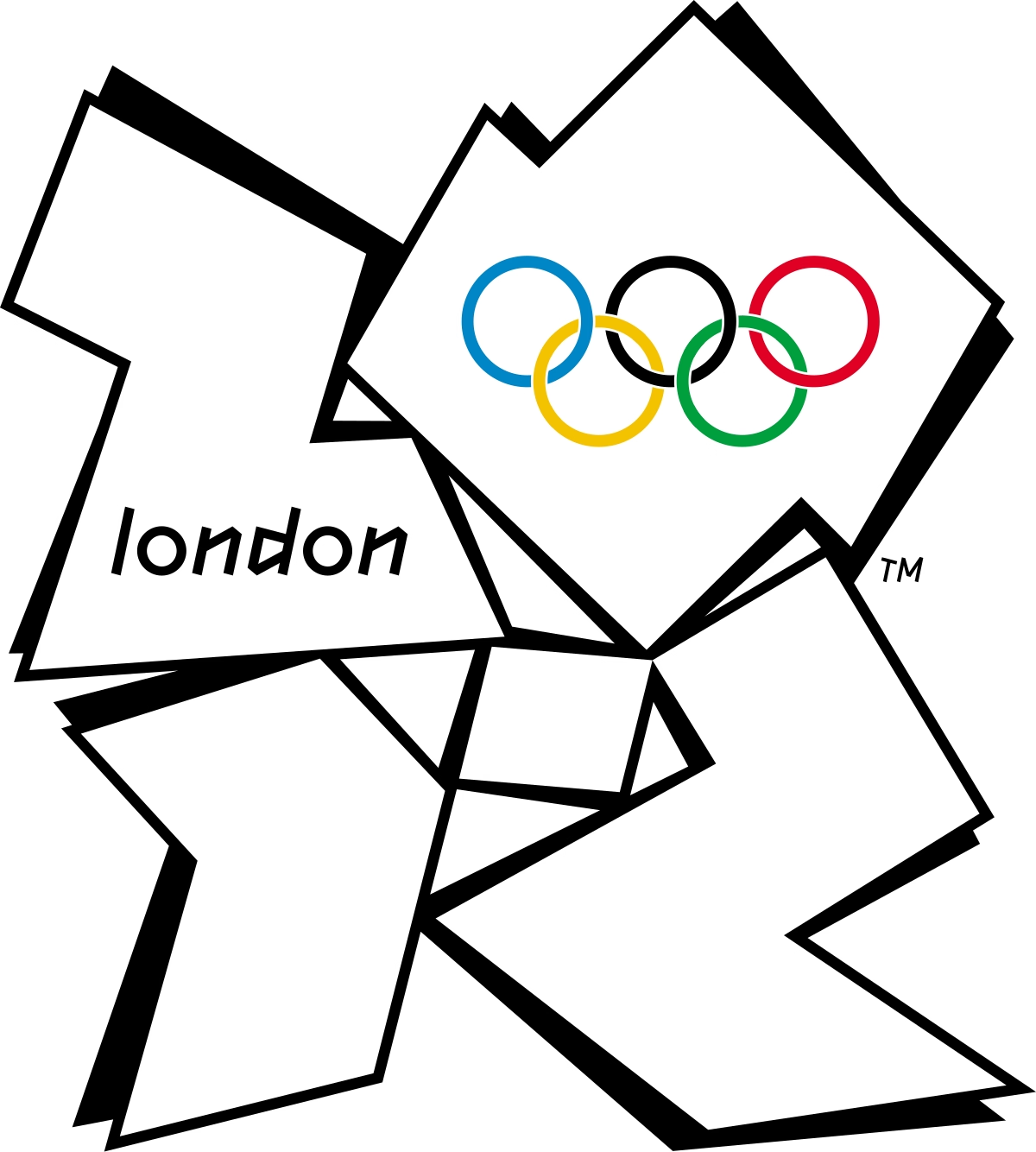
Intended to be bold and youthful, this logo looked like someone dropped puzzle pieces mid-design. Its jagged shapes and clashing colors were hard to look at, let alone understand. Worse, the animations reportedly triggered seizures in some viewers. It became more of a distraction than a celebration—and that’s the last thing you want at a global event.

GAP wanted to “refresh” its identity. What they delivered was a bland, Helvetica-font logo with a tiny gradient square thrown in as an afterthought. Fans of the brand were outraged. It felt cold, corporate, and completely out of touch with GAP’s casual, all-American vibe. The public outcry was so intense, the company pulled the redesign in just six days.
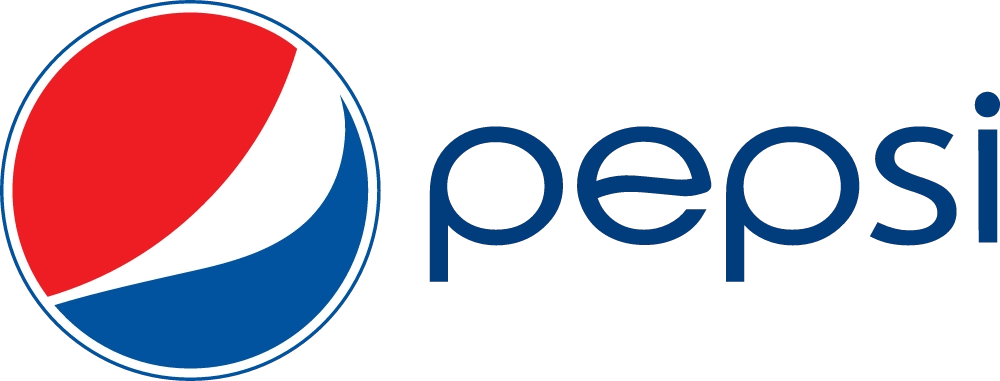
Pepsi spent over $1 million on a redesign that left people scratching their heads. The updated logo introduced a white “smile” across the middle—but it was more confusing than cheerful. Some said it looked like a smirk. Others saw a belly. Either way, it was a fizzy flop that failed to connect with its audience.
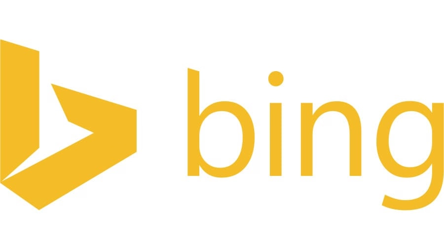
When Microsoft launched Bing, their choice of logo said... nothing. It lacked personality, emotion, or even a hint of innovation. The lowercase 'b' felt weak, and the yellow color choice felt off-brand for a tech product. It looked more like a placeholder than the identity of a serious Google competitor.

Yes, that’s what some people called it. Elon Musk’s Grok launched with an AI-generated logo that resembled a spinning black hole. But social media quickly pointed out a far less flattering comparison. Instead of awe, the design sparked jokes—and that’s not the kind of buzz a futuristic AI tool wants to generate.
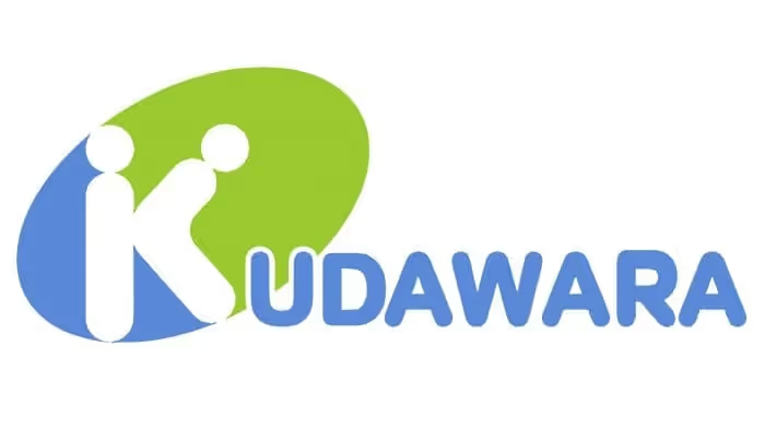
Intended to show a sense of teamwork between two figures, the Kudawara Pharmacy logo quickly went viral for its unfortunate resemblance to something X-rated. It wasn’t the logo’s complexity that caused the issue—it was what people saw in it. A clear reminder that abstract doesn’t always mean appropriate.
Verizon’s rebrand aimed for minimalism, but ended up with something forgettable. The checkmark looked like a leftover idea from 2005, and the font felt cold. Customers were confused. Where was the emotion? Where was the progress? For a company pushing innovation, the logo felt stuck in neutral.
The University tried to modernize its seal with a clean, blue-and-yellow swirl representing a ‘U’. But to many alumni and students, it looked like a toilet swirl or a sad emoji. Petitions were signed, voices were raised, and the logo was shelved. When heritage is involved, change has to tread carefully.

In an attempt to modernize its juice cartons, Tropicana redesigned everything—logo, packaging, layout. But the new design removed the iconic orange-with-a-straw image. Sales plummeted by 20% in just a few weeks. Customers didn’t recognize the product anymore. That one decision ended up costing the brand $30 million.

Animal Planet’s original logo featured an elephant, symbolizing the majesty of the wild. The new version? Just the words “Animal Planet” with a tilted ‘M’. The elephant was gone. So was the emotion. It felt sterile and generic, lacking any of the life or wonder that made the original memorable.
It’s easy to mock a bad logo—but much more useful to learn from it. Each of these design flops leaves behind a trail of takeaways for anyone working with branding. Whether you're a designer, founder, or just logo-curious, these lessons can help you avoid becoming the next cautionary tale.
Many failed logos started with a solution to a problem that didn’t exist. GAP’s redesign is the perfect case—there was no major brand crisis, no reason to reinvent the wheel. They changed something iconic without a clear strategy. And the audience felt betrayed. If your logo is working, don’t touch it just because someone suggested a “refresh.”
Designing in a vacuum is dangerous. A logo might look trendy in the boardroom, but what matters is how it lands with the public. Pepsi’s $1 million redesign fell flat because it tried to be clever instead of clear. The message got lost, and so did the connection with customers.
This sounds obvious, but you’d be surprised how many brands skip it. The London 2012 logo, Kudawara Pharmacy, and Grok all could’ve avoided embarrassment with simple pre-launch testing. Show it to people who aren’t designers. Ask what they see. If it takes more than a few seconds to “get,” it’s probably not ready.
Minimalism is everywhere—but going too minimal can drain a logo of personality. Verizon’s flat checkmark and Bing’s generic 'b' lacked emotion and originality. Clean design should still have character. Otherwise, you're just replacing your logo with a bland placeholder.
A good logo makes its message clear without explanation. If viewers have to squint, tilt their heads, or decode a meaning, the design has already failed. Grok and Kudawara are reminders that ambiguity is risky. Your logo isn’t a riddle. It’s a first impression.
A bad logo isn’t just embarrassing—it can be expensive. Some of the biggest design fails in history came with a high price tag, not just in dollars, but in lost trust and momentum. Let’s break down what these mistakes really cost and how some brands bounced back.
Before we dive in, here’s the truth: redesigning a logo isn’t just about the logo. It’s the ripple effect across packaging, ads, websites, customer perception—and in some cases, public outrage.
Tropicana’s rebrand is one of the most painful examples. The moment they changed their classic orange-and-straw design, people stopped recognizing the product on store shelves. Sales dropped by 20% in a single month. That one packaging change cost the brand over $30 million. The logo wasn’t just cosmetic—it was a sales driver.
When GAP revealed its 2010 redesign, the backlash was immediate. Social media mocked it. Design blogs tore it apart. Loyal customers felt blindsided. And when the company reversed the change just six days later, it looked indecisive. A logo fail can dent your credibility even if you fix it fast.
Changing a logo means reprinting every label, updating websites, retraining staff, and redoing campaigns. That’s a massive cost most brands don’t budget for—especially if you need to fix it twice. Tropicana and UC had to reverse their decisions, losing money on both the failed rollout and the return to the original.
Not every bad logo ends in disaster. Some brands take the hit and come back stronger. Animal Planet eventually brought the elephant back in spirit through bolder storytelling and better branding. Even Bing, after its shaky start, improved its visual identity to better fit the Microsoft ecosystem.
Redesign isn’t the enemy—bad redesign is. And sometimes, failing publicly is how brands learn to finally get it right.
Logos are more than just visuals—they’re emotional anchors. They tell people who you are before a single word is spoken. And when they go wrong, the damage can ripple through every corner of your brand.
The worst logos ever made didn’t fail because of a lack of talent. Most were designed by smart people with big ideas. But somewhere along the way, they forgot the basics: clarity, alignment, audience, and meaning. When a logo doesn’t reflect the soul of a brand—or worse, confuses or offends—it quickly becomes a meme instead of a message.
If there’s one takeaway, it’s this: test early, design with intention, and always, always listen to your audience. A great logo doesn’t just look good—it feels right. And when it does, it quietly builds trust, loyalty, and recognition without needing to shout.
So… which of these logo fails was the worst? Scroll back, take a second look—and drop your vote in the comments.
A bad logo usually has unclear design, poor typography, mismatched colors, or fails to represent the brand's personality. It can confuse, offend, or simply leave no impression.
Some of the most notorious include the London 2012 Olympic logo, Pepsi’s 2008 redesign, and GAP’s 2010 update. Each sparked widespread criticism for being unclear or off-brand.
GAP’s redesign replaced its iconic logo with a generic, modern font and a tiny gradient square. The new look felt cold and disconnected, leading to a massive backlash within days.
Test your logo with real users before launch. Make sure it's readable, on-brand, simple, and doesn’t carry any unintended meanings. Don’t design in a vacuum—gather feedback early.
Some logos failed due to accidental visuals that looked inappropriate or confusing, like the Kudawara Pharmacy or OGC logos. These hidden meanings often went viral for the wrong reasons.


Discover how 500,000+ businesses and creators are using our AI logo maker in their Logo creation.


