Best Fonts for Logos: Typography Trends in 2025
Discover the best fonts for logo design in 2025. Explore font trends, how to choose logo typography and our curated list of 10 top fonts to use for your brand identity.

Discover the best fonts for logo design in 2025. Explore font trends, how to choose logo typography and our curated list of 10 top fonts to use for your brand identity.


When you look at a brand logo, you rarely focus solely on the symbol or icon — the typography often speaks just as loudly. The choice of font in your logo can define your brand’s personality, readability across formats, and longevity in the marketplace. If you want to build a strong brand identity, then choosing the best fonts for logo design isn’t just a decorative decision — it’s a strategic one.
In 2025, typography is playing an even bigger role in logo design. With brands needing to appear across mobile apps, websites, print, and global touch-points, the right font must adapt, scale, and resonate across contexts. This guide will walk you through why font choice matters, what typography trends are dominating in 2025, how to select the right font for your logo, and then introduce you to our curated list of the top fonts for logo design this year. Whether you’re launching a new brand, redesigning an existing logo, or simply exploring design options, this article will give you actionable insights to make typography work for your brand.
Choosing a great icon or graphic mark is important. But typography — the actual letters and typeface you use for your brand name — often shapes the way people perceive your brand before they read a single word. According to typography experts, font selection can affect how credible, modern, bold, or trustworthy your brand appears.
Here are key reasons typography deserves attention in logo design:
Typography evolves with technology, culture and visual practice. For logo design in 2025, several noteworthy trends are shaping choices. Designers need to be aware of these so they can choose a font that feels current while remaining future-proof. Below are the major trends:
While sans-serifs have dominated for years (especially in digital contexts), 2025 is seeing a resurgence of serif fonts in logo design. Sophisticated, refined serifs are being used by luxury brands, boutique services and premium products to evoke heritage, craftsmanship and trust.
In a crowded visual environment, logos that stand out often use bold display or headline typefaces — thick weights, strong character forms, and minimalistic shapes. These fonts make an impact, especially in mobile icons and thumbnail views.
With brands appearing across devices and formats, typography that adapts is important. Variable fonts (those which change weight, width or optical size within one file) are becoming more common, allowing logos to remain consistent yet flexible.
Clean typography remains a foundation, but designers are adding subtle quirks — unique ligatures, cut-outs, unexpected spacing — to add character without undermining readability. The goal is minimal but memorable.
As brands expand globally, choosing fonts that support multiple scripts (Latin, Greek, Cyrillic, etc) and remain consistent across cultures is key. Typography must be accessible and culturally appropriate.
A gentle wave of nostalgia is influencing logo fonts — vintage-inspired serifs, 70s-style curves, and typefaces that evoke retro branding while being updated for modern usage.
For tech brands, startups and digital services, futuristic sans-serifs with clean geometry and advanced character sets are favoured. These fonts communicate innovation, clarity and forward momentum.
Understanding these trends helps you not just pick a font that looks good today, but one that aligns with your brand direction in the years to come.
Choosing the right font for your logo is one of the most strategic design decisions a brand can make. The typography you select must reflect your brand’s personality, ensure legibility across formats, and remain timeless despite changing design trends. Below is a curated list of ten typefaces that — based on current trends, expert recommendations, and practical branding considerations — represent the best fonts for logo design in 2025. Each typeface brings its own aesthetic and emotional tone, making it suitable for specific industries and audiences.

Playfair Display continues to dominate the luxury and editorial design scene. Its elegant, high-contrast serif structure gives a sense of refinement and authority, making it perfect for brands that want to convey sophistication and timeless appeal. The subtle curves and delicate serifs exude confidence and tradition — ideal for high-end boutiques, lifestyle magazines, jewelry lines, or hospitality brands that want a touch of heritage in their logos.
If your brand narrative revolves around craftsmanship and elegance, Playfair Display can be a signature font that instantly communicates credibility and class.

Modern, geometric, and incredibly versatile, Montserrat has become a designer favorite for digital-first brands. Its clean lines and smooth curves make it highly legible even at smaller sizes, which is essential for ecommerce stores, apps, and social media icons.
Inspired by urban signage in Buenos Aires, Montserrat carries a sense of modernism and accessibility — perfect for startups, creative agencies, and lifestyle brands that want a friendly yet professional visual identity. It’s one of the best fonts for logo design when you need a modern, approachable aesthetic that feels both fresh and dependable.

Gotham is known for its solid geometry, balanced proportions, and timeless versatility. It’s widely used in corporate and political branding because it combines strength with clarity. The font communicates confidence without arrogance, making it suitable for businesses in technology, architecture, and urban industries.
Its structure gives a feeling of stability and professionalism, while still remaining modern and clean. For brands that prioritize trust, authority, and straightforwardness, Gotham delivers a dependable foundation for logo typography.
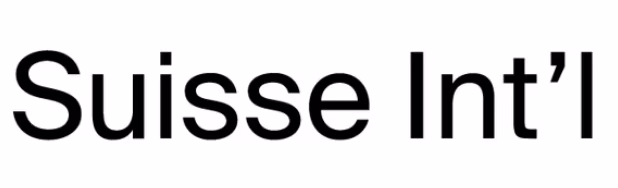
For global brands that demand versatility, Suisse Int’l offers a refined neo-grotesque aesthetic reminiscent of Helvetica but with a more contemporary edge. It provides exceptional legibility across digital and print mediums and supports multiple scripts — making it ideal for international companies or multilingual brands.
Suisse Int’l embodies clarity, neutrality, and global accessibility. Whether you’re designing for a multinational tech platform or a clean minimalist brand, this typeface ensures consistency and balance everywhere your logo appears.
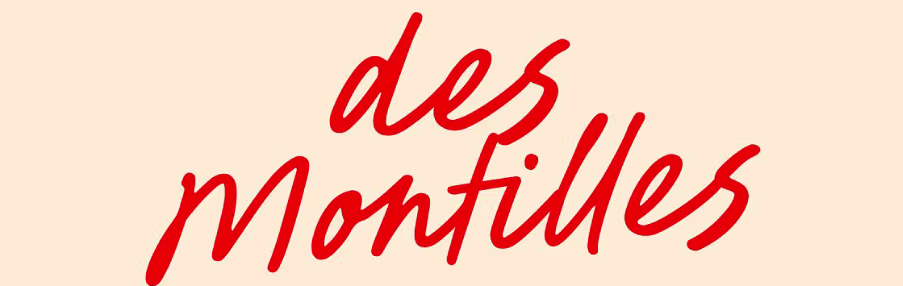
Des Montilles bridges the elegance of serifs and the fluidity of scripts, making it a perfect choice for high-end boutique logos. It exudes personality, charm, and a handcrafted touch without losing refinement. The letterforms have graceful strokes that feel custom-made, giving your logo an artisanal edge.
Luxury fashion houses, perfumeries, and premium stationery brands often lean toward fonts like Des Montilles to evoke exclusivity and artistry. It’s not overly formal — it’s refined with soul.

Bold, confident, and full of character — Bricolage Grotesque is the modern answer to display sans-serifs that demand attention. It maintains clear legibility while adding playful variations in its structure, giving brands room to express creativity without compromising professionalism.
This font is ideal for creative studios, advertising agencies, and design-driven startups that want to stand out visually. It adds energy and movement to your logo, helping it capture interest at first glance. If your brand thrives on innovation and boldness, this is your go-to typeface.

Contemporary and sleek, Zenotica balances simplicity with modern flair. Its smooth geometry and subtle edge make it perfect for fashion, beauty, and tech-forward brands looking to appear stylish yet futuristic. The refined curves lend sophistication, while its structure keeps the overall look clean and minimal.
Zenotica embodies the modern minimalism trend of 2025 — understated yet impactful. It performs well in both uppercase wordmarks and elegant monograms.

For brands that want softness, elegance, and warmth, Opalique offers a beautiful display script designed for feminine-lifestyle and boutique businesses. Its flowing letterforms and delicate curves bring emotional appeal and charm.
Perfect for skincare, wellness, or handmade product lines, Opalique gives your brand a personalized, approachable touch. It humanizes your logo, adding an artisanal, emotional feel while maintaining clarity — something that resonates strongly in lifestyle branding today.
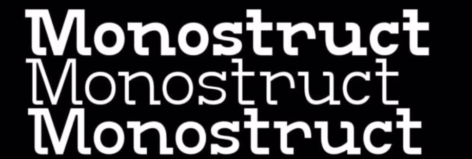
Minimalist, structured, and precise, Monostruct is a monospaced font designed to reflect digital precision and simplicity. Each character carries equal width, giving a uniform and tech-savvy feel that aligns beautifully with architecture, fintech, and SaaS brands.
This typeface conveys control, logic, and modernity — making it a solid choice for logos that emphasize efficiency and innovation. Monostruct fits perfectly within the emerging design movement that values balance and order in digital aesthetics.

At the luxurious end of the spectrum, Regentia Noevele is a high-contrast serif designed for fashion houses, editorial brands, and premium lifestyle companies. The elegant serifs and carefully balanced proportions bring a sense of drama and refinement to your brand name.
This typeface works especially well in monochrome or metallic applications, where its sophisticated letterforms can shine. Regentia Noevele embodies prestige and taste, making it ideal for high-fashion and luxury interiors where the logo must express aspiration and quality.
Each of these fonts embodies the key principles that define great logo typography:
What makes these the best fonts for logo design in 2025 isn’t only their style or popularity, but how well they combine versatility, emotion, and design integrity. They balance aesthetic appeal with practical branding function — ensuring that your logo not only looks exceptional but also communicates your brand’s voice with precision and consistency.
Selecting a font for a logo should be a strategic decision. Here’s a step-by-step method to guide the process:
Start by articulating what your brand stands for. Is it luxury or accessible? Tech or lifestyle? Playful or serious? The font must mirror that personality.
Example: A high-end jewellery brand might choose an elegant serif; a mobile app might lean toward a clean geometric sans-serif.
Your logo will appear in many contexts — website header, mobile icon, print, packaging, favicon, social. Choose a font that scales, works in light/dark backgrounds, and retains clarity at small sizes.
Ensure the font is properly licensed for commercial logo use, and that weights, italics or variable functionalities you might need are included. Avoid using fonts without clear licensing under your brand identity.
Mock up your logo with the font in different scenarios — mobile, print, horizontal/vertical layouts. See how it holds up in real contexts rather than just a design canvas.
Ask yourself: Will this font remain relevant in five years? Does it allow you to extend brand lines or sub-brands? Does it evade fads that may date quickly?
If your brand identity uses more than one font (e.g., logo + tagline), ensure the fonts pair well visually. Avoid conflicting styles. Also consider how the font aligns with colours, symbols or graphic elements.
With this method in place, you’ll be stronger in choosing typography that doesn’t just “look good” but “works well”.
Having chosen a font, here are practical tips to implement it within your brand logo:
Typography is more than design — in logo creation, it’s a strategic tool that shapes perception, readability and brand strength. In 2025, choosing one of the best fonts for logo design isn’t about picking what looks stylish now, but selecting a typeface that aligns with your brand identity, scales across media, and remains relevant in years to come.
The fonts we’ve highlighted represent a mix of timeless and trend-forward, making them excellent starting points for your logo design. But the most important step is to tie your font choice back to your brand personality, practical use-cases, and long-term vision.
When done right, your logo font won’t just spell out your brand’s name — it will convey its story, values and presence at a glance. Start designing your brand identity today with Logome — your typography and logo-design partner for modern branding excellence.
A good logo font balances style, readability, and scalability. It should reflect your brand’s personality while staying clear across all formats — from digital to print. The best fonts for logo design are unique, versatile, and timeless enough to support long-term brand recognition.
The choice depends on your brand identity. Serif fonts communicate tradition, luxury, and trust, making them ideal for premium or heritage brands. Sans-serif fonts feel modern, clean, and tech-forward — perfect for startups, lifestyle brands, or digital companies.
Yes, but pairing must be intentional. Combine contrasting styles — for instance, a bold sans-serif for your brand name and a lighter serif for a tagline. Always ensure both fonts complement each other and maintain visual balance for professional harmony.
Start by defining your brand traits — modern, elegant, playful, or minimalist. Then choose a font that expresses those qualities visually. Test it in various contexts and sizes to ensure it feels consistent and communicates your intended tone.
Some free fonts work well if they have proper commercial licensing and strong design quality. However, premium fonts often offer better craftsmanship, legibility, and uniqueness — reducing the risk of overuse. Always verify licensing before finalizing your logo.


Discover how 500,000+ businesses and creators are using our AI logo maker in their Logo creation.


