Logo Evolution: How Big Brands Modernized Their Designs
Explore how famous brands transformed through logo evolution. Learn why modernization matters, what trends drive redesigns, and how your brand can evolve successfully.

Explore how famous brands transformed through logo evolution. Learn why modernization matters, what trends drive redesigns, and how your brand can evolve successfully.


A logo is more than a decorative graphic — it’s the visual heartbeat of a brand. Over time, as businesses evolve, so must their logos. The brand logo evolution of famous companies reveals how thoughtful redesigns can transform public perception, maintain relevance, and align with cultural and technological change.
From flat design movements to minimalist rebranding, major corporations continually refine their visual identity to match modern aesthetics and audience expectations. But logo evolution is not just about keeping up with trends — it’s about staying timeless while adapting to the ever-changing world.
In this article, we’ll explore why brands evolve their logos, what drives these transformations, how some of the world’s biggest companies modernized their designs, and what lessons you can take from their evolution for your own brand.
Logos carry meaning far beyond their shape or color. They embody the brand’s story, values, and legacy. However, as design preferences and consumer expectations evolve, brands must update their visual identity to remain current.
Here’s why brand logo evolution is essential:
Design trends shift with technology, culture, and audience behavior. A logo designed decades ago may look outdated in today’s digital context. Updating it helps your brand maintain cultural and visual relevance.
As companies expand their services, markets, or missions, their visual identity must adapt. A simplified or redesigned logo communicates that the brand is growing, evolving, and forward-thinking.
Old logos often struggle with scalability and responsiveness on modern screens. A refreshed design ensures your logo looks sharp on everything from websites to mobile apps to smartwatches.
Redesigning thoughtfully allows brands to realign their imagery with the values and emotions they want to evoke. Sometimes, a subtle logo evolution can reenergize audience trust and loyalty.
In an era of rapid consumption, clarity wins. Minimalism has become a core principle in logo design, making simplification a key part of evolution.
Every logo redesign goes deeper than surface-level aesthetics — it’s rooted in psychology. Before evolving a logo, brands study how people interpret design elements like typography, color, and shape, both consciously and subconsciously. These visual cues influence emotion, perception, and ultimately how consumers connect with a brand.
When a company decides to modernize its logo, it’s not simply about keeping up with design trends. It’s a process of redefining emotional resonance — ensuring that the logo continues to express the brand’s identity, purpose, and promise in a way that feels relevant to today’s audience.
The typeface a brand chooses can immediately signal its tone and character. Typography isn’t just about style; it’s about personality.
When brands evolve their logos, switching typefaces or refining letterforms often helps align tone with brand evolution — from traditional to contemporary, playful to professional, or niche to global.
Color plays one of the most powerful roles in logo psychology. It directly influences mood, recall, and perception — often before the viewer consciously processes what the logo says.
As brands evolve, many simplify or refine their color palettes to reflect digital harmony and global appeal. For instance:
In the digital age, brands also consider how their colors perform across screens, dark modes, and accessibility standards. Simplifying hues makes logos adaptable, consistent, and instantly recognizable everywhere.
Shapes carry subconscious meanings that affect how people interpret logos. They set the emotional tone before any words are read.
When a logo evolves, tweaking or simplifying shapes can dramatically shift perception. Rounded corners may soften a corporate image, while sharper lines might project growth, innovation, or strength.
Ultimately, brand logo evolution is about emotional recalibration — maintaining a connection with the audience as times change. The redesign process bridges the gap between where the brand has been and where it’s going.
Every design decision — whether it’s flattening an icon, brightening a color, or refining typography — is intentional. It shapes how people feel, think, and remember. Successful logo evolution doesn’t discard a brand’s heritage; it builds on it, ensuring that the logo continues to tell the brand’s story in a modern, relevant, and emotionally resonant way.
Below are some of the most iconic brand logo evolution examples — each revealing valuable lessons in modernization, strategy, and design psychology.
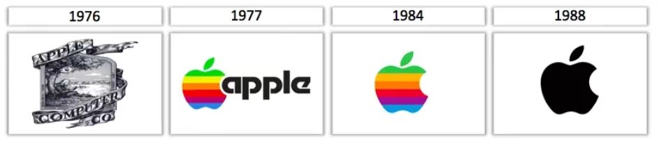
Apple’s first logo in 1976 depicted Isaac Newton under an apple tree, framed by ornate Victorian borders. It was complex, literary, and detailed — but not scalable or modern.
Just a year later, Apple replaced it with the bitten apple silhouette we know today. Over time, the logo evolved from a rainbow-filled mark to sleek monochrome and finally to the polished flat icon we recognize globally.
Lesson: Simplify. Apple’s transition shows how distilling an idea to its purest form creates a timeless mark. Minimalism made the Apple logo iconic and adaptable across all digital platforms.

Google’s logo has undergone several refinements since 1998. The early versions were playful but clunky, with drop shadows and inconsistent spacing. In 2015, Google adopted a geometric sans-serif typeface that balanced fun with professionalism.
Its flat, colorful simplicity reflects the brand’s accessibility and user-centered approach while maintaining its recognizable identity.
Lesson: Keep evolution subtle when you already have a strong identity. Google didn’t reinvent its logo — it refined it for readability, simplicity, and scalability.

Starbucks began in 1971 with a detailed siren illustration encircled by the brand name. As the company grew globally, it simplified the siren and removed text altogether in 2011. The logo now stands confidently as a symbol recognized worldwide.
Lesson: Strong icons can transcend language. Once brand recognition is established, stripping away text can make the logo more universal and versatile.
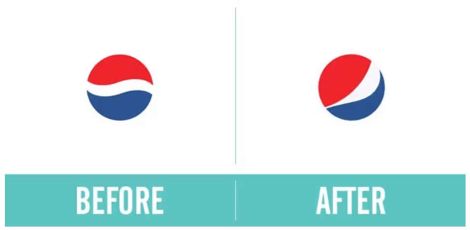
Few brands have undergone more logo transformations than Pepsi. Its earliest logo (1898) featured decorative script typography. Over the decades, Pepsi embraced bold colors, geometric forms, and simplicity.
The most recent iterations focus on circular balance — representing global connection — while keeping the iconic red, white, and blue palette.
Lesson: Maintain visual DNA while evolving. Pepsi’s redesigns always honor its legacy colors and shape, ensuring familiarity while staying fresh.
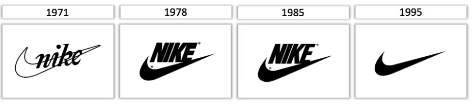
Originally called “Blue Ribbon Sports,” Nike introduced the Swoosh in 1971 — a symbol of movement, speed, and victory. Over time, Nike dropped the brand name, letting the Swoosh stand alone.
Today, the Nike logo is among the most powerful minimalist marks in history.
Lesson: Trust simplicity and symbolism. Nike’s evolution proves that powerful brand symbols can eventually communicate identity without any text.
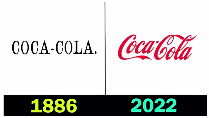
Unlike many others, Coca-Cola’s logo has evolved subtly without abandoning its roots. The iconic Spencerian script has remained nearly unchanged since the early 1900s, proving that when a logo becomes part of culture, minimal updates can preserve authenticity.
Lesson: If it isn’t broken, refine rather than replace. Evolution doesn’t always mean drastic change; it can mean consistency with slight adjustments to keep it relevant.

Instagram’s original logo depicted a detailed camera with a vintage feel. As mobile design shifted toward flat aesthetics, Instagram rebranded in 2016 with a vibrant gradient background and simplified camera outline.
Lesson: Adapt to platform aesthetics. A modern logo must align with digital trends without losing brand recognition.

BMW’s 2020 logo redesign removed the black outer ring and introduced a transparent background, reflecting a more digital, open brand identity. The iconic blue and white emblem remained untouched.
Lesson: Keep heritage intact while modernizing execution. BMW’s refresh shows how slight updates can modernize a legacy without compromising history.

Warner Bros.’s iconic shield logo was simplified in 2019 by Pentagram Studio. The redesign kept the WB monogram but flattened the structure and introduced a flexible system adaptable to animation, streaming, and digital media.
Lesson: Logos must adapt to motion and multimedia. The new design works seamlessly across streaming platforms, proving the importance of digital flexibility.

Burberry’s 2018 redesign swapped its elegant serif logo for a modern sans-serif, aligning with minimalist fashion trends. However, in 2023, Burberry surprised the industry by reviving its heritage font and introducing a redesigned emblem based on archival inspiration.
Lesson: Authenticity never goes out of style. Modernization doesn’t always mean minimalism — sometimes, returning to heritage can feel fresh in a world of uniformity.
Across all these brands, several key design movements continue to influence logo evolution in 2025 and beyond.
Flat logos — with simple lines, solid colors, and no 3D effects — dominate modern branding. They’re versatile, responsive, and work beautifully on screens.
Readable sans-serif fonts have replaced ornamental or decorative letterforms. Typography that scales seamlessly between digital and print is now standard.
Dynamic logos that adjust based on platform — for example, simplified app icons — help brands maintain identity while adapting to new contexts.
Many brands now reintroduce vintage elements from older logos to evoke nostalgia and authenticity while updating the execution for modern audiences.
Limited palettes help create clean, cohesive branding across digital and print. Brands like Mastercard and Spotify use simple, consistent colors for instant recognition.
If you’re considering a refresh, here’s how to guide your brand logo evolution without losing your identity.
Identify why you’re redesigning. Is the logo outdated, complex, or inconsistent? Understanding the problem ensures meaningful design improvements.
Keep recognizable elements — a shape, color, or symbol — to maintain continuity and brand recognition.
Avoid over-simplifying to the point of genericity. Reduce clutter while retaining what makes your logo distinct.
Ensure your new logo performs well on all mediums: websites, packaging, signage, and merchandise.
When brands rebrand, transparency helps. Share the story behind the redesign with your audience — it turns a design update into a meaningful narrative.
Every iconic redesign teaches a universal truth — great logos evolve; they aren’t reinvented. Successful brands understand that their logo is part of a continuous journey rather than a one-time statement. Through evolution, not revolution, they manage to remain recognizable while adapting to the changing expectations of modern audiences.
One of the biggest lessons from brand logo evolution is that change should never come at the cost of recognition. The most memorable logos retain visual elements that tie back to their heritage — such as color, shape, or structure. Apple’s minimalist evolution kept the bitten apple silhouette intact, and Coca-Cola’s cursive script has endured for over a century. Both brands modernized while maintaining their core identity, ensuring familiarity even as design trends changed.
When updating a logo, brands should identify what makes their design instantly recognizable — and protect it. This consistency helps audiences continue to trust the brand through each transformation.
A well-executed redesign respects the brand’s history while looking confidently toward the future. The most successful transformations find harmony between heritage and modernity — keeping what’s timeless while refining what feels outdated.
Take Burberry, for instance. The brand transitioned from a minimalist sans-serif logo back to a revived heritage wordmark, merging tradition with contemporary execution. This balance tells a story: a nod to its roots, paired with a fresh expression for today’s fashion landscape.
For any business, especially one with an established customer base, logo modernization should be evolutionary — refining details rather than erasing legacy.
Modern logo design is driven by clarity, but clarity doesn’t mean dullness. The goal is to simplify without losing creativity. When Google refined its logo, it removed shadows and decorative elements, focusing on clean lines and symmetry — yet retained its playful, multicolored identity.
This demonstrates that creativity can thrive within simplicity. A streamlined logo should still express emotion, story, and intent. The more a design communicates with fewer elements, the more timeless and versatile it becomes.
Consumers are naturally drawn to familiarity — it signals reliability and comfort. However, a logo that never evolves risks appearing stagnant or irrelevant. The best brands master the balance between familiarity and innovation.
Instagram’s shift from a realistic camera to a flat, colorful gradient icon was initially divisive but ultimately successful. It maintained the recognizable silhouette of the original logo while introducing a modern, digital aesthetic. The result was a fresh yet familiar identity that resonated with a mobile-first audience.
This balance ensures that a logo continues to feel both recognizable and exciting — familiar enough to trust, but innovative enough to inspire.
You don’t need to be Apple, Nike, or Coca-Cola to benefit from logo evolution. For small businesses and startups, redesigning a logo can be just as powerful — and often more impactful.
A thoughtful evolution can help reposition your brand, reflect growth, or better align with your audience’s expectations. The process doesn’t require an expensive agency; it starts with observation and reflection. Ask yourself:
Making subtle refinements — adjusting typography, updating color palettes, or simplifying layout — can breathe new life into your brand without losing its essence.
Every effective logo evolution begins with a clear reason. Brands that evolve successfully do so with purpose — not just to follow trends. A logo update should mirror the brand’s growth, new direction, or refined mission.
When the intent is strategic, the redesign tells a story. It signals transformation and progress while reaffirming the brand’s core values. Whether it’s a global company or a small business, intent turns design change into meaningful brand storytelling.
Logo evolution reflects more than visual change — it mirrors cultural shifts, business transformations, and audience connection. From Apple’s minimalism to Burberry’s heritage revival, the world’s most famous brands show that modern design is about adaptability and authenticity.
If you’re planning your next redesign, focus on clarity, relevance, and meaning. A logo that evolves with intention can strengthen brand recognition for decades to come.
At Logome, we understand the delicate balance between modernization and tradition. Our platform helps you design, refine, and future-proof your logo — ensuring your brand’s next evolution becomes a story of success, not just a change of style.
Brand logo evolution is the gradual process of refining and modernizing a logo to match changing design trends, brand values, and audience expectations. It keeps a brand visually relevant without losing the essence of its identity or recognition.
Most global brands choose evolution over reinvention to preserve brand recognition. Subtle updates in color, typography, or form maintain familiarity while giving the logo a modern, refreshed look suited to current markets and digital platforms.
There’s no fixed timeline, but brands typically consider updates every 5–10 years. The decision depends on factors such as company growth, technological change, or audience shift. Consistent visual relevance is the goal — not constant redesign.
A drastic redesign can confuse loyal customers or dilute brand identity. If the brand logo evolution disregards key visual DNA — such as color, shape, or symbolism — it can disconnect the brand from its audience and reduce recognition.
Small brands can evolve their logos successfully by making subtle improvements — simplifying fonts, updating colors, or refining shapes. The key is to focus on clarity and consistency while ensuring the design still reflects the brand’s story and mission.


Discover how 500,000+ businesses and creators are using our AI logo maker in their Logo creation.


