Best Colors for Logo
Discover how logo color psychology influences branding and emotions. Learn the best colors for logo design by industry and create your ideal logo with LOGOME.AI.

Discover how logo color psychology influences branding and emotions. Learn the best colors for logo design by industry and create your ideal logo with LOGOME.AI.


Colors are the silent language of branding, shaping how people feel about a business before they even read its name. From the calming trust of blue to the energetic confidence of red, each hue sparks an emotional response that can define how a brand is perceived. This connection between color and emotion is what we call logo color psychology — the science behind choosing colors that influence customer perception and behavior. Understanding this psychology helps businesses design logos that reflect their personality, values, and purpose. In this guide, you’ll discover how colors influence branding and learn how to pick the best colors for your logo to make a powerful, lasting impression on your audience.
Logo color psychology is the study of how different colors influence human emotions and shape brand perception. It goes beyond aesthetics — colors have the power to trigger feelings, build connections, and guide consumer decisions. For instance, red often evokes excitement and passion, while blue conveys trust and reliability. These subtle emotional cues help brands communicate their personality without saying a word.
According to research by the University of Loyola, color increases brand recognition by up to 80%, proving that the right hue can make a brand instantly memorable. Choosing the right color palette isn’t just about looking good — it’s about building trust, consistency, and emotional connection. A well-chosen logo color can turn first-time viewers into loyal customers.
When it comes to logo color meanings, every shade tells a story. Understanding color psychology in branding helps you choose colors that match your brand’s values and resonate emotionally with your audience. Below is a breakdown of what each major color represents and how it influences perception.
Red is the color of energy and action. It evokes strong emotions like passion, power, and desire, making it ideal for brands that want to stand out and inspire immediate response. That’s why companies like Coca-Cola, YouTube, and Netflix use red — it grabs attention and sparks enthusiasm. In industries like food, retail, and entertainment, red drives impulse and excitement, encouraging engagement and appetite.

Blue represents stability, intelligence, and reliability — qualities that make customers feel safe. It’s a favorite in industries like tech, finance, and healthcare, where trust is essential. Think of Facebook, PayPal, and Samsung — their blue logos create an instant sense of credibility and calm. In color psychology in branding, blue is the go-to hue for brands that want to project professionalism and dependability.

Green reflects nature, balance, and renewal. It’s strongly tied to feelings of health, prosperity, and sustainability, making it perfect for wellness, eco-conscious, and financial brands. Logos like Starbucks, Whole Foods, and Spotify use green to communicate growth and harmony. For brands focused on environmental values or personal well-being, green instantly signals a fresh and responsible identity.

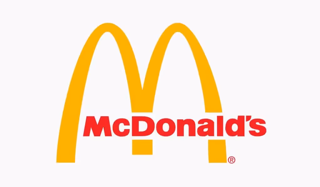
Yellow radiates happiness and positivity. It’s an attention-grabbing color that evokes feelings of joy and friendliness. Brands like McDonald’s, IKEA, and Snapchat use yellow to appear approachable and cheerful. In industries like hospitality, entertainment, and children’s products, yellow logos express creativity, fun, and openness. However, it should be balanced with a contrasting tone to maintain readability.
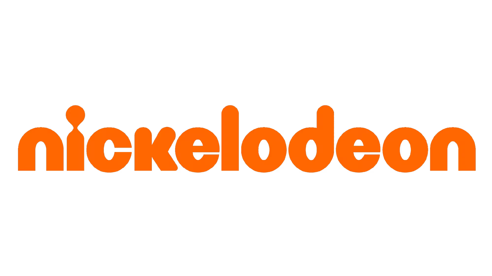
Orange combines the warmth of red and the joy of yellow, representing creativity, energy, and friendliness. It’s an excellent choice for startups and innovative brands looking to appear bold and approachable. Companies like Fanta, SoundCloud, and Nickelodeon leverage orange to express playfulness and youthful energy. This color encourages interaction and is great for brands that want to exude positivity and enthusiasm.
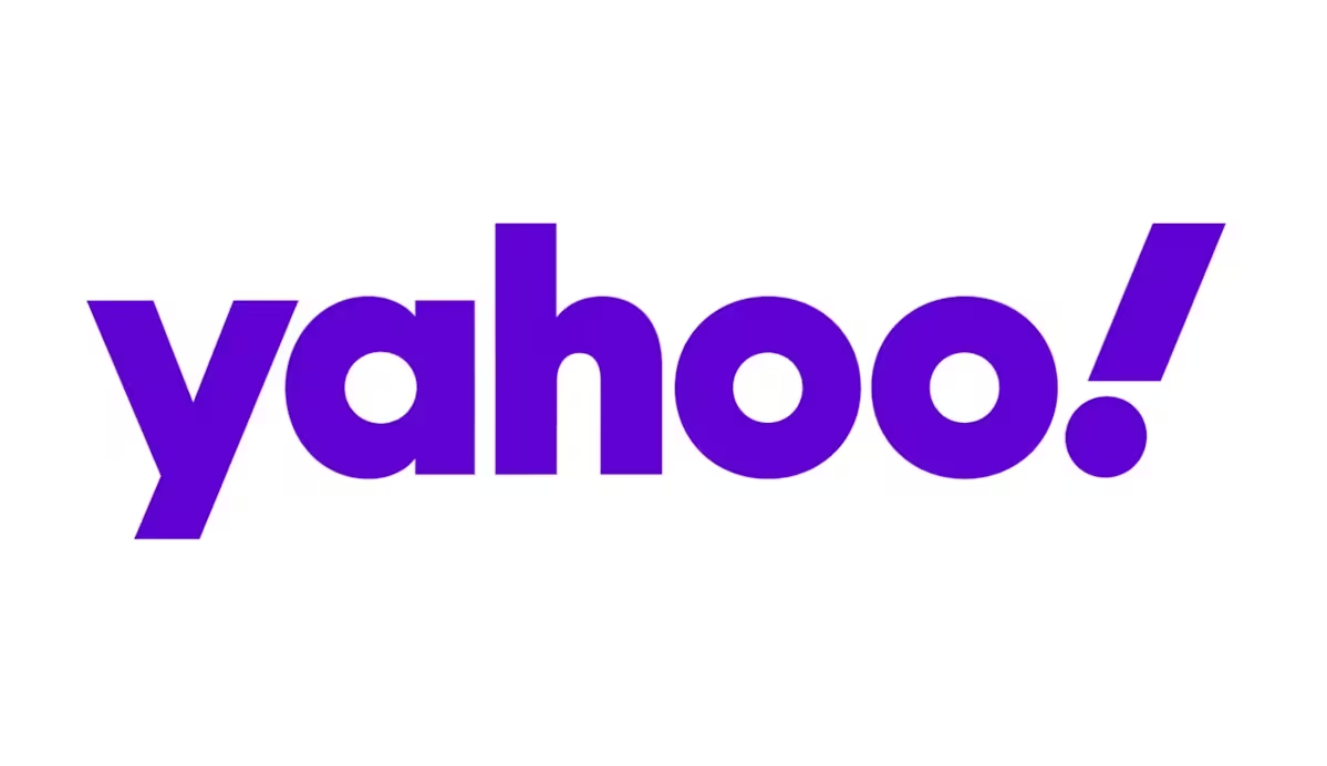
Purple has long been associated with royalty and sophistication. It signifies wisdom, creativity, and exclusivity — making it ideal for beauty, luxury, and premium brands. Brands such as Cadbury, Yahoo, and Twitch use purple to stand out as imaginative and upscale. If your brand aims to feel elegant or thought-provoking, purple creates a refined and aspirational impression.
These neutral tones are the foundation of modern and minimal design. Black represents power and elegance (used by Nike and Chanel), white symbolizes purity and simplicity (seen in Apple’s clean branding), and gray conveys balance and professionalism (Mercedes-Benz). Together, they form the core of timeless, versatile design — perfect for brands wanting a sleek, high-end, or minimalist image.

When deciding on the best colors for a logo, it’s essential to understand that every industry connects with its audience through specific emotional cues. The colors you choose should reflect your brand’s purpose, values, and market expectations. From building trust in tech to sparking appetite in food, color psychology plays a defining role in shaping how your brand is perceived.
Below is a complete guide showcasing the most effective logo colors by industry — along with examples of well-known brands that use them successfully.
Different industries rely on color psychology to connect with their audiences. Tech brands prefer blue for credibility and security, while red and yellow dominate the food industry to stimulate appetite and create excitement. In contrast, black and beige help fashion brands appear sophisticated and aspirational.
However, remember that color meanings vary across cultures. For example, white signifies purity and simplicity in Western cultures but is associated with mourning in parts of Asia. Similarly, red means energy and passion in Western contexts yet symbolizes prosperity and good fortune in China.
When choosing your palette, always consider your audience’s cultural background and emotional triggers. Selecting the best colors for your logo isn’t just a design choice — it’s a strategic decision that defines how people around the world perceive and trust your brand.
If you’re wondering how to choose logo colors that truly represent your brand, it’s not just about picking your favorite shade — it’s about selecting hues that tell your story, attract your audience, and inspire emotion. The process combines strategy, psychology, and design intuition. Follow this step-by-step guide to find the best colors for your logo that align with your brand’s personality and purpose.
Start by identifying who your brand really is. Are you bold and energetic or calm and trustworthy? Your logo colors should reflect your brand’s values, tone, and target audience. For instance, a youthful startup might choose vibrant tones, while a luxury label may favor muted or metallic shades that exude sophistication.
Every color triggers a specific emotional response. Ask yourself what feelings you want your audience to associate with your brand — trust, excitement, creativity, or luxury. Blue evokes reliability, red sparks energy, and purple suggests imagination. Aligning your emotional goals with the right color family ensures your logo connects on a psychological level.
Analyze the color palettes used by your competitors. This helps you understand industry standards — and where you can stand out. For example, if every financial brand in your niche uses blue, experimenting with green or teal could give your brand a distinctive yet trustworthy edge.
Now that you know your emotional direction, choose one primary logo color that defines your identity. Use logo color psychology as your guide:
This dominant hue will anchor your visual identity across all touchpoints.
Complement your primary color with one or two accent shades to create harmony and visual interest. For example, blue and orange work well for dynamic tech brands, while black and gold express luxury and prestige. Accent colors shouldn’t overpower — they should enhance and balance your overall design.
A color that looks great on your laptop might appear dull on a phone screen or print medium. Test your logo palette across web, print, packaging, and dark mode to ensure clarity and consistency. A strong logo remains recognizable in any setting — whether it’s on a website header, social media icon, or billboard.
Designing a logo doesn’t have to be complicated. With Logome, you can instantly generate professional logo color combinations tailored to your brand’s personality and audience. The AI analyzes industry trends and emotional associations to suggest palettes that resonate — helping you create a logo that feels authentic, balanced, and unforgettable.
The most memorable logos often use more than one color — because the right mix creates balance, depth, and emotion. Using 2–3 harmonious colors not only enhances visual appeal but also strengthens your brand’s message. When chosen strategically, these combinations follow the principles of logo color psychology, ensuring that your design feels both aesthetically pleasing and emotionally powerful.
A successful logo design isn’t about random color choices — it’s about creating harmony. Here are three classic color combination types that every brand should know:
Each approach aligns with logo color psychology by combining emotion with visual design — ensuring your brand evokes the right feelings while remaining distinct and professional.
Here are a few timeless color pairings that embody both emotional strength and design harmony:
When crafting your palette, remember that the best logo color combinations are those that reflect your brand’s values and appeal to your audience’s emotions. Test your colors across digital and print formats to ensure consistency and clarity.
If you’re unsure where to start, Logome can help you generate color-perfect combinations instantly. Its AI-powered design tools use logo color psychology to create harmonious palettes that make your brand memorable and visually stunning.
Selecting the right colors for your logo is one of the most important branding decisions you’ll ever make. Yet, many businesses fall into avoidable traps that weaken their visual identity. To ensure your design captures attention and builds trust, here are some common mistakes to avoid when picking logo colors — backed by principles of logo color psychology.
One of the biggest mistakes is letting personal taste dictate your logo palette. Your favorite color might not resonate with your target audience or represent your brand message effectively. Instead of designing for yourself, focus on color psychology in branding — how colors make people feel and what they associate with them. For example, while you may love purple, your audience might connect more with blue if your brand focuses on trust and technology.
Even the most beautiful color combinations fail if your logo isn’t legible. Low contrast between background and text can make your logo hard to read, especially on mobile screens or printed materials. Always test your logo in different sizes, backgrounds, and lighting conditions to ensure clarity. A clear contrast ensures your logo remains professional and recognizable anywhere it appears.
While experimenting can be fun, using too many colors often leads to visual clutter and confusion. A great logo is simple, memorable, and instantly identifiable — not a rainbow of competing hues. Stick to 2–3 well-balanced colors that reflect your brand personality and support each other harmoniously. Remember, simplicity strengthens brand recognition and reinforces trust.
Colors don’t carry the same meaning everywhere. For example, white represents purity in Western cultures but mourning in some Asian regions. Similarly, red symbolizes energy and passion globally but also has specific cultural associations with luck and celebration in countries like China. Beyond culture, consider accessibility — ensure your logo is easily distinguishable for people with color vision deficiencies. Tools that simulate color blindness can help you design inclusive and universally appealing logos.
As branding continues to evolve, so does the science of logo color psychology. The way businesses use color is shifting to match modern design preferences, technology, and user behavior. From minimalist designs to AI-powered customization, here are the top future trends in logo color psychology every brand should watch.
Minimalism is redefining modern branding. More companies are adopting single-color logos to create sleek, timeless identities that translate seamlessly across platforms. A well-chosen hue — whether it’s black for sophistication, blue for trust, or green for balance — can communicate just as much emotion as a multicolor design. This trend also enhances brand recall, as audiences remember clean, simple visuals more easily.
As digital experiences expand, brands need logos that adapt across devices, backgrounds, and themes — especially dark and light modes. Adaptive logo color palettes ensure consistent visibility and readability in any environment. For example, brands are designing flexible color systems that adjust automatically, maintaining both aesthetic appeal and psychological impact no matter where they appear. This adaptability reflects modern design’s focus on accessibility and user experience.
Artificial intelligence is reshaping how designers approach color choices. With platforms like Logome, businesses can now generate personalized color palettes based on brand personality, target audience, and emotional tone. AI analyzes millions of color combinations and trends to predict which palettes resonate most effectively with customers. This innovation bridges creativity and data, making logo design smarter, faster, and more impactful than ever before.
The future of logo color psychology is about more than trends — it’s about creating authentic emotional connections through intelligent design. Whether through minimalism, adaptability, or AI personalization, color will continue to be the cornerstone of brand storytelling in the digital age..
In the world of branding, logo color psychology shapes how audiences perceive, trust, and remember your business. Every shade you choose tells a story — influencing emotion, loyalty, and recognition. The key takeaway? Choosing the best colors for your logo isn’t about personal taste; it’s a strategic decision rooted in psychology and design. When done right, the right color palette transforms your logo into a powerful brand symbol.
Use Logome to find the perfect color palette and design a logo that connects emotionally with your audience and stands out in every impression.
The 60-30-10 rule balances design by using 60% dominant color, 30% secondary, and 10% accent. With four colors, include a neutral shade (white, gray, or black) as the base. This method ensures harmony, readability, and visual flow, making your logo cohesive and aesthetically pleasing across all platforms.
The 70-20-10 rule emphasizes a dominant color (70%), a secondary tone (20%), and an accent (10%) for visual hierarchy. This proportion creates focus and balance, ensuring logos feel structured yet engaging. It’s a widely used color design principle that strengthens emotional impact and improves brand recognition across mediums.
The 6-3-1 golden rule guides balanced color usage: six parts primary color, three parts secondary, and one part accent. This ratio maintains clarity and prevents visual clutter. It’s ideal for logo design, ensuring harmony and consistent emphasis while reinforcing your brand identity through controlled, strategic color distribution
The best color for a logo depends on brand personality and audience. Blue conveys trust, red shows energy, green represents growth, and black reflects luxury. Choose colors aligned with your brand values. Tools like LOGOME.AI help generate ideal palettes based on emotional and psychological impact.
The psychology of logo colors explores how colors shape emotions and brand perception. Blue evokes trust, red triggers passion, and green brings balance. Brands use these associations to build emotional connections and strengthen recognition. Understanding color psychology ensures your logo resonates deeply and communicates your identity effectively.
The 5 colors theory suggests using up to five colors — one primary, two secondary, and two accent or neutral tones. This maintains visual harmony, professionalism, and consistency across branding. Limiting your palette ensures clarity and strong recall, making your logo cohesive and impactful across all design applications.


Discover how 500,000+ businesses and creators are using our AI logo maker in their Logo creation.


