What Makes a Logo Timeless? 7 Design Principles That Never Go Out of Style
Master the art of creating logos that last for decades. Learn seven core design principles that separate timeless brand marks from forgettable ones.

Master the art of creating logos that last for decades. Learn seven core design principles that separate timeless brand marks from forgettable ones.

A good logo will move your audience, wow clients, and make a stunning impression. And that recognition you create will last for years.
The difference between a timeless logo and one that’s forgotten and faded are key design principles each follow. If you pay attention to these principles, you will be doing good for the years to come. But get them wrong, and everything turns into a nightmare down the road. Let’s check them out.
There are many courses you can take, graphic design theory classes or even crash courses on color theory, but if you don't know how to make logo design principles work, then you'll be cooked pretty much. Timeless logo design hinges on some basics that you absolutely have to get right no matter what these logo design principles will just make or break business. Ask any independent professional graphic artist or logo design specialist and they will all agree with them.
Here are the seven key logo design principles you should be aware enough to make your logos truly timeless.
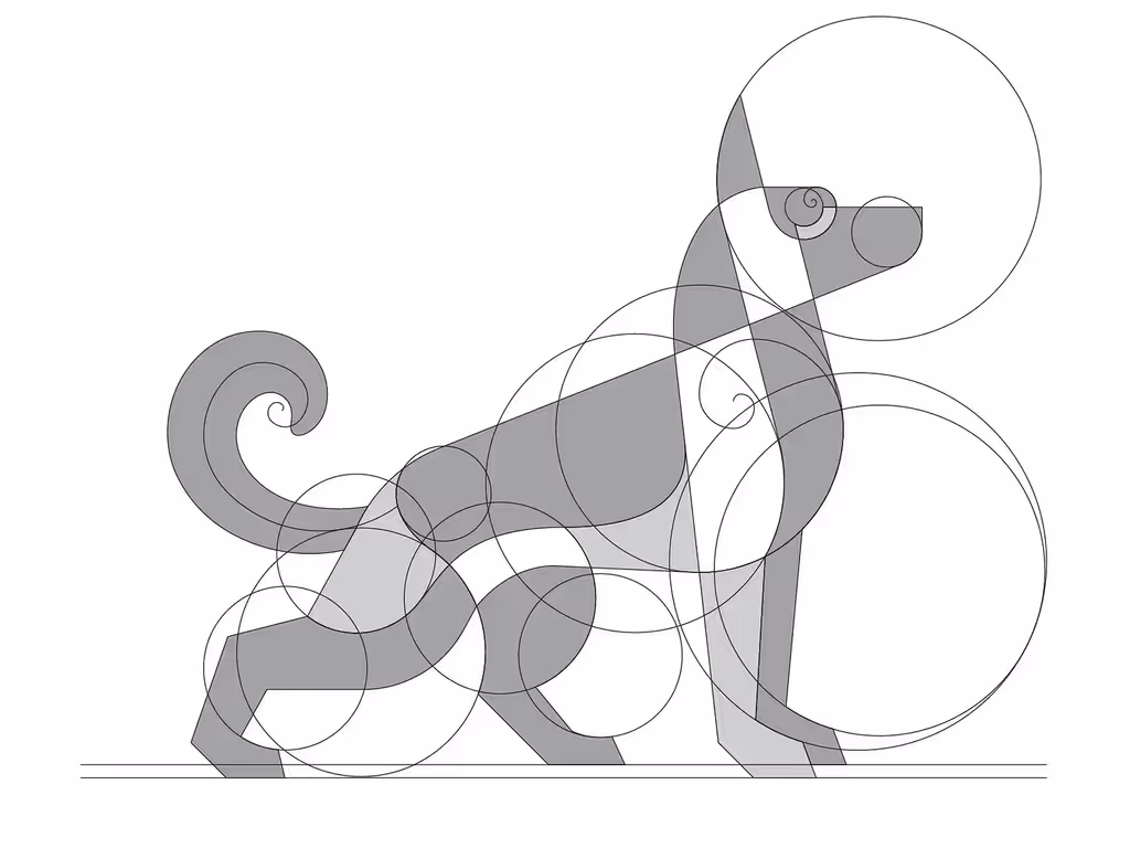
You'll know a well-designed logo when you see it - the shapes feel right, nothing looks out of place. Strong geometric shapes form the backbone of memorable logos. Circles, squares, and triangles create instant recognition because our brains process simple shapes faster than complex imagery.
If you need to check proportions, use the golden ratio as your guide. You can divide your logo into sections where each element relates mathematically to the others. You should keep symmetry balanced but not rigid - perfect symmetry can feel sterile while slight asymmetry adds visual interest.
Your logo must speak your brand's language. If you're a tech startup, clean lines and modern geometry work well. But you could go with organic, flowing shapes for wellness brands. The shape psychology matters - angular forms suggest strength and stability, while curved lines feel approachable and friendly.
You will need your logo to work everywhere - from business cards to billboards. If you notice detail getting lost when shrinking your design, you're overcomplicating things. Test your logo at different sizes before finalizing it.
Typography choices make or break logo readability. You can use custom lettering for uniqueness, but standard fonts work too if they match your brand personality. You should avoid trendy typefaces that will date your design quickly.
Let's see how your text interacts with your logo mark. You could place text beside, below, or integrate it within your symbol. But you need consistent spacing and alignment throughout. If you're combining multiple elements, there will be hierarchy - one element should dominate while others support.

You'll want to start with pencil sketches before jumping into design software. Hand-drawn concepts help you think through ideas without getting distracted by digital tools. If you notice yourself getting stuck, try drawing 20-30 variations quickly.
Grid systems keep your design organized and professional. You can use basic grids like 4x4 or 8x8 to align elements consistently. But you don't need complex grid systems - simple guidelines work just fine for most logo projects.
Visual balance doesn't mean everything needs equal weight. You could have a heavy element on one side balanced by negative space on the other. If you need to check balance, imagine your logo sitting on a seesaw - would it tip over or stay level?
You should test your logo on real applications early in the design process. You can create mockups showing your logo on letterheads, websites, and product packaging. But you will need to see how it looks in different contexts before making final decisions.
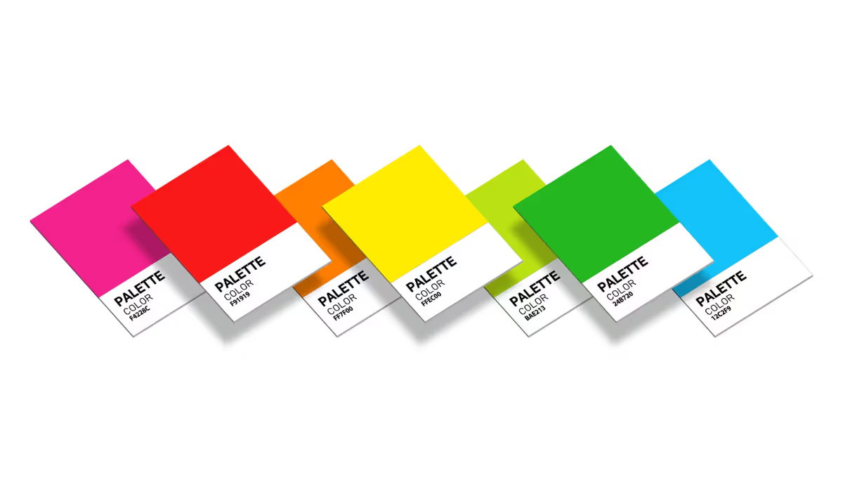
Color psychology affects how people perceive your brand. You could use blue for trust and reliability, red for energy and passion, or green for growth and nature. If you're working with limited budgets, design in black and white first - if it works without color, adding color will only make it stronger.
You will need your logo to work in single color for stamps, embossing, and low-cost printing. You should create versions for light backgrounds, dark backgrounds, and single-color applications from the start.
You'll notice design trends come and go, but simple logos endure. If you're tempted to add gradients, drop shadows, or complex effects, step back and reconsider. You can always add visual interest through smart use of negative space instead of decorative elements.
Complex logos fail because they try to communicate too much at once. You should pick one main concept and execute it clearly rather than cramming multiple ideas together. But you could hint at secondary meanings through subtle details that reward closer inspection.
If you need to explain what your logo represents, it might be too abstract. You will want immediate recognition and understanding from your target audience. You can test this by showing your logo to people unfamiliar with your brand and asking what they see.
Modern brands need flexible logo systems, not just single designs. You could create a main logo plus simplified versions for different uses. But you will need consistency across all variations - same colors, similar proportions, matching personality.
Responsive logos adapt to different screen sizes and contexts. You should have horizontal versions for wide spaces, stacked versions for square formats, and simplified marks for tiny applications like favicons.
If you notice your logo losing impact in certain contexts, you might need additional variations. You can develop a logo family with different levels of complexity while maintaining brand recognition across all versions.

You'll want your logo burned into people's memory after one glance. Simple, unexpected elements create lasting impressions. You could use clever negative space, subtle visual puns, or unique shape combinations that make people look twice.
Your logo must connect with your specific audience, not everyone. If you're designing for lawyers, playful cartoon styles won't work. But you should avoid clichés - not every tech company needs a swoosh, and not every restaurant needs a chef's hat.
Original thinking sets great logos apart from forgettable ones. You can find inspiration everywhere, but copying existing designs kills your brand's unique voice. You should develop concepts that only make sense for your specific business and audience.
Creating logos that stand the test of time requires careful attention to fundamental design concepts. Strong shapes, clear typography, and thoughtful color choices form the foundation of memorable brand marks. When you focus on simplicity over trends and test your designs across multiple applications, you build logos that work today and tomorrow. Smart designers balance creativity with practicality, creating marks that communicate clearly while remaining flexible enough to grow with changing needs. Try Logome today.
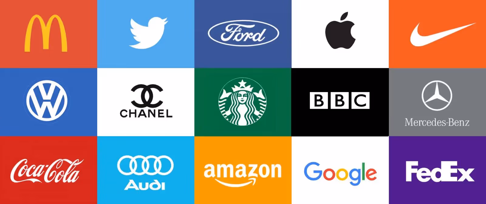
Simplicity trumps everything else when designing for longevity. Complex designs with multiple elements, trendy effects, or overly detailed illustrations quickly become outdated. Simple geometric shapes, clean typography, and clear visual hierarchy create logos that remain relevant across decades while maintaining instant recognition and memorability.
The best logos work perfectly in single color before adding additional hues. Starting with black and white forces you to rely on strong shapes and smart use of negative space rather than color differentiation. If you add color, limit yourself to two or three maximum to maintain versatility across different applications and printing methods.
Scalability depends on eliminating unnecessary detail and maintaining strong contrast between elements. Thin lines, small text, and intricate patterns disappear when reduced to favicon size. Test your logo at actual application sizes - business card corners, social media profiles, mobile app icons - to identify elements that need simplification.
Company names aren't always necessary if your logo mark is distinctive enough to stand alone. Large, well-known brands often use symbol-only versions once they build recognition. However, new businesses benefit from including readable text until their visual mark becomes familiar to their target audience through consistent use and marketing.
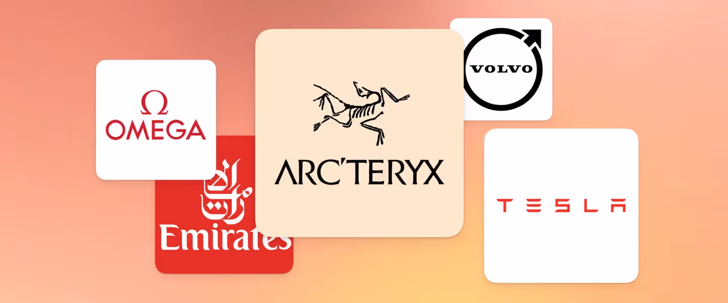
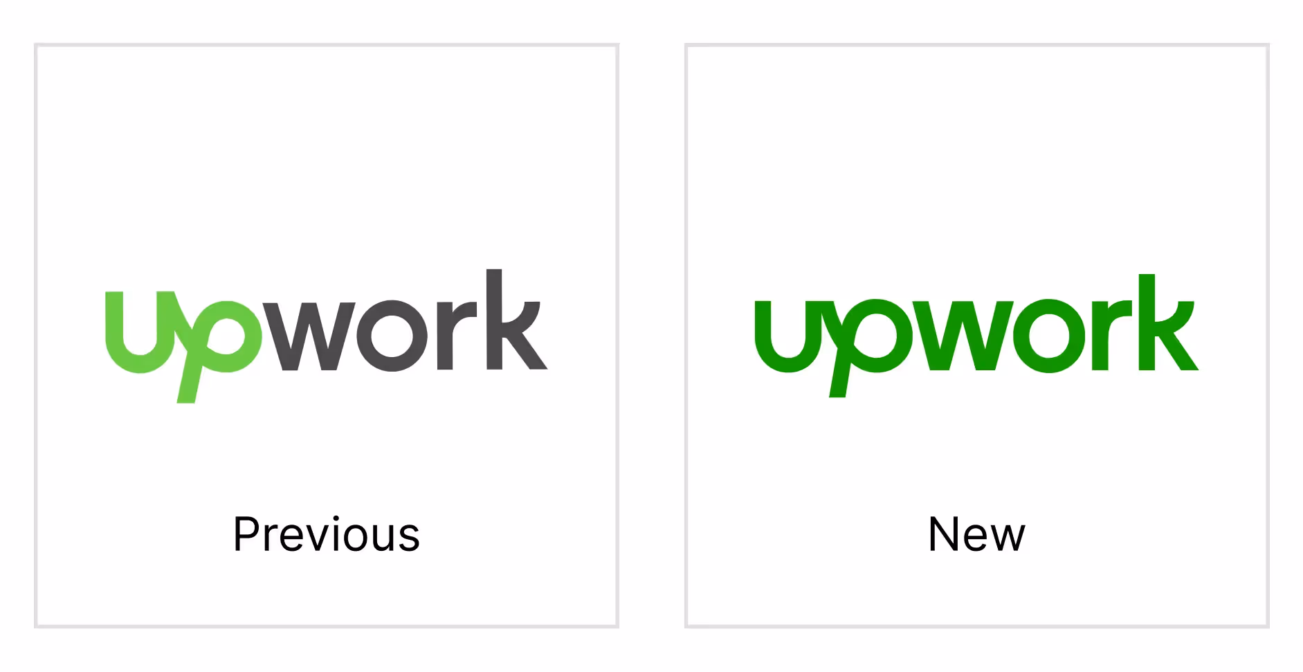
Trendy logos rely heavily on current design fads like specific color palettes, illustration styles, or typography treatments that feel very "of the moment." Ask yourself if your logo would look appropriate in a different decade. Timeless designs use classic proportions, proven color combinations, and typography that doesn't scream a particular era.
Memorable logos often contain one unexpected element that makes viewers take a second look - clever use of negative space, subtle visual connections, or unique shape combinations. The key is restraint: include just enough surprise to create interest while keeping the overall design clean and immediately understandable at first glance.


Discover how 500,000+ businesses and creators are using our AI logo maker in their Logo creation.


