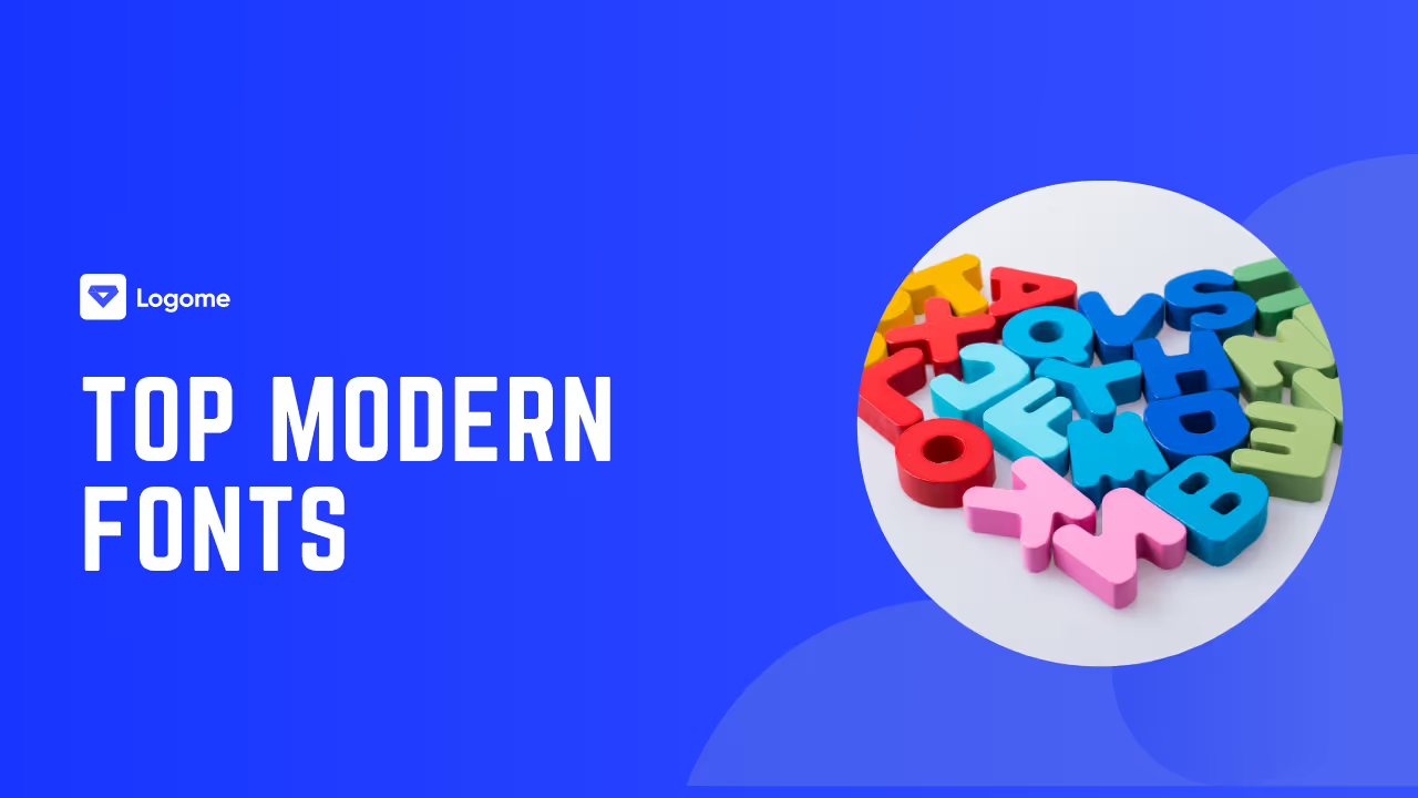
Top Modern Fonts
Discover the top modern fonts for web, branding, and UI design. Get expert pairing tips, performance insights, and where to find free or premium options.

Discover the top modern fonts for web, branding, and UI design. Get expert pairing tips, performance insights, and where to find free or premium options.

Choosing the right font is like picking the tone of your voice—but for your design. Whether you're building a sleek website, creating a logo, or launching an app, modern fonts can instantly set the vibe. They tell your audience, “Hey, this is fresh, clean, and made for today.”
But with thousands of fonts out there, how do you find the ones that actually work?
This guide isn't just another list. We'll walk you through the top modern fonts designers actually use (and why), show you how to pair them like a pro, and help you pick the right one based on where you’ll use it—be it web, print, or branding.
You’ll also get tips on licensing, performance, and accessibility—because good design is more than just pretty letters.
Let’s dive in and explore the modern typefaces shaping the way we communicate today.
Modern fonts aren’t just about being new—they're about feeling relevant. They reflect the clean, crisp aesthetics we see in today's digital design. But before we jump into specific fonts, it's important to understand what actually makes a font “modern”—because it’s not just about when it was created.
Let’s break it down into its core characteristics and see why these fonts are dominating everything from apps to packaging.
Modern fonts usually lean toward minimalism. You’ll notice balanced curves, consistent stroke widths, and letterforms that feel intentional and uncluttered. Many are inspired by Swiss or Bauhaus design principles—think clarity, structure, and functionality.
Geometric sans-serifs like Poppins or Satoshi are great examples. Their circles and straight lines give off a polished, tech-forward look that feels bold yet approachable.
But not all modern fonts are cold or robotic. Some have subtle quirks or humanist touches that add warmth without compromising that clean feel.
Here’s where modern fonts really shine: on screens. Designers today aren’t just working with print—they're designing for phones, tablets, laptops, and watches.
That’s why modern fonts are crafted with screen performance in mind. Open apertures (like the space inside letters), high x-heights, and generous spacing help ensure they’re legible at any size.
Fonts like Inter and Roboto Flex are engineered for this. They're not only beautiful—they’re functional, loading quickly and staying crisp no matter the device.
Now that you know what makes a font modern, let’s explore the real stars of the design world. These aren’t random picks—they’re the fonts that designers turn to when they want their work to look clean, current, and credible.
Each one brings something unique to the table—whether it’s versatility, personality, or razor-sharp readability.
Designed specifically for digital interfaces, Inter is like the Swiss Army knife of modern fonts. It’s insanely legible, works across every screen size, and comes with variable font features that let you tweak weight and width on the fly.
Whether you’re designing a UI or writing long-form content, Inter adapts beautifully.
Poppins is geometric, bold, and a little playful. Its circular forms give off a modern, youthful energy that’s perfect for startups, product pages, or mobile apps.
It also plays well in uppercase, which makes it great for headlines and CTAs that need to pop.
General Sans feels sophisticated without trying too hard. It’s got clean lines and neutral energy, making it ideal for brands that want to feel modern but not overly sterile.
Use it in landing pages, minimalist portfolios, or clean branding systems.
Roboto is everywhere—but Roboto Flex is its cooler, more flexible cousin. It’s a variable font, meaning you can fine-tune everything from weight to width, which gives you more creative control without sacrificing performance.
It’s perfect for mobile-first design, where performance matters as much as style.
Need a serif that doesn’t feel old-school? Lora is your go-to. It combines traditional elegance with a modern sensibility—making it a perfect fit for blogs, editorial layouts, and brands that want to appear both polished and contemporary.
Bonus: It pairs beautifully with many sans-serifs.
Inspired by urban signage, Montserrat has strong personality but clean structure. Its wide letterforms make it perfect for headlines, hero sections, and big, bold branding statements.
Pair it with a softer serif for contrast, and you’ve got a winning combo.
If minimalism had a font, it’d be Satoshi. It’s precise, elegant, and completely unbothered by trends. Its neutrality makes it super versatile—whether you’re designing a fashion brand or a portfolio site.
It’s subtle but never boring.
Sora was made for blockchain and fintech branding, but don’t let that niche scare you. It’s got a wide stance, sharp shapes, and modern flavor that fits well in any digital-first design.
Think of it as Inter with more edge.
Designed for high readability and clean interfaces, DM Sans is a web-safe favorite. It’s elegant, accessible, and doesn’t try to steal the spotlight—which makes it perfect for body text or supporting roles in any layout.
It’s a quiet powerhouse.
Want something bold, stylish, and totally unexpected? Sincopa breaks away from the neutral crowd with strong visual rhythm and character.
Ideal for standout branding or high-contrast editorial design, Sincopa demands attention without being loud.
This one nails the balance between classic and contemporary. Neue Montreal feels timeless but not outdated—making it a favorite for agencies and brands that want to look refined yet modern.
Great for long text, great for display. It does it all.
If you’re building interfaces, Work Sans should be in your kit. It was designed with screen readability in mind, especially at smaller sizes. Clean, simple, but with a bit of humanist warmth—it makes any app feel more polished.
Looking to design for a SaaS or startup? TT Gertika is made for you. It’s bold, versatile, and has tech-forward roots that make it a solid choice for high-trust brands.
It also holds up across platforms, which is a huge plus.
A modern grotesk with enough flair to feel fashionable. Clash Grotesk is a dream for editorial layouts, lifestyle brands, or lookbooks that need style and substance.
Its contrast and texture make it feel alive on the page.
Ceramic is crisp, elegant, and tailored for premium branding. If you’re creating a high-end experience—whether in luxury retail or digital storytelling—this font helps communicate sophistication and class.
Use it sparingly, and it steals the show.
Knowing your favorite fonts is one thing. Using them together in a way that feels intentional? That’s where the real design magic happens. Font pairing isn’t just about aesthetics—it’s about creating visual hierarchy, balance, and clarity in your layout.
Here’s how to confidently pair modern fonts that don’t clash, confuse, or compete for attention.
The best pairings create contrast without conflict. Typically, designers match a strong, eye-catching display font with a more neutral, legible body font. One font leads, the other supports.
It’s like having a lead singer and a backup vocalist—you need both, but they serve different roles.
Make sure the fonts you pair have enough distinction in weight, width, or style. Avoid picking two fonts that look too similar—it can make your design feel off without knowing why.
Need inspiration? These font combos are tried, tested, and beloved by designers across digital and print projects:
A bold sans-serif for headlines with a classic serif for body copy—great for blogs or creative agencies.
Clean and readable pairing perfect for web interfaces and product pages. Roboto brings clarity, Lora adds elegance.
A geometric-modern meets old-school charm. Works beautifully for portfolios or editorial layouts.
Simple, friendly sans paired with a solid, trustworthy serif. Great for fintech or service-based brands.
Inter keeps it neutral and crisp; Crimson Pro brings warmth. Ideal for SaaS blogs or content platforms.
Still not sure? These free tools can help you test combos before you commit:
Remember: Pairing fonts is part science, part gut instinct. Don’t be afraid to experiment, test, and trust your eye.
Not all modern fonts are built for the same purpose. Some shine in mobile apps, others thrive in print or branding. Choosing the right font isn’t just about style—it’s about using the right tool for the job.
Here’s how to pick modern fonts based on where and how you plan to use them.
Top picks: Inter, DM Sans, Work Sans
User interfaces demand clarity and speed. Inter was made for digital environments—it’s clean, sharp, and optimized for legibility at small sizes. DM Sans adds a bit of softness without losing clarity, making it a great choice for friendly, modern interfaces.
Work Sans is another standout. It’s incredibly readable and built with screens in mind, especially mobile apps where space is limited.
Top picks: Ceramic, Sincopa, Neue Montreal
Branding is about personality, and these fonts bring it. Ceramic is all elegance—ideal for luxury brands or high-end services. Sincopa, on the other hand, is bold and rhythmic, making it perfect for edgy, creative businesses.
Neue Montreal offers a balanced, modern look that feels polished without being boring—great for agencies or minimalist brands.
Top picks: Lora, Crimson Pro, Clash Grotesk
Editorial work calls for fonts that are readable but stylish. Lora and Crimson Pro offer classic serif charm with a modern twist—ideal for body text. For headlines or pull quotes, Clash Grotesk adds contrast and flair without being too loud.
Together, they create a layout that’s both beautiful and easy to read.
Top picks: Poppins, Roboto Flex, Satoshi
Mobile design is all about space, scale, and speed. Poppins is geometric and bold—great for titles or tabs. Roboto Flex offers total flexibility with its variable features, keeping performance top-tier.
Satoshi feels clean and precise, perfect for minimalist app UIs that need to look sharp on all screen sizes.
Top picks: TT Gertika, Sora, General Sans
Startups love modern fonts that feel smart and future-facing. TT Gertika has a subtle tech vibe without going full sci-fi. Sora was built for blockchain projects, but its clean structure makes it a strong fit for any tech product.
General Sans rounds out the trio with its neutral tone, working well in pitch decks, landing pages, or dashboards.
Using the right modern font isn’t just about aesthetics—it directly impacts your website’s speed, accessibility, and user experience. A beautiful font that slows down your site is a design fail in disguise.
Let’s look at how modern fonts influence performance—and how to use them wisely.
Variable fonts are like a Swiss Army knife in one file. Instead of loading separate files for bold, light, or italic, a single variable font can handle it all. This means fewer HTTP requests, reduced file sizes, and faster load times.
Fonts like Roboto Flex and Inter offer full variable functionality. You can fine-tune weight, width, and slant—all while keeping performance in check.
If your site needs multiple styles or weights, choosing a variable font can shave seconds off load time.
Some modern fonts are designed with speed in mind. Inter, DM Sans, and Work Sans are top choices here. They’re lightweight, screen-optimized, and well-supported across browsers.
Stick with fonts that are served from reliable platforms like Google Fonts or Fontshare. These providers use fast CDN delivery and preloading techniques to help your fonts load before users even notice.
Always include fallback fonts in your CSS. If your custom font fails to load, your site won’t break—it’ll just switch to a safe alternative like Arial or Helvetica.
Use the font-display: swap property. This ensures that your text appears immediately using a fallback, then switches to your chosen font once it’s ready. It prevents that awkward invisible-text moment on slow connections.
Little tweaks like this go a long way in keeping your designs modern—and lightning-fast.
So you’ve picked your favorite fonts—great. But before you start designing, let’s make sure you’re actually allowed to use them. Licensing matters, and it’s not just about avoiding legal issues—it’s about using fonts with confidence across platforms.
Here’s where to get modern fonts the right way.
There are hundreds of high-quality modern fonts available for free—and yes, they’re legit for commercial projects. Platforms like Google Fonts, Fontshare, and Velvetyne offer open-source fonts under licenses like SIL Open Font License or Apache 2.0.
That means you can use them in websites, apps, logos, and even print materials—no strings attached.
Some of our favorite free picks include Inter, Poppins, Lora, and Work Sans—all available on Google Fonts with simple integration and no messy legal hoops.
Sometimes, paying for a font is absolutely worth it. Premium typefaces offer unique character, sharper detailing, and often come with wider language support or advanced features.
Platforms like Adobe Fonts, Pangram Pangram, and Future Fonts are popular among branding and design professionals. Fonts like Ceramic or Sincopa fall into this category—bold, original, and made to stand out.
If you’re working on a brand identity, paying for a premium font can give your work that extra edge of uniqueness.
Font licenses can be confusing, so here’s a quick cheat sheet:
Always read the license before downloading—especially from smaller foundries. When in doubt, contact the foundry directly or stick with trusted sources.
Modern fonts aren’t just trendy—they’re powerful tools that shape how your audience experiences your brand, product, or content. The right typeface can elevate your design, improve readability, and even boost your website’s performance.
Whether you’re working on a sleek app, a bold rebrand, or a minimalist blog, the key is to choose fonts with intention. Think about tone, context, and function—not just style. Combine that with smart pairing, legal use, and performance-friendly formats, and you’ve got a typography setup that does more than just look good.
Remember: good fonts don’t scream for attention—they support your message.
So take what you’ve learned here, test different combinations, and don’t be afraid to experiment. Found a modern font combo you love? Share it—we’re all designers in progress.
Modern fonts are sleek typefaces built for clarity and impact. Often sans‑serif or minimalist serifs, they feature geometric shapes, open apertures, and high legibility—especially on screens. Unlike ornate styles, modern fonts focus on readability and clean aesthetics.
For web use, Inter and Roboto are standout choices. They offer clean lines, screen optimization, and variable font options. Inter excels in body text; Roboto Flex gives flexibility for headings and UI details.
Great pairings often combine a bold modern sans with a neutral serif. For example, Montserrat + Merriweather or Roboto + Lora. Contrast in weight and tone builds hierarchy and keeps designs visually balanced.
Variable fonts let you use one file to handle multiple weights, widths, or styles. That cuts down load requests, boosts performance, and offers typographic flexibility—making designs faster and easier to maintain.
Reliable sources include Google Fonts, Fontshare, and similar open‑source archives. Fonts like Inter, Poppins, and Lora are free under licenses like SIL or Apache and safe for commercial projects.


Discover how 500,000+ businesses and creators are using our AI logo maker in their Logo creation.


