Top 10 Rebrands of 2025: Logo Redesigns That Worked
Check out the top famous rebrands 2025 had to offer. We explore some of the craziest and coolest redesigns and draw inspo.

Check out the top famous rebrands 2025 had to offer. We explore some of the craziest and coolest redesigns and draw inspo.

2025 has been wild and we have come across some of the biggest brands who have had the craziest logo redesigns ever. We already predicted logo trends for last year but this year we saw some really cool stuff coming out. The new brand design of Meta is expected to be a big hit in the future. Neon logos are also gaining popularity from companies like Eventbrite and Mindbody.
Meta's new brand design was quite a pleasant surprise and many companies drew inspiration from their standalone characters and how they used them to represent their brand's identity.
Now enough about that, today we want to talk about which were the biggest logo redesigns 2025 had to offer. You will learn something about each, take inspiration from famous rebrands and apply it to your own logo. Let's start off with the 10 best logo redesigns 2025 witnessed.
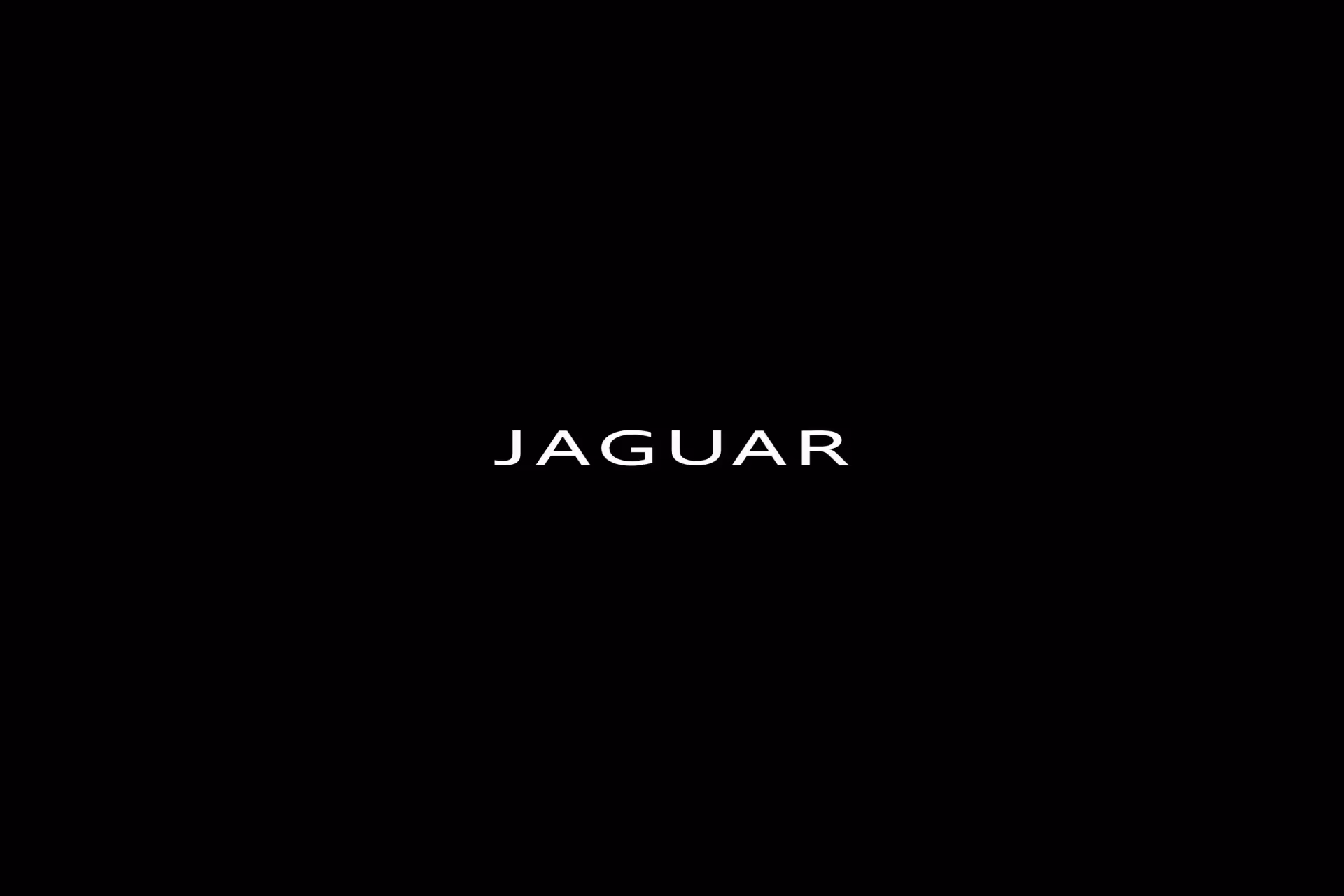
Jaguar stepped away from old-school luxury to start fresh as a modern, electric car brand. The famous "growler" logo and vintage touches are gone. The plan is to make a strong mark with a new audience who might not remember the brand's classic cars from the past. This is their way of showing that something brand new is happening at Jaguar. By dropping the old identity, they're telling the world that they're not the same company anymore. They want buyers who care about future tech and sleek design, not just heritage and tradition. The rebrand was risky, and plenty of car fans weren't happy about it. But that's exactly what Jaguar wanted—to shake things up and grab attention.
What we like: Their new logo is simple—a single bold "J" with minimalist colours. People online had a lot to say, especially fans who love the old look, but the buzz got Jaguar everyone talking. The sharp colors and the thick lines make the new image easy to spot, even from far away. The wordmark feels fresh and modern without looking cold or sterile. Jaguar's team wanted to show they're not afraid to make a big change, and they nailed it. The design works on billboards, car hoods, and tiny phone screens all the same way. This rebrand proves that sometimes you have to break the mold to stand out in a crowded market.
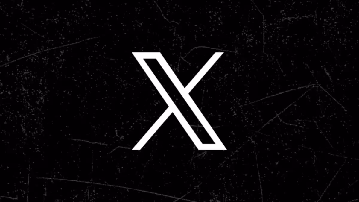
Elon Musk wanted Twitter to be more than just a place for short messages. He changed the name to X, hoping it would become an app for everything people do online, from chatting to sending money. The switch was also about leaving behind the old blue bird and starting fresh with a new symbol. Musk had a vision of building an "everything app" that rivals services in other countries. So the old Twitter bird didn't fit that goal anymore. The rebrand happened fast, which shocked a lot of people. Some users stuck around, but plenty were confused or frustrated by the sudden change. Still, X managed to stay in the conversation and keep millions of users coming back every day.
What we like: The new X logo is black and white and easy to remember. It stands out because it's so plain and to the point, with no bells and whistles. Although some regulars were unsure about the big switch, it started a lot of interesting conversations about what social media could become. The simple X works everywhere—on phones, computers, and even billboards. The logo has a bold, confident feel that matches Musk's ambition. You can see it on a business card or a huge building, and it pops just the same. The design is so basic that it actually feels modern and forward-thinking. It's the kind of logo that sticks in your head because there's nothing fancy about it.
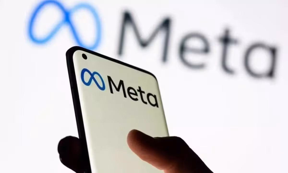
When Facebook switched to Meta, it was about moving beyond social media and getting into new tech, like virtual reality and the metaverse. The new name and logo help people think of Meta as a company focusing on more than just social newsfeeds. Facebook's image had taken some hits over the years, so a fresh start made sense. The company wanted to show investors and users that they were betting big on what comes next. By 2025, Meta had shifted focus again, putting a lot of energy into AI tools and features. The rebrand proved smart because it gave the company room to grow into new areas without dragging the old "Facebook" baggage along. It's easier to build something new when you have a new name to go with it.
What we like: The looped symbol they picked is friendly and easy to spot. It's simple enough that even kids can draw it, but it feels polished. The blue shades still remind everyone of Facebook, so there's some connection to the past, but now the brand looks more laid-back and less stiff. The logo reads like a smile or a hug, which makes Meta feel warmer. The symbol is clear whether you see it on a big wall or a small screen. It works in every color and every size. The design doesn't feel like a tech company trying too hard—it just works. This logo lets Meta do whatever they want next without the image feeling out of place.
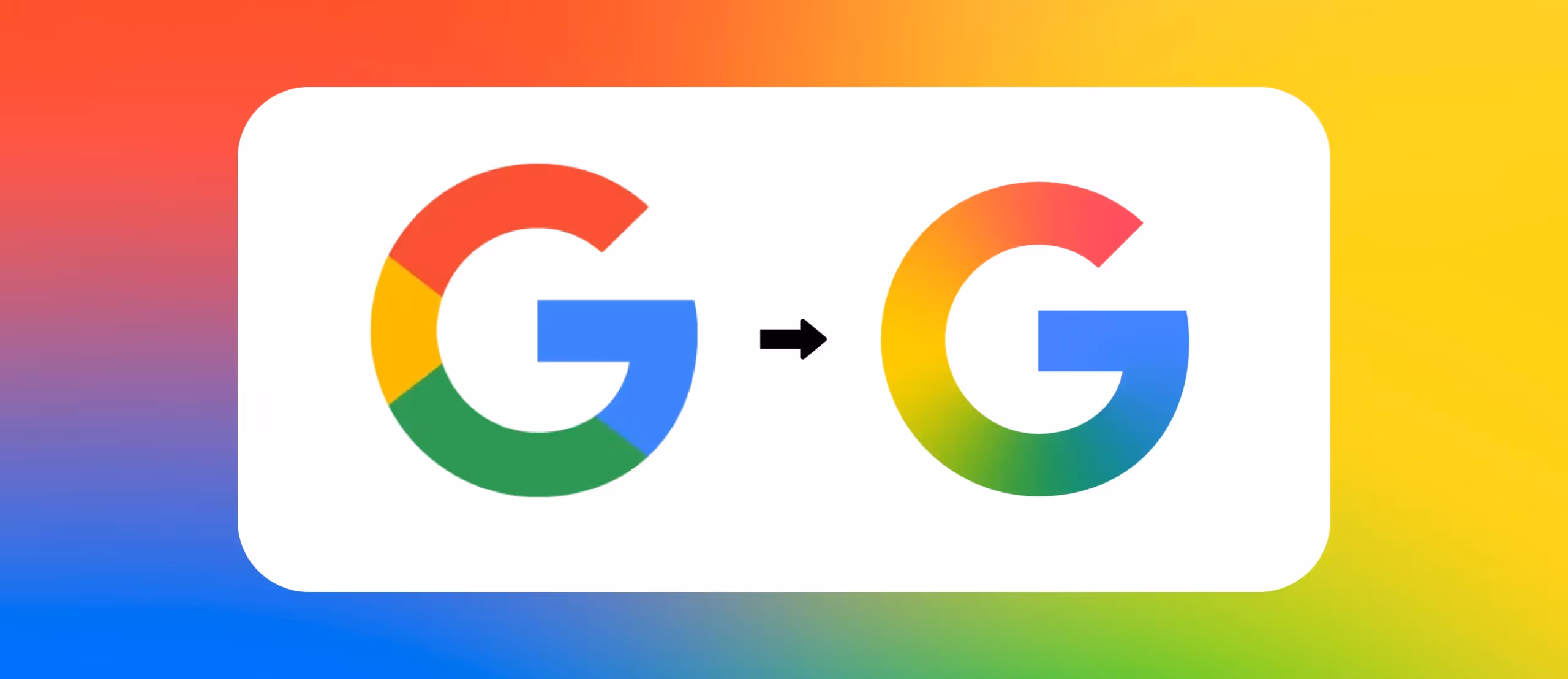
Google updated their G logo to show off their newest AI tools and features. The changes are slight—the colors flow into each other a bit more instead of being hard blocks. This was a way of keeping their style fresh without losing anything people know and like about Google. The company realized that small tweaks can make a logo feel current without scaring off fans. By softening the edges and blending the colors, Google made their brand look a little less rigid. The update also signals that Google is moving into new areas of tech. It's a quiet change, but it sends a message that the company is always working on what's next.
What we like: The G still uses four colors but now looks softer and more approachable. The logo is still fun but a bit more blended, like a fresh coat of paint on something everyone already likes. The gradients make it feel organic instead of computer-made. You still know it's Google the second you see it, which is huge for a company this big. The colors feel warmer and less aggressive. It's the kind of update that feels natural instead of forced. By making such a small change, Google proved that you don't have to burn everything down to stay relevant. Sometimes a little refresh is all you need.
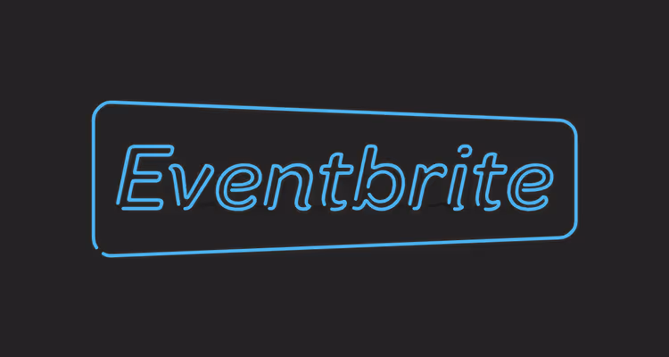
Eventbrite's brand update was all about making it feel exciting to find and attend events. The old logo was a solid orange, but by mixing in pastels and neon highlights, they turned up the energy. The company wanted to shift from being a faceless booking tool to being a fun destination. Eventbrite realized that people want to feel pumped about going out and doing stuff. So they needed a visual identity that matched that excitement. The rebrand also helps Eventbrite stand apart from other ticketing sites that all look pretty boring. By going bold with color and design, they grabbed attention in a space where most competitors play it safe.
What we like: Their "E" graphic pops out now and fits any event style. With the new colors, Eventbrite feels more like a place you'd go to have a good time, not just another ticket site. The neon tones work great on phones and websites where most people book their tickets. The design is flexible too—it can be bright and wild for a music fest or calm for a corporate talk. The colors feel young and full of life. You can see the logo and instantly want to find out what events are happening. The refresh proves that even simple apps can feel exciting with the right visual style. Eventbrite went from invisible to impossible to ignore.
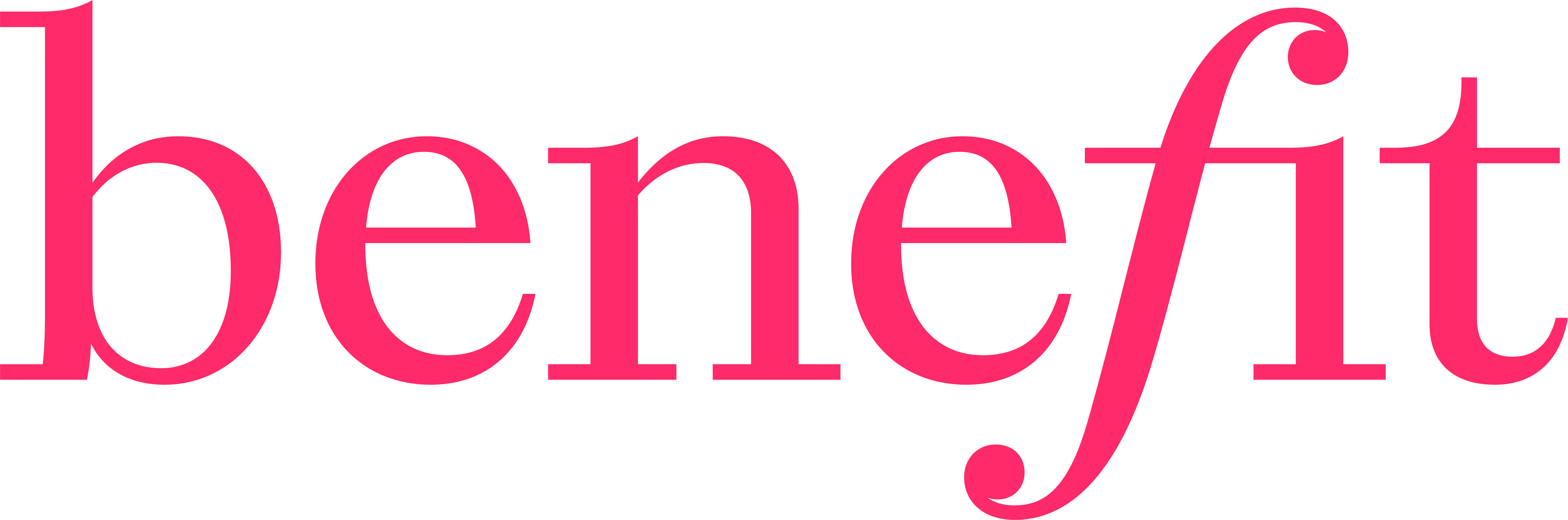
Benefit Cosmetics dropped "San Francisco" from the logo so they could look more global, not tied to just one place. The new look brings in shapes and colors inspired by makeup, like lips and lashes, making the brand feel playful and inviting. The company wanted to reach customers all over the world without feeling like a small San Francisco brand. Benefit also wanted to make sure younger shoppers saw them as fresh and fun instead of old-fashioned. The rebrand includes more diversity in how the brand looks and who it speaks to. By making the logo more flexible and colorful, Benefit can work with different cultures and trends. The new design lets them grow into new markets without losing their quirky, playful personality that fans love.
What we like: Deeper colors and fresh graphics give Benefit a style that feels current but still fun. The shapes celebrate what makeup does for people—it helps you feel confident and like yourself. The brand hasn't lost its sense of humor, which is a huge part of what makes Benefit special. The new logo works everywhere from storefronts to Instagram. The colors feel warm and inviting instead of stiff or corporate. You can see hints of their San Francisco roots in the design, so they're not erasing history—just moving past it. Benefit kept what made them special while updating the look for new fans. It's a rebrand that feels earned instead of forced.
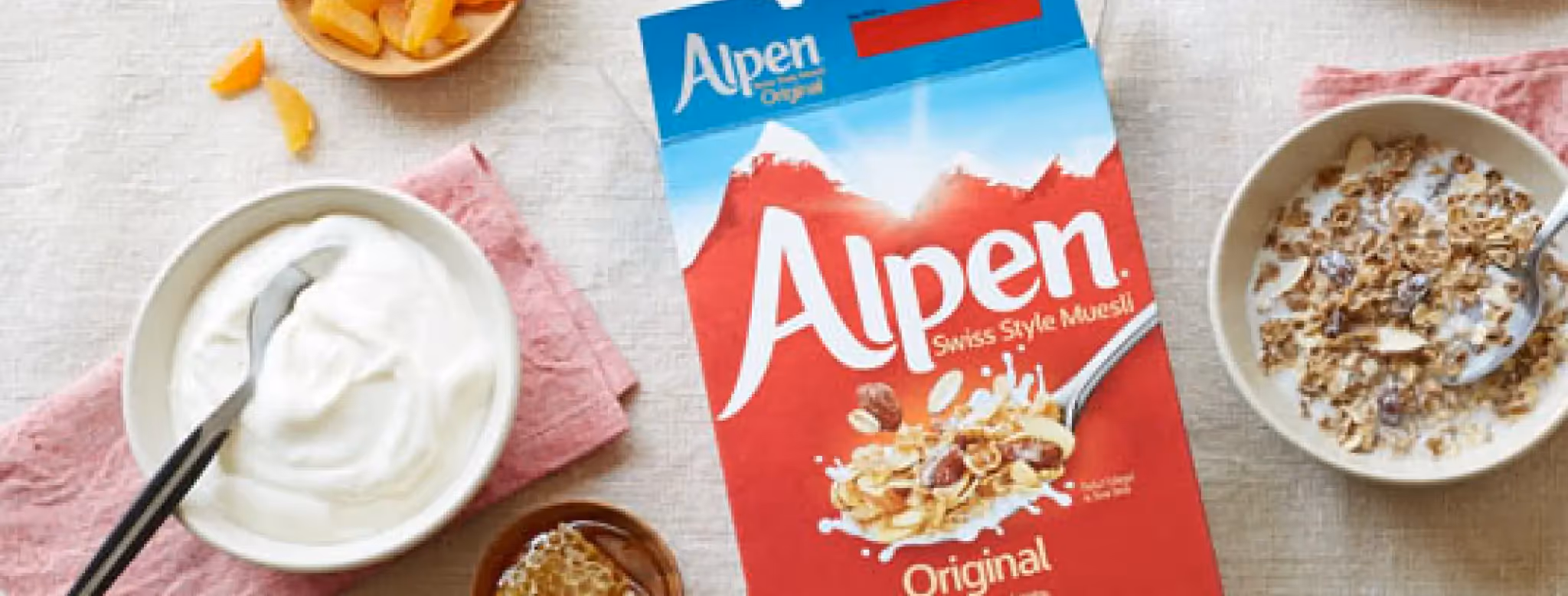
Alpen changed its logo to show that their cereal is all about healthy eating with natural ingredients. Their old wordmark made way for pictures of mountains, rivers, and sunny skies. The company faced stiff competition from newer granola and porridge brands that looked more modern and appealing. Alpen realized they needed to prove they were just as good for you and just as tasty. By adding nature imagery to the logo, they're speaking directly to people who care about health. The rebrand also helps Alpen feel less like a box from the back of your parents' pantry and more like something you'd actually want to eat today. It's a smart move in a breakfast aisle where old-fashioned doesn't usually win.
What we like: The new logo feels like breakfast in the countryside. It's warm, friendly, and goes straight to the message: real, good food. The mountains and rivers aren't just pretty—they tell a story about where the ingredients come from. The colors are natural and earthy without feeling dull or lifeless. You can tell at a glance that this cereal is different from the sugary stuff aimed at kids. The design feels honest, which is what shoppers want from health food brands. Alpen proved that you can update a classic brand without making it look cheap or trying too hard. The logo stands out on grocery shelves because it looks like it actually belongs there.
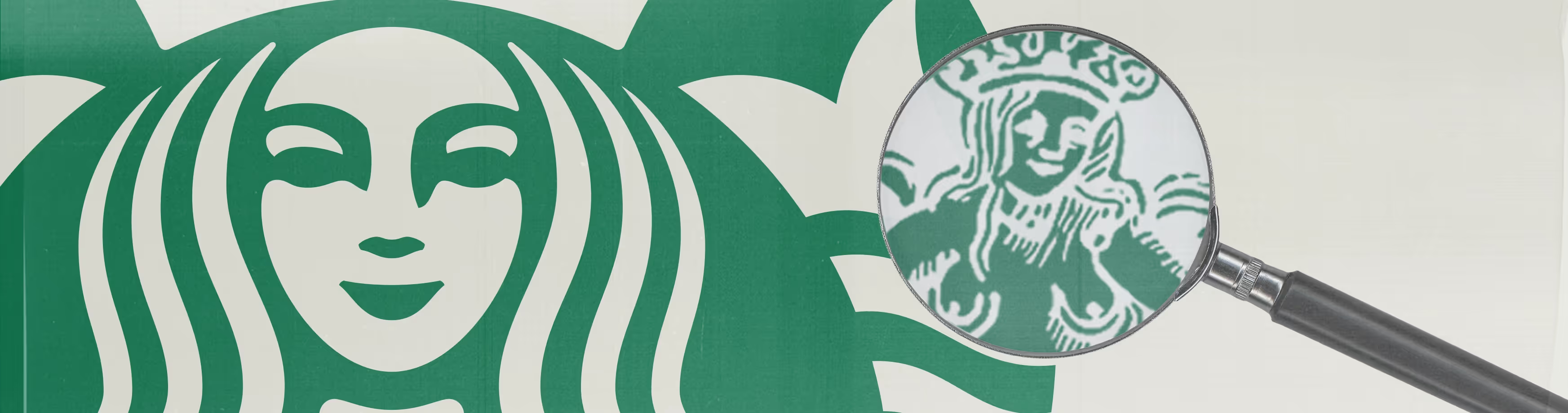
Starbucks wanted to get back to what made them special—coffee and personal service. They now use "The Starbucks Coffee Company" to remind everyone of their roots. The chain had been losing its way a bit, becoming more about apps and delivery than actual coffeehouse experience. New leadership wanted to fix that by making stores feel like real places where baristas know your name again. They also ditched some menu items to focus on doing coffee right instead of having a million choices. By going back to basics, Starbucks is telling customers that they remember why people fell in love with the brand in the first place. It's a rebrand about feeling, not just visuals.
What we like: The personal touches, like names on cups and brighter store spaces, create a warm feeling. The logo tweak matches this classic coffeehouse vibe instead of just being about quick orders. The green logo still works, but now it feels less corporate and more local. Starbucks stores now have comfy seating where people actually want to hang out. The rebrand feels less like marketing and more like listening to what fans actually wanted. You can go into a Starbucks and feel like you're in a real coffeehouse instead of a busy kiosk. The simplicity of the rebrand shows confidence—Starbucks trusts that good coffee and good vibes are enough. This update proves that sometimes going backward is the smartest move forward.
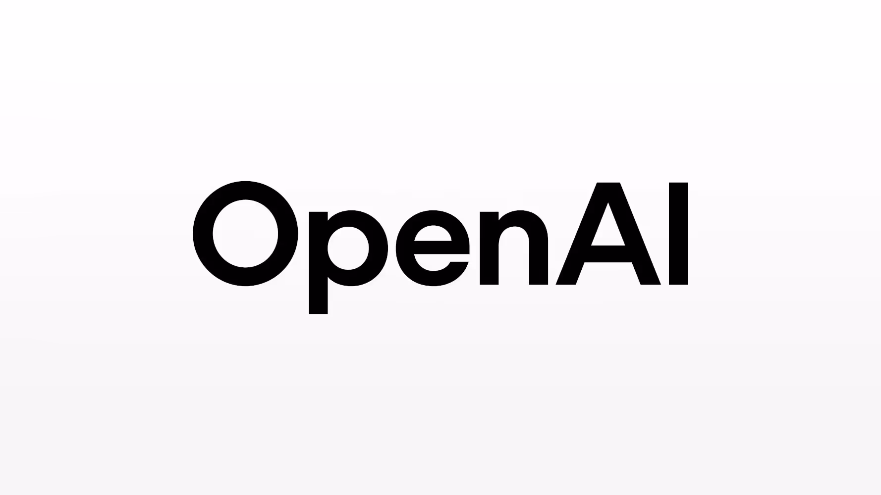
OpenAI added their own custom font, giving the wordmark a new look while still keeping their blossom logo for some uses. This lets OpenAI stand out, especially as their name starts showing up in more places. The company realized that a custom font gives them ownership over how their name looks. They're not relying on a standard typeface that thousands of other brands use. By creating something unique, OpenAI makes sure their brand feels special and hard to copy. The custom font also works better when OpenAI's name appears in headlines, on websites, or in app stores. It's a smart move for a company that wants to be seen as a leader, not just another tech startup.
What we like: The clean, custom font is simple but strong. It looks sharp and works just as well on websites as on product packaging. The letters have a friendly feel even though they're bold and confident. You can read the wordmark fast, which matters when someone's scrolling through their phone or walking past a store. The font feels modern without looking like it'll be outdated next year. OpenAI's design team made sure it works in every size and color. The blossom logo still hangs around for certain uses, so there's a nice balance between symbol and words. This rebrand shows that even tech companies can have style without being stuffy about it.
Disney brought out a platinum castle logo to mark 100 years since it all began. The new logo ties in special details from classic movies and parks, making it a tribute to their long history. The company wanted to celebrate with fans around the world and remind everyone of the magic Disney has created over a century. The anniversary logo also gets people excited about what comes next. By looking back at all the classics, Disney sets up the future as something just as exciting. The rebrand isn't permanent—it's a special edition to mark the moment. But it's still proof that even the most famous logo can get a fresh take when the time is right.
What we like: The shiny platinum style and movie nods make the new castle logo feel like a celebration. Everything about it is designed to make fans smile and remember old favorites while looking forward to new adventures. The castle has tiny details from Frozen, Moana, Inside Out, and dozens of other films. Fans spend time looking at the logo to spot all the hidden references. The platinum color feels special and limited, which makes it feel more valuable than the everyday logo. The design proves that Disney understands their fans on a deep level. It's not just a logo change—it's a love letter to everyone who's ever believed in Disney magic.
These best logo redesigns 2025 examples show us that rebranding isn't just about slapping a new coat of paint on something. It's about telling your audience who you really are now. Whether a company goes bold like Jaguar or takes small steps like Google, the goal stays the same—staying true to your roots while moving forward. These ten brands proved that smart design choices, clean simplicity, and honest storytelling beat flashy trends every single time. If you're thinking about updating your own brand's look, these lessons matter.
Companies rebrand to stay current and show they're growing. A new logo signals change—whether that's entering new markets, shifting what you sell, or just reminding customers you're still here. In 2025, rebrands often happen when companies need to reach younger buyers or move into different industries. The goal is to feel fresh without losing what made people love you in the first place.
Successful rebrands happen when companies actually change something real, not just the visuals. If your product, service, or story stays the same, a new logo won't fix that. The winners in 2025 backed up their design changes with real improvements. Listen to what your fans say, test the logo across different platforms, and make sure it works as hard as your old one did.
Yes! You don't need a huge budget to rebrand smart. Pick one or two things to change—maybe your colors or your wordmark. Keep it simple and test it with real customers before rolling it out fully. Small businesses actually have an edge because they can move faster than big corporations. The lessons here apply to anyone who wants their brand to feel current and real.
Simple logos work better on phones, websites, and tiny ads everywhere online. When your logo appears on a smartwatch or a social media icon, fancy details disappear. Brands in 2025 realized that less is more. A clear, easy-to-read logo builds trust faster than something complex. Plus, simple designs stay timeless longer—you won't need another rebrand in three years.
Most customers need three to six months to get used to a new logo. Some take even longer if the change is dramatic. The key is showing up consistently with the new look everywhere—your website, packaging, ads, and stores. Companies that kept talking about why they changed did better than those who just rolled out something new without explanation.
Not always. Keeping one or two key colors helps people remember you, but if your old colors feel dated, let them go. The 2025 winners balanced both sides—they kept enough to feel familiar but changed enough to feel new. Test different color combos with your audience before deciding. Your brand color should feel right for who you are now, not just who you were.


Discover how 500,000+ businesses and creators are using our AI logo maker in their Logo creation.


