The Best Game Logos of All Time
Great game logos do more than look good—they build worlds. Check out the best game logos of all time in our post.

Great game logos do more than look good—they build worlds. Check out the best game logos of all time in our post.

Have you ever stopped to admire the splashy title screen before hitting “Start”? Game logos are more than eye candy. They’re battle cries, whispered spells, and neon signs all in one. The best game logos aren’t just attractive—they’re iconic. They tap into our memories, fuel our anticipation, and shape how we remember entire worlds.

That moment when the Diablo flame flickers or Pokémon’s bubbly lettering bounces in your brain? That’s brand magic. And you can have it too. Let’s decode what makes the best game logos of all time stand out—and how you can craft one just as unforgettable.
Game logos are the visual signatures of video games. They combine typography, color, and shape into a compact design that conveys a game's identity, tone, and genre. Think of them as the cover of a book—but one that screams, whispers, or glitches at you depending on the game.
Whether it’s the gothic serif of Castlevania or the candy-bright bubble letters of Kirby’s Dream Land, logos help players form expectations. Are we gearing up for blood-soaked demon slaying? Or bouncy, pink puffball fun? The logo usually tells you first.
They're often the first thing a player sees—on a cartridge, download screen, or store listing. A good one sticks in memory, much like a catchy theme song or unforgettable first level. Bad ones? Forgotten faster than a skipped cutscene.
More than decoration, game logos function like symbols of allegiance. Fans wear them on t-shirts, splash them on fan art, and sometimes even ink them into skin. They’re shorthand for an entire gaming universe.
In short, game logos are not just about looks. They’re identity, memory, and emotion—pixelated into a single image.
Why do game logos matter so much? Simple—they’re often the entire first impression. Before the gameplay, characters, or soundtrack comes into play, it’s that logo front and center. It's branding in its most concentrated form.
A sharp logo can build hype months before release. Look at how people react when a new Grand Theft Auto title is teased. That stark blocky font drops, and suddenly it's trending worldwide. That’s the power of a strong visual identity.
But it’s not just about flash. A well-crafted logo communicates genre, vibe, even gameplay style. Diablo’s jagged, hellish typeface tells you all you need to know about what you’re getting into. Compare that to the bubbly whimsy of Moshi Monsters—no confusion there.
It also plays a huge role in longevity. A timeless logo grows with its fans. Pokémon’s logo hasn’t changed much in 25 years. Why? Because it nailed it early—playful, bold, instantly recognizable.
In an industry where attention spans are measured in milliseconds, the best game logos act like anchors. They keep a title rooted in players’ minds, whether they’re browsing a store or walking past a merch booth at Comic-Con.
Game logos have come a long way since the days of blocky pixels and blurry CRTs. Back in the '70s and '80s, logos were basic—due to tech limits and design trends that echoed arcade cabinet art. Think bold, chunky fonts like Atari or Pac-Man, designed for quick readability and punch. The ’90s introduced a style boom. With the rise of home consoles like Super Nintendo and Sega Genesis, developers leaned into personality. Franchises like Street Fighter and Sonic the Hedgehog used electric fonts and wild gradients that screamed “cool” to every kid on the block.
By the 2000s, logos started maturing. Gothic fonts, 3D bevels, and cinematic flair hit mainstream—just look at the moody gravitas of Diablo II or the regal lettering in Final Fantasy titles.
Today’s logos are a mixed bag—some go minimalist like Journey, while others still lean into drama like Elden Ring. There’s more flexibility, but also more pressure. Your logo needs to pop on everything from mobile apps to Twitch thumbnails.
From neon explosions to slick grayscale marks, game logos have become a visual language. And their evolution reflects the changing face of gaming itself.
Here is a list of the best game logos of all time:


Fantasy RPGs don’t just tell stories—they build entire worlds. And their logos? They're the banners flying over those worlds. Diablo’s ember-lit serif font feels like it’s forged in hellfire. It sets the tone before a single demon spawns.
World of Warcraft leans heavily into myth. Its typeface looks like it belongs on ancient tomes. The medallion border isn’t just decorative—it’s ceremonial. It screams epic.
Zelda, meanwhile, hits a softer note. Its iconic sword-and-scroll vibe blends legend with action. From the NES days to Breath of the Wild, the logo’s evolution mirrors the series: mythical, polished, and always bold.
These aren’t fonts—they’re prophecies.

Arcade logos have one job: get your attention fast. Mario’s bubbly, colorful logo is joyous and iconic, instantly familiar whether you’re five or fifty.
Sonic’s slanted, italicized letters almost race off the box. The yellow outline screams speed. And Mega Man? It goes digital-futuristic, yet keeps the approachable tone with blocky structure and crisp blue palette. These logos are the equivalent of a sugar rush: quick, loud, and impossible to forget.
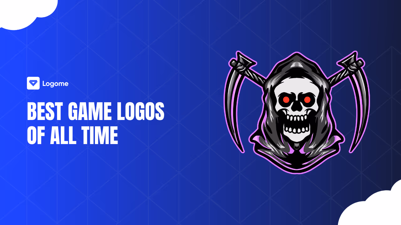
Dark games go for drama—and their logos reflect that. Devil May Cry’s splattered brush typography is erratic and raw, matching the chaos inside.
Castlevania wears its gothic heart on its serif sleeves. It's elegant but menacing, like a cathedral soaked in shadow. The Legacy of Cthulhu pushes it even further with twisted, tentacle-like letters and sickly green hues. You can almost smell the decay.
These logos linger like nightmares.
Playful games need playful logos. Kirby’s Dream Land 2 uses pastel bubble fonts and sparkles to channel pure charm. It’s soft, inviting, and very pink.
Moshi Monsters goes even louder with its thick, squishy type and cheerful lime green palette. Leps World throws in some fantasy tools—like coins and axes—to mix whimsy with action.
These logos wear joy on their sleeves. They’re made to be hugged.
Minimalist logos don’t need bells and whistles. GTA’s simple, bold wordmark became globally recognized by being unapologetically stark.
Wii’s soft gray sans-serif feels gentle and futuristic. Game Boy stuck to blue on white, but the result was timeless. These logos prove you don’t need flash when you’ve got identity nailed down.
Futuristic games need logos that feel like tech artifacts. Metroid’s beveled metallic logo could be laser-etched on Samus’s armor. Star Fox? All italic energy and starburst motion.
Destiny keeps things sleek with serif lettering and an iconic tricorn symbol that feels both sacred and alien. These logos promise the future—cold, strange, and shiny.
League of Legends knows grandeur. Its gilded serif lettering channels ancient power. It feels carved, not typed.
Prince of Persia blends flowing motion with ornate touches, evoking mystical desert tales. AshTaria and Era of Chaos follow suit with fonts that could be spell runes or kingdom banners.
These logos are armor-clad.
These logos are bold, bright, and born to headline tournaments. Dungeon Defenders explodes with 3D textures and fantasy action flair.
Thunder League borrows from sports aesthetics—shields, symmetry, and punchy lines. Power Stone, on the other hand, leans into its comic book chaos with movement-heavy fonts and explosive outlines.
Each one looks like it belongs on a cape.
Eastern logos blend flair with structure. Wonder Flick R glows with colorful gradients and soft curves, channeling JRPG magic.
BreakPoint slashes with arcade sharpness. Crystal Re:Union mixes Kanji and Roman alphabets, tying culture and fantasy in a single glance.
These logos tell their stories before you even load the menu.
These games bite—and so do their logos. Sex and Monsters goes for pulp horror with over-the-top splatter and sharp, blood-red strokes. Zombie Lockdown feels metallic and militarized. And Night in the Woods uses messy, horror-doodle typography to conjure small-town dread. These aren’t logos—they’re warnings.
Fantasy-meets-tech deserves hybrid logos. Tales of Dragos blends soft sci-fi gradients with glowing text. Terra and SkySaga opt for crystalline lines and hovering glyphs. Alchymedes is a visual spellbook—glowing runes, alchemical symbols, and steampunk grit all packed into one mark. These logos walk the line between magic and machine.

Not everyone has a design team—or the time to learn complex tools. That’s where Logome.AI steps in. It’s a free AI-powered logo maker that doesn’t just generate logos—it builds full brand identities.
Used by over 800,000 creators and rated #5 Product of the Day on Product Hunt, Logome offers everything from logo templates to email signatures and responsive websites. You can choose from 100+ fonts, experiment with gradients or solid colors, and generate logos tailored to your style.
Here’s how it works:
Need a website too? Done. Social media templates? Covered. Posters, business cards, even profile icons? All there. No design degree. No headaches. Just a tool that gets what you’re trying to say—and makes it look good.
A game logo isn’t just decoration—it’s your opening line. It’s the vibe before the soundtrack. It’s the pause before the first cutscene. And when it’s done right, it becomes timeless.
From pixel-poppers to epic fantasies, the best game logos grab our hearts—and stick in our heads. And with tools like Logome.AI, creating yours is easier (and more fun) than ever.
Iconic logos achieve timelessness through simplicity and clean lines that maintain effectiveness across various mediums. The most memorable logos like Nike's Swoosh, Apple's bitten apple, and Coca-Cola's script combine distinctive design with business strategy to become integral parts of our visual landscape. These logos transcend cultural barriers, achieving global recognition through their ability to convey brand values at a glance. Successful logos tell a story about the brand while avoiding trends that quickly become dated.
The Nike Swoosh, designed in 1971 for just $35, symbolizes victory and speed, perfectly aligning with Nike's athletic excellence ethos. Apple's bitten apple logo, created by Rob Janoff in 1977, represents simplicity and innovation. Coca-Cola's distinctive cursive script, virtually unchanged since 1886, evokes nostalgia and joy. Other consistently top-ranked logos include McDonald's Golden Arches, Amazon's smile arrow, FedEx with its hidden arrow, and Starbucks' twin-tailed siren. These designs achieve recognition through strategic simplicity and meaningful symbolism.
Colors evoke specific emotions and psychological responses - red conveys energy and passion, blue suggests trustworthiness, and green represents health and nature. Strategic color choices become inseparably linked to brands, like Target's vibrant red bullseye or Facebook's signature blue. Typography gives logos personality and communicates brand values - serif fonts appear formal and authoritative, while sans-serif fonts feel friendly and modern. The Coca-Cola script in Spencerian style conveys elegance and approachability, while Disney's whimsical font evokes magic and family entertainment.
Overcomplicated designs with too many elements create confusion and lose impact when scaled down. Failing to test logos in different contexts led to embarrassing failures like the Office of Government Commerce logo, which formed an inappropriate shape when rotated. Trendy designs quickly become dated, as seen with the London 2012 Olympics logo that received widespread criticism for its radical approach. Poor typography spacing created unintended messages in logos like "Kids Exchange". Successful logos maintain versatility across all applications while clearly communicating brand identity.


Discover how 500,000+ businesses and creators are using our AI logo maker in their Logo creation.


