Nintendo Company Logo: A Legacy of Innovation, Playfulness, and Success
Discover the history, evolution, and meaning of the iconic Nintendo logo. Learn how its design reflects Nintendo’s legacy and future in gaming.

Discover the history, evolution, and meaning of the iconic Nintendo logo. Learn how its design reflects Nintendo’s legacy and future in gaming.

The Nintendo logo is one of the most recognizable symbols in the world, instantly associated with gaming, innovation, and creativity. From its humble beginnings as a playing card company in the late 1800s to becoming a global leader in video gaming, Nintendo has built a brand that resonates with gamers and enthusiasts of all ages.
The evolution of its logo mirrors the company’s transformation over the decades, symbolizing its journey from traditional games to revolutionizing the gaming industry. In this comprehensive article, we will explore the history, evolution, meaning, and impact of the Nintendo logo, and understand why it remains such a significant part of Nintendo's identity.
Founded in 1889 by Fusajiro Yamauchi as Nintendo Koppai, Nintendo initially produced Hanafuda cards, a type of traditional Japanese playing card. At this time, the company’s logo was quite simple, reflecting the nature of its products, which were artisanally crafted cards. The logo during the early years was a simple design with a calligraphic typeface, paying homage to its traditional Japanese roots.
In the early 1970s, Nintendo began its foray into the world of electronic toys and arcade machines, marking the beginning of its shift into the entertainment industry. It wasn’t until the 1980s, however, when Nintendo introduced its NES (Nintendo Entertainment System) that the company truly established its iconic status within the gaming community. Throughout this journey, Nintendo’s logo adapted to fit its new, tech-driven vision, all while maintaining elements of its roots, reflecting its growth and expanding influence.
The evolution of the Nintendo logo is a fascinating journey in itself. Over the years, the company’s logo has gone through several transformations, each one mirroring the changing face of gaming and the company’s shifting goals and target audiences.
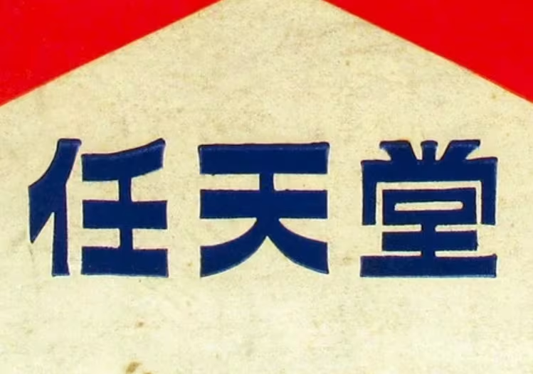
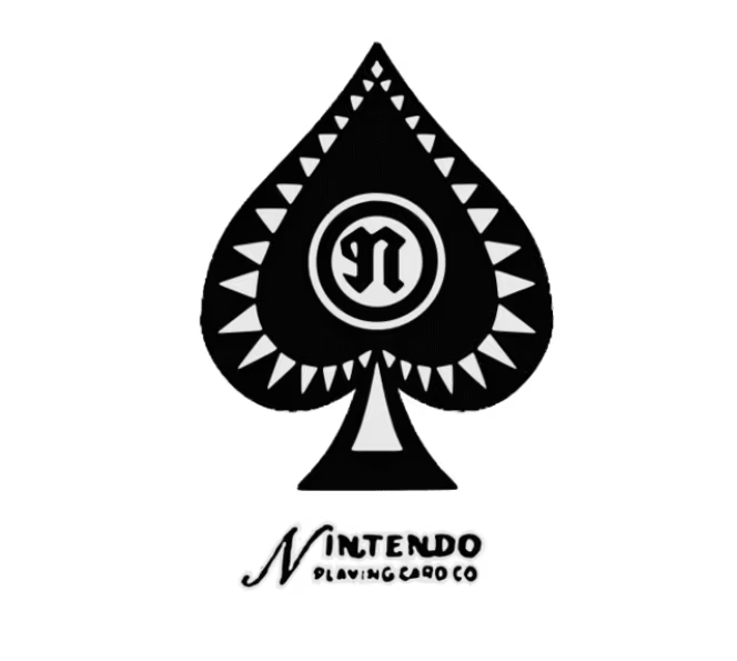
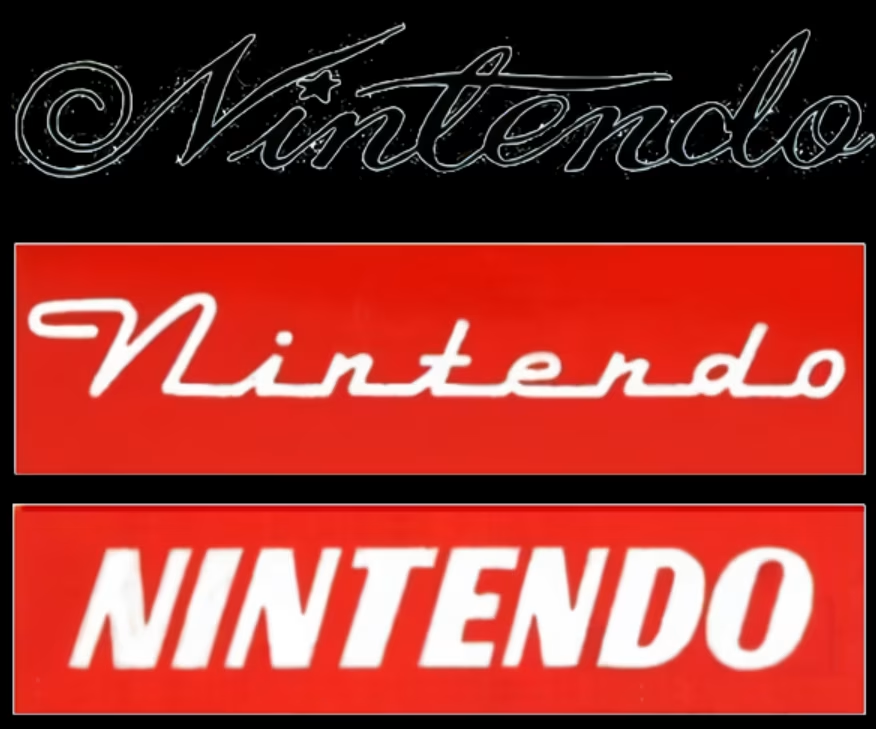
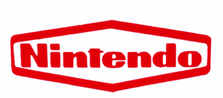
In the beginning, Nintendo was not a tech company, but a traditional playing card manufacturer. The original logo featured the word “Nintendo” in a cursive style, often accompanied by a small symbol representing the company’s association with playing cards. This logo was quite delicate, reflecting the high-quality, handcrafted nature of the company’s playing cards.
As Nintendo diversified and began exploring new business avenues, it updated its logo to reflect a more modern aesthetic. During this time, the cursive logo was replaced with a geometric sans-serif typeface. The wordmark was more angular and featured a bold, authoritative feel. This updated design mirrored the company’s push to modernize and expand beyond traditional card games, moving into the growing industry of electronic toys.
By the mid-20th century, Nintendo’s logo evolved again as it ventured into the world of toys. The rounded, sans-serif font used in the 1950s symbolized simplicity and approachability. It was at this point that Nintendo started to design products like electronic toys and arcade games. The streamlined font, with a focus on legibility and playfulness, mirrored the nature of the company’s products, which were now accessible to a younger audience.
As Nintendo fully transitioned into the video game industry, it introduced a bold new logo. The blocky font became more geometric, with the letters closely spaced and more angular, giving the logo a stronger presence and a futuristic feel. This was also the period when Nintendo launched its first arcade game, Donkey Kong, and began shaping the future of gaming.
In the 1970s, the red and white color scheme became a hallmark of the brand, a bold and recognizable choice that would remain integral to the Nintendo identity for decades.
By the early 1980s, as the company introduced the Nintendo Entertainment System (NES), the logo saw a further simplification. The design shed its angular, geometric lines in favor of a cleaner, simpler design with a focus on readability. The logo retained the bold red and white color scheme, becoming synonymous with the launch of Super Mario Bros., one of the most iconic video games of all time.
Nintendo’s focus was now firmly on gaming, and its logo was reflective of this new identity as a leader in the emerging home video game console market. The minimalist design also reflected Nintendo’s ethos of simplicity and accessibility for all players, regardless of age or experience level.
In the 1990s, Nintendo’s logo underwent a subtle evolution to reflect the company’s embrace of 3D graphics and more advanced gaming technology with the launch of the Nintendo 64. The 3D effect, however, was short-lived, and Nintendo soon returned to a simpler, flat design that was both adaptable and versatile across digital and print mediums.
While the logo itself was more refined, the bold red color continued to dominate, symbolizing the energy and excitement associated with Nintendo’s games. The simplicity of the logo ensured it worked across various platforms, from the Super Nintendo to the Game Boy, and helped it remain relevant in an increasingly digital world.
As technology progressed, Nintendo maintained its modern, flat design with slight tweaks to keep the logo fresh and relevant. The logo was adjusted to be more adaptable for use on digital devices, ensuring that it looked crisp and clear on screens of all sizes, from the Wii U to the Nintendo Switch.
Today, the Nintendo logo continues to retain its iconic red-and-white color scheme and rounded sans-serif font, with the emphasis on legibility and approachability. The logo serves as a visual cue to the company’s legacy, and is a core element of the Nintendo brand—one that evokes nostalgia while remaining forward-facing, ready for the future of gaming, where innovations with AI voice API are shaping new interactive experiences.
The Nintendo logo is not only visually appealing but also deeply symbolic, with each design element carrying specific meanings that align with the brand’s values and gaming philosophy.
The red color in the Nintendo logo plays a significant role in communicating the emotions and excitement that the brand wants to evoke. Red is often associated with passion, energy, and excitement. These are all core elements of Nintendo's gaming experience, especially in games like Super Mario, Zelda, and Pokémon, which are designed to excite players and provide a rush of adrenaline. The red color energizes the logo and makes it visually striking, instantly catching attention. It represents the excitement and intensity that players feel as they dive into Nintendo’s immersive gaming worlds.
This choice of red also connects the brand to a sense of action and adventure, which is evident in the fast-paced nature of many of Nintendo’s iconic games. Think of the thrills of Super Mario, where jumping through levels and completing missions creates a dynamic and exciting gameplay experience. Red amplifies the emotional connection between the game and the player.
In contrast to the boldness of red, the white color in the Nintendo logo conveys a sense of clarity, simplicity, and accessibility. These values are key to Nintendo's approach to game design. The company has always focused on creating games that are easy to understand but difficult to master. Games like Super Mario and Zelda can be enjoyed by players of all skill levels, from beginners to experienced gamers. White is also associated with cleanliness and neutrality, which ensures that the logo is not overwhelming. The simplicity of the design allows the logo to appeal to a broad demographic, reinforcing Nintendo’s family-friendly identity.
White is a timeless and universal color, further strengthening the brand’s appeal to gamers of all ages, ensuring the logo resonates with both young children and adult gamers.
The font used in the Nintendo logo is a rounded sans-serif typeface, which adds to the brand’s friendly and approachable character. Rounded fonts are known for their soft and welcoming aesthetic, making them more playful and accessible. This choice aligns perfectly with Nintendo's position as a family-oriented brand, providing a sense of fun and inclusivity. The logo doesn’t intimidate; instead, it invites people in.
The clean lines of the sans-serif typeface make the logo legible and easy to recognize, even from a distance or on small screens. This simplicity is crucial, especially as Nintendo’s logo is seen across various platforms, from gaming consoles and mobile apps to marketing materials. The rounded font, combined with the clean and minimalist approach, ensures that the logo remains timeless and doesn't feel outdated, no matter how many years pass.
The Nintendo logo has become far more than just a symbol of a company—it has grown into an icon of gaming culture. For millions of people worldwide, the logo represents nostalgia and childhood memories, evoking emotional connections to some of the most beloved video games in history.
Nintendo has built franchise powerhouses like Super Mario, Zelda, and Pokémon, which have become embedded in gaming culture. These franchises, alongside Nintendo’s groundbreaking hardware, have helped the company solidify its place as a cultural icon.
When the Nintendo logo first appeared on the Super Mario Bros. game in 1985, it marked the beginning of an era. The logo was associated with Mario, a character who would become one of the most recognizable in pop culture. The excitement and energy encapsulated in the logo represented the thrill that players felt while playing Mario games—whether it was jumping on Goombas or saving Princess Peach. Today, Mario continues to embody Nintendo’s fun and family-friendly image.
Another major franchise, The Legend of Zelda, deeply connects with the Nintendo logo. The Zelda series is known for its rich lore, captivating adventures, and exploration-based gameplay. The logo is synonymous with Link’s quests to save Hyrule, filled with puzzles, challenges, and heartfelt moments. Players who grew up with Zelda associate the logo with their own memories of discovering dungeons, battling bosses, and uncovering secrets.
The Pokémon franchise, first introduced in 1996, has become one of the most successful video game franchises of all time. Its logo is now associated with not only video games but also TV shows, movies, trading cards, and more. The Nintendo logo, when paired with the Pokémon brand, represents a cultural phenomenon that transcends generations, connecting players young and old across the world.
The Nintendo logo has become a beacon for all these experiences. It’s more than just a visual identity—it evokes memories of adventure, fun, and creativity, creating lasting emotional connections with gamers everywhere.
As Nintendo continues to evolve and innovate within the gaming space, it's likely that the Nintendo logo will adapt, though its core design principles will remain intact. The red-and-white color scheme and rounded sans-serif font are timeless features that align with Nintendo’s commitment to being approachable, fun, and innovative. However, the company will likely continue to modernize the logo to fit new mediums, devices, and trends.
With the launch of the Nintendo Switch, Nintendo introduced a hybrid gaming console that allows players to seamlessly transition between handheld and console play. The future may see the logo evolving further to represent the flexibility and versatility of these new gaming experiences. As virtual reality (VR) and augmented reality (AR) become more prominent in gaming, Nintendo may adapt the logo for use across these new technologies while maintaining its visual identity.
Nintendo has made significant strides in the mobile gaming market with titles like Super Mario Run, Fire Emblem Heroes, and Animal Crossing: Pocket Camp. The evolution of the logo may take into account its use across smaller screens, where clarity and simplicity are essential. Nintendo may consider introducing a more compact version of the logo for mobile interfaces, while maintaining the same foundational design principles.
In short, while the core design of the Nintendo logo will remain timeless, it will likely continue to adapt to new technologies and platforms to ensure it stays relevant to future generations of gamers.
The Nintendo logo is more than just a symbol; it is a reflection of the company’s journey from a playing card manufacturer to a global leader in gaming. The red-and-white color scheme, the clean and approachable font, and the timeless design principles encapsulate Nintendo’s core values of innovation, accessibility, and fun. The logo has become an enduring part of gaming culture, symbolizing some of the most beloved franchises in the world.
As Nintendo continues to innovate with consoles like the Switch, mobile gaming ventures, and new technologies, the logo will undoubtedly evolve, while remaining a symbol of creativity, adventure, and quality gaming experiences for players of all ages. Whether you're playing Super Mario, exploring Hyrule, or catching Pokémon, the Nintendo logo will always be a reminder of the unforgettable gaming experiences it has provided over the years. If you're inspired by the power of iconic logos like Nintendo’s, why not create your own? Visit Logome to design a professional, unique logo that captures the essence of your brand.
The red symbolizes excitement and passion, while white conveys simplicity and clarity. The rounded sans-serif font represents playfulness and approachability, aligning with Nintendo’s family-friendly image.
The Nintendo logo has undergone several transformations, from a cursive design for playing cards to the bold, modern red-and-white logo we recognize today, reflecting the company’s growth and shift to the gaming industry.
The Nintendo logo has become a symbol of gaming culture, evoking nostalgia for players who grew up with franchises like Super Mario, Zelda, and Pokémon, and is a beacon for new generations of gamers.
While the logo will likely evolve with new gaming technologies and platforms, its core design—red-and-white colors and rounded sans-serif font—will likely remain consistent to maintain its timeless appeal.
The Nintendo logo is iconic because of its association with the company’s beloved franchises, innovative hardware, and its universal appeal to gamers of all ages. It represents fun, creativity, and high-quality gaming.


Discover how 500,000+ businesses and creators are using our AI logo maker in their Logo creation.


