God of War Logo
Discover the history, meaning, colors, fonts, and mythology behind the iconic God of War logo. Learn about its evolution, symbolism, and impact on gaming culture.

Discover the history, meaning, colors, fonts, and mythology behind the iconic God of War logo. Learn about its evolution, symbolism, and impact on gaming culture.


The God of War logo is more than just a game emblem—it’s a powerful symbol packed with meaning and history. Whether you're a gamer, a fan of mythology, or a tattoo enthusiast, understanding this logo opens a window into the world of Kratos and the epic stories behind him. Since its debut, the logo has evolved, blending Greek and Norse mythologies, and has become iconic in gaming culture worldwide.
With millions of players engaging with the game series, the logo’s symbolism resonates deeply, reflecting themes of strength, fate, and legacy. Curious about the mysterious runes, the omega symbol, or the striking colors used? This guide breaks down everything—from the design process and mythology influence to its impact on fans and branding. Dive in to uncover the true god of war logo meaning and why it stands out in gaming history.

The God of War logo stands as one of the most iconic symbols in gaming. It’s not just a logo-it’s a visual story that mirrors Kratos’s journey through Greek and Norse mythology. Designed by Santa Monica Studio, the logo evolves alongside the game’s narrative, reflecting shifts in mythology, character growth, and the ever-changing world of God of War.
If you’re searching for the meaning behind the God of War logo, want to know how it changes with each game, or are curious about its symbolism for tattoos, runes, or even its use as a 4K wallpaper, you’re in the right place. Let’s dive into how this legendary emblem has grown with the franchise and why it’s so meaningful for fans and gamers alike.
The earliest God of War logo draws heavily from Greek mythology. You see the bold, blood-red Omega symbol-an unmistakable nod to Kratos’s Spartan roots and the Greek god of war, Ares. This Omega isn’t just a letter; it’s a symbol of finality, power, and fate, all central themes in the early games. The sharp, aggressive font and deep red hues capture the intensity and violence of Kratos’s quest for revenge.
As the series progresses, the logo starts to shift. When God of War moves into the Norse mythos, you notice the logo adapts. Norse runes and circular motifs replace the strictly Greek elements. The color palette becomes colder and more muted, reflecting the harsh northern landscapes. The logo’s evolution isn’t just for aesthetics-it signals a new chapter in Kratos’s story and a fresh mythological backdrop for players to explore.
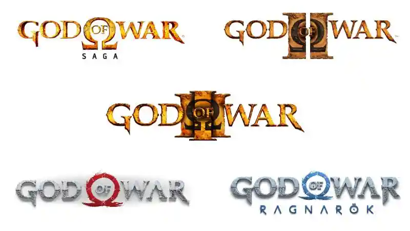
Each God of War installment brings a new layer to the logo’s design. In the original trilogy, the Omega remains central, representing Kratos’s struggle against the gods of Olympus. The logo’s edges are rough, almost carved, echoing ancient Greek stonework. With the 2018 reboot, the logo transforms. Now, it features Norse runes and a more circular design, symbolizing the cyclical nature of fate and the new world Kratos inhabits. The red ring in the 2018 logo stands for both the sun and the cycle of life and death, while the runes hint at secrets and ancient knowledge.
The God of War logo is much more than a game icon. It tells the story of Kratos’s journey through Greek and Norse mythology. Whether you want to understand the god of war logo meaning for tattoos, explore its runes, or appreciate its design, this guide covers it all. Let’s uncover the powerful symbols behind this legendary logo.
The Omega symbol (Ω) is the centerpiece of the God of War logo. In Greek, omega means “the end,” symbolizing finality and fate. This fits Kratos perfectly as a force that ends gods and eras. The bold red omega reflects power, strength, and Kratos’s Spartan roots. It’s a popular tattoo choice because it captures the essence of the game’s themes in a simple, striking symbol.
Kratos represents raw strength and struggle. The logo’s sharp lines and intense colors mirror his fierce personality. As the series shifts from Greek to Norse mythology, the logo adapts by adding runes and circular shapes, showing Kratos’s evolving story. Every detail in the design reflects his resilience and transformation.
The logo hides clever details. In Norse-themed games, it resembles Jormungandr, the world serpent, linking to the game’s setting. The runes often spell secret messages like “RAGNAROK” in the latest installment. These Easter eggs connect fans deeper to the story and add layers to the logo’s meaning.

The God of War logo blends Greek and Norse mythology. The original omega ties to Greek gods and Spartan heritage. Later logos add Viking-inspired runes and circular motifs. This mix creates a unique mythology-inspired logo design that reflects Kratos’s journey across worlds.
The runes in the logo use the ancient Elder Futhark alphabet. They often spell out key words or themes, like “RAGNAROK.” This adds depth and mystery, making the logo a favorite among fans who love runes and mythological symbolism.
The God of War logo uses colors that tell a story. Each logo color reflects Kratos’s journey and the game’s mood. Understanding these colors helps you grasp the god of war logo meaning and why it’s so iconic.
Red dominates the logo. It symbolizes blood, power, and intense battles. This bold red makes the logo instantly recognizable and popular for tattoos. Gray adds balance and seriousness, reflecting the cold Norse settings in later games. Black creates contrast, emphasizing the logo’s dramatic and powerful feel.
The colors set the game’s tone perfectly. Red signals danger and rage, while gray and black reflect the serious, mythological themes. This color palette shows the brand’s shift from fiery Greek battles to icy Norse legends. It helps the logo stand out in gaming and inspires fans worldwide.
For those creating god of war logo vectors or wallpapers, key colors include:
The God of War logo’s colors capture power, myth, and emotion in one iconic design.
The God of War logo’s font is a key part of its powerful identity. It combines boldness and ancient style to reflect the game’s epic mythological themes. If you want to understand the god of war logo font or use it for design or tattoos, here’s a clear breakdown.
The logo uses a custom Gothic-style font called “GodOfWar.” It features thick, uppercase letters with rough, weathered edges. This style mimics ancient stone carvings and battle scars. The Omega symbol blends into the text, highlighting the Greek mythology roots. The font is strong, sharp, and instantly recognizable.
The rugged Gothic font matches Kratos’s fierce and mythic journey. Its distressed look echoes war, struggle, and ancient legends. The Omega symbol adds meaning about fate and finality. This font’s boldness makes it perfect for tattoos, merchandise, and digital use, capturing the game’s intense spirit.
The original 2005 logo used a bold red Gothic font with the Omega symbol. Later games kept the Gothic style but adjusted colors and textures to fit new stories. The 2018 reboot switched to a cleaner, modern font with Norse rune influences, reflecting Kratos’s new world. Despite changes, the core Gothic style and Omega remain, keeping the brand strong and consistent.
The God of War logo font is a perfect mix of myth and power. It’s a go-to choice for fans and designers wanting to capture the essence of Kratos’s saga in any format.
The God of War logo is deeply rooted in mythology. It blends Greek and Norse symbols to reflect Kratos’s epic journey. If you want to understand the god of war logo's meaning or its mythological background, this guide covers it all.
The original logo centers on the Omega symbol, representing “the end” in Greek. It highlights Kratos’s Spartan roots and his role as a bringer of fate and destruction. The blood-red color and stone textures evoke Greek battles and power, making the logo iconic and meaningful.
With the 2018 reboot and Ragnarok, the logo shifts to Norse themes. The Omega becomes a weathered circle with Norse runes spelling key words like “RAGNAROK.” The design hints at Norse legends like Jormungandr and uses colder colors to match the new setting, blending old and new mythologies.
Mythology shapes the logo’s look and story. Greek elements reflect Kratos’s past, while Norse runes show his new path. This mix creates a strong, evolving brand identity that connects fans to the game’s rich lore and epic storytelling.
The God of War logo perfectly combines Greek and Norse mythology, making it a powerful symbol for the franchise and its fans.
Santa Monica Studio creates the God of War logo with a clear vision. They turn myth and story into a powerful, iconic symbol that fans instantly recognize.
The studio uses a collaborative process. Designers and storytellers work together to blend Greek and Norse mythology with Kratos’s journey. They refine colors, fonts, and symbols until the logo perfectly fits the game’s tone and story.
While specific names are rarely public, creative leads, concept artists, and graphic designers at Santa Monica Studio shape the logo. Directors and writers also provide input to keep the logo aligned with the evolving story.
Santa Monica Studio aims for a logo that tells a story. Their focus on mythology and visual impact keeps the logo fresh and meaningful. This vision makes the God of War logo a top brand in gaming, loved by millions worldwide.
Santa Monica Studio’s expert design and clear vision make the God of War logo a lasting symbol of myth, power, and storytelling.
The God of War logo is the core of the franchise’s identity. It captures the game’s power, myth, and epic storytelling, making it instantly recognizable worldwide.
The logo’s bold design and mythological symbols reflect Kratos’s journey through Greek and Norse worlds. It stands for strength and deep storytelling, helping the game stand out in the action-adventure genre.
The logo appears on trailers, game covers, posters, and ads. It creates a consistent brand image across all platforms, building hype and recognition before every release.
The logo unites fans as a symbol of quality and loyalty. It strengthens the brand and encourages community engagement through tattoos, fan art, and collectibles. God of War remains one of PlayStation’s most beloved franchises.
The God of War logo drives branding, marketing, and fan loyalty with one powerful, unforgettable symbol.
The God of War logo does more than brand the game-it sets the tone, builds emotional ties, and makes the series unforgettable. Every detail, from the omega symbol to the runes, draws players into Kratos’s mythological world.
The logo tells a story before you play. Greek and Norse symbols, bold colors, and strong shapes reflect Kratos’s journey and the game’s epic themes. The shift from Greek to Norse elements mirrors the game’s narrative, making the logo a visual summary of the series.
Fans connect deeply with the logo because it represents Kratos’s struggle and growth. The red and black colors symbolize power and rage, matching the game’s emotional intensity. Many use the logo for tattoos, fan art, and collectibles, showing their bond with the story.
The logo anchors the God of War brand. It appears on trailers, covers, and merchandise, making the franchise instantly recognizable. Its mythological roots and bold design help it stand out, building loyalty and excitement with each release.
The God of War logo is a storytelling tool, emotional anchor, and key part of what makes the series legendary. It pulls players in and leaves a lasting impression.
The God of War logo is more than a game symbol-it’s a cultural icon embraced by fans worldwide. Its bold design and deep mythology make it a favorite for tattoos, merchandise, and fan art. If you want to know the god of war logo meaning in tattoos or its pop culture impact, this is your go-to guide.

Fans choose the logo for tattoos because it symbolizes strength, struggle, and transformation. The omega symbol, rooted in Greek mythology, represents endings and new beginnings-just like Kratos’s journey. Many see it as a personal reminder of overcoming challenges or a tribute to the franchise.
Popular tattoo styles include the classic red omega, Norse runes from the 2018 logo, and designs mixing Kratos’s face or red tattoo with the logo. The Ragnarok logo with icy blue tones is also trendy. Each variation reflects themes of power, mythology, and resilience.
The logo features on T-shirts, hoodies, posters, and collectibles. It inspires fan art, wallpapers, and 4K vectors. Its mythology-inspired design keeps the brand strong and connects fans globally, extending its influence beyond gaming.
The God of War logo stands as a symbol of strength and mythology. Whether for tattoos or fan art, it continues to inspire and unite fans worldwide.
The God of War logo is much more than a game emblem-it’s a powerful symbol that captures mythology, strength, and storytelling. From its roots in Greek and Norse legends to its impact on fans through tattoos, merchandise, and fan art, the logo plays a vital role in shaping the franchise’s identity. Whether you’re a gamer, artist, or fan, understanding the god of war logo meaning adds depth to your connection with this legendary series. This iconic design continues to inspire and unite a global community, making it a timeless mark in gaming history. If you wish to create logo of your favorite games try Logome!
The God of War logo was created by Santa Monica Studio to reflect the game’s mythological themes and Kratos’s journey. It started with Greek influences and evolved as the game shifted to Norse mythology.
The logo began with strong Greek motifs, like the Omega symbol, and later incorporated Norse elements, such as runes and circular designs, to match the changing story and setting in newer games like God of War Ragnarok.
The Omega symbol represents “the end” in Greek and stands for power, fate, and Kratos’s role as a bringer of destruction and new beginnings. It’s a central part of the logo’s identity and meaning.
The logo was designed by the creative team at SIE Santa Monica Studio, known for their attention to mythological detail and visual storytelling.
Yes, the logo is full of hidden meanings. Norse runes, for example, spell out key story elements like “RAGNAROK,” and the design often blends Greek and Norse symbols to reflect Kratos’s journey and the game’s themes.
The logo mainly uses blood red, black, and white. Red stands for passion, violence, and epic battles, while black and white add contrast and seriousness. Newer logos also use colder tones to reflect the Norse setting.
The logo’s bold, aggressive style and mythological symbols mirror Kratos’s strength, resilience, and transformation from a vengeful Spartan to a complex hero in a new world.
The logo features Norse runes in recent games. These runes spell out important words like “RAGNAROK” and represent the nine realms, tying the logo directly to the Norse mythological setting.


Discover how 500,000+ businesses and creators are using our AI logo maker in their Logo creation.


