Dallas Mavericks Logo: History and Evolution
Explore the complete history and evolution of the Dallas Mavericks logo, from the original cowboy hat design to the modern stallion emblem.

Explore the complete history and evolution of the Dallas Mavericks logo, from the original cowboy hat design to the modern stallion emblem.


The Dallas Mavericks logo is more than just a sports emblem—it reflects over four decades of strategic branding, cultural representation, and organizational identity. Since the team's inception in the early 1980s, the logo has evolved through multiple design phases, each one capturing the Mavericks’ shifting values, ownership changes, and brand direction.
From the original cowboy-themed motif rooted in Texas heritage to the modern stallion and shield symbolizing strength and ambition, the Mavericks logo has consistently mirrored the team’s journey on and off the court. This article explores the full history of the logo, detailing its visual transformations and the meaning behind each design choice.
The Dallas Mavericks, often referred to as the Mavs, are a professional basketball team based in Dallas, Texas. They were established in 1980 as an expansion team in the National Basketball Association (NBA). From their early days as a developing franchise to their rise as NBA champions, the Mavericks have built a strong legacy rooted in resilience, star power, and strategic transformation.
The Mavericks were founded by businessman Don Carter, whose signature cowboy hat inspired the team’s original logo. The franchise joined the NBA in the 1980–81 season and made an immediate cultural impact with their Texan identity. After a few challenging years, the Mavericks began to find their rhythm in the mid-1980s, thanks to players like Mark Aguirre, Rolando Blackman, and Derek Harper. By 1988, the team reached the Western Conference Finals, signaling its emergence as a competitive force.
The early 1990s were marked by significant decline. Following roster changes and internal challenges, the Mavericks experienced some of the worst records in franchise history. Despite drafting talent like Jamal Mashburn and Jason Kidd, the team struggled with consistency and chemistry. By the late 1990s, however, the seeds of a turnaround were being planted.
The Mavericks’ fortunes dramatically shifted in 2000 when tech entrepreneur Mark Cuban purchased the team. His hands-on approach, investment in technology, and commitment to winning transformed the franchise’s culture. At the center of this new era was Dirk Nowitzki, a German-born forward who would go on to become the team’s all-time great. Alongside stars like Steve Nash and Michael Finley, Dirk helped the Mavs become a regular playoff contender. In 2006, Dallas reached the NBA Finals for the first time but lost to the Miami Heat.
The pinnacle of the franchise’s success came in the 2010–11 season, when the Mavericks returned to the NBA Finals for a rematch against the Miami Heat. This time, led by Nowitzki and a strong supporting cast including Jason Terry, Tyson Chandler, and Jason Kidd, the Mavericks defeated the Heat in six games, securing the first NBA Championship in franchise history. Nowitzki’s performance earned him Finals MVP, and the victory solidified his legacy as one of the greatest power forwards of all time.
Following the 2011 title, the team entered a period of transition. Attempts to build another championship-caliber roster were hindered by short-term contracts and injuries. Dirk continued to lead the team but retired in 2019 after 21 seasons—all with the Mavericks. His retirement marked the end of an era, but the team’s focus quickly shifted toward rebuilding.
In 2018, the Mavericks traded up in the NBA Draft to select Luka Dončić, a Slovenian phenom whose impact was immediate. Dončić won Rookie of the Year and has since emerged as one of the league’s brightest stars. Paired with Kristaps Porziņģis (2019–2022) and later Kyrie Irving (2023–), Luka has led the team back to playoff contention.
Under head coach Jason Kidd, the Mavericks reached the Western Conference Finals in 2022, marking their best postseason performance since 2011. With Dončić at the core and strong front-office leadership, the Mavericks are once again poised to remain competitive for years to come.
The Dallas Mavericks have evolved from a regional expansion team into a global NBA brand, known for their loyal fanbase, iconic players, and strategic reinvention. With a championship to their name, a modernized brand identity, and a rising superstar in Luka Dončić, the Mavericks continue to shape their legacy—on and off the court.
The Dallas Mavericks logo has undergone several key transformations since the team’s founding in 1980. Each redesign reflects not only a shift in visual identity but also the evolving vision of the franchise. From a cowboy hat symbolizing Texan roots to the bold stallion that embodies strength and modernity, the logo’s evolution tells the story of a team growing in confidence, culture, and competitive spirit. Here's a detailed breakdown of each era.
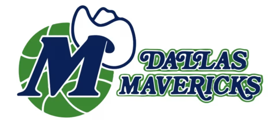
When the Dallas Mavericks entered the NBA in 1980, their first logo reflected the local culture and the team's identity at the time. The emblem featured a green basketball with a blue, italicized “M”, partially overlaid with a cowboy hat. This design directly referenced the Texan heritage and the team's co-founder Don Carter, who was often seen wearing a cowboy hat.
The typeface used for “Dallas Mavericks” was a serif font, traditional and flowing, aligning with the overall casual and regionally inspired aesthetic. The colors—green and royal blue—stood out from other NBA franchises at the time, giving the Mavericks a distinct visual identity.
This logo conveyed community, youthfulness, and a strong regional connection. It was playful, approachable, and well-suited for a newly established team.

In 1993, the Mavericks introduced a refined version of the original logo. The cowboy hat and italic “M” remained, but the lines were smoother and more polished. The serif typeface was updated to a cleaner, sans-serif font, giving the logo a more modern and professional appearance.
This update didn’t drastically change the original concept but aimed to clean up the design to reflect the team's growth and maturity. It still retained its playful roots but appeared more aligned with contemporary branding trends of the time.
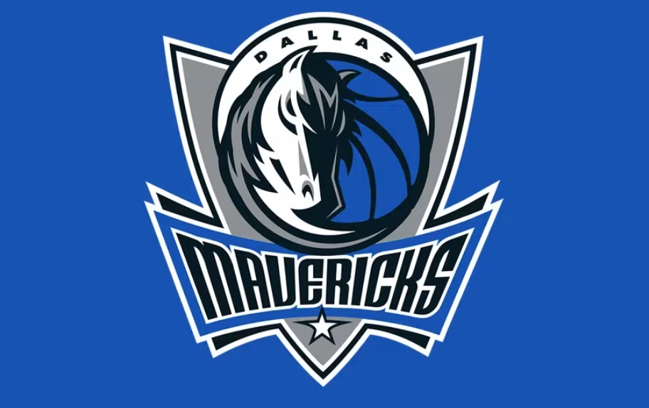
A significant shift came in 2001 under new ownership led by Mark Cuban. The Mavericks unveiled a completely new logo, marking a departure from the cowboy theme. The new design featured a stylized stallion head, overlaid on a basketball and shield emblem.
This redesign represented a modern, aggressive, and bold direction for the team. The stallion symbolized strength, speed, and determination, while the shield element conveyed protection and resilience. Together, they projected a new team identity—more competitive and aspirational in nature.
The color scheme also changed dramatically. The new palette included navy blue, royal blue, silver, and black, replacing the previous green and blue. The word “Mavericks” was displayed in angular, futuristic typography across the bottom of the shield, accompanied by “Dallas” in a smaller, complementary font.
This version of the logo was seen across all branding, including jerseys, merchandise, and digital platforms. It became closely associated with the team’s rise to prominence in the 2000s and culminated in their 2011 NBA Championship.

The 2017 update did not drastically change the concept introduced in 2001. Instead, it focused on refining the visual elements to align with modern branding standards. The stallion design remained intact, but the lines were cleaner and the details sharper.
Colors were slightly adjusted—blues were deepened, and grays became more metallic and consistent across platforms. The typography was subtly enhanced for better clarity and scalability, particularly for digital use across social media, mobile apps, and modern merchandising formats.
This refinement aimed to ensure consistency, legibility, and a more premium look without abandoning the core identity built over the previous decade.
The Dallas Mavericks logo is a well-crafted visual identity that goes beyond aesthetics. Each design element serves a specific purpose and reflects different milestones in the team's journey.
The stallion is central to the modern Mavericks logo and directly connects to the team's name. A “maverick” traditionally refers to an unbranded, independent-minded horse, and more broadly, a free-spirited individual. The stallion represents speed, power, and autonomy—qualities that align with both the sport of basketball and the team’s on-court character. It symbolizes the bold, energetic playing style the Mavericks aim to embody.
The shield surrounding the stallion and basketball is a design choice that conveys strength, resilience, and structure. It adds a layer of professionalism and authority, suggesting that the team not only values athleticism but also defends its legacy and identity. The shield also enhances the logo’s adaptability across merchandise and marketing channels.
The typography used in the current Mavericks logo is sharp, angular, and modern. This style communicates dynamism and motion, key aspects of the game of basketball. It stands in contrast to the more traditional serif fonts used in the team’s early logos, signaling a shift from regional charm to a more assertive, performance-driven identity.
The Mavericks’ original color palette—green and royal blue—reflected a strong connection to Dallas and gave the franchise a fresh and playful visual identity. In 2001, this shifted to a more contemporary scheme: navy blue, royal blue, silver, and black. These tones convey professionalism, sophistication, and competitive intensity. The darker palette also allows the logo to appear more polished across digital and printed formats.
Together, these elements tell the story of a team that has grown from a locally rooted NBA franchise into a modern, globally recognized brand. The current logo reflects both its heritage and its future-facing ambitions.
The evolution of the Dallas Mavericks logo was not simply a cosmetic decision—it was a reflection of the franchise’s broader strategic direction, marketing priorities, and long-term brand vision. Each change aligned with a shift in leadership, technology, or cultural relevance, helping the organization maintain both authenticity and modern appeal.
When Mark Cuban acquired the Dallas Mavericks in 2000, he brought with him a bold vision: to turn the team into a consistent contender and raise its national profile. The 2001 logo redesign served as a visual reset, signaling a departure from the lighthearted, regional tone of the cowboy-hat era toward a more competitive, globally resonant identity.
The introduction of the stallion—symbolizing speed, determination, and power—aligned with the team's aggressive new strategy both on and off the court. This transformation was not just about aesthetics; it represented a change in leadership philosophy, ambition, and positioning within the NBA. The updated branding helped the team reposition itself as a serious, modern franchise that could compete with the league’s best.
As consumer habits shifted and digital platforms began to dominate how fans engage with teams, it became critical for sports logos to be scalable, legible, and adaptable across all formats—from smartphone screens and app icons to merchandise and arena signage.
The 2017 refinement of the Mavericks logo addressed this need. It kept the core elements—stallion, shield, and typography—but introduced subtle adjustments in color, clarity, and spacing to ensure the logo would perform consistently across digital and physical media. These changes made the brand more future-proof, optimizing it for high-resolution screens, mobile-first applications, and e-commerce.
In essence, the refinement wasn’t just about looks; it was about functionality in a modern media environment.
Beyond modernization, the logo updates helped the Mavericks strengthen their brand identity in a competitive sports market. The original logo was regionally specific and less distinctive outside Texas. In contrast, the stallion-and-shield motif introduced in 2001 created a universal, dynamic symbol that could resonate with both domestic and international audiences.
The refined typography and balanced use of color reinforce the team’s professional image, while the consistent use of the logo across various platforms builds recognition and trust. The brand is no longer just tied to a location—it now represents values like ambition, strength, and independence, appealing to a broader and more diverse fan base.
This intentional design evolution has helped the Dallas Mavericks become more than just a sports team—they are now a well-recognized brand with a consistent visual identity, aligned with modern marketing and fan engagement strategies.
A well-designed logo isn’t just about visual appeal—it plays a critical role in building a team’s brand identity and deepening fan loyalty. For the Dallas Mavericks, each version of the logo has helped solidify their image both on and off the court.
The stallion and shield design not only communicates strength and motion but also translates effectively across merchandise, marketing campaigns, and digital platforms. Whether it’s on a jersey, a billboard, or a mobile screen, the logo remains instantly recognizable—making it a unifying symbol for fans.
Moreover, consistent logo use across branding touchpoints reinforces emotional connections with supporters. For many fans, the Mavericks logo is tied to moments of pride, such as their 2011 NBA Championship. As a result, the logo acts as both a marketing tool and a cultural anchor, strengthening the team’s presence in the league and enhancing long-term brand equity.
The Dallas Mavericks logo is a visual reflection of the franchise’s journey—one that spans decades of cultural shifts, leadership changes, and strategic evolution. Each redesign has been more than an aesthetic update; it has symbolized pivotal moments in the team’s growth. The current stallion-and-shield emblem not only conveys strength and professionalism but also captures the ambition that defines the Mavericks today.
As the NBA continues to evolve in a digital and global landscape, the Mavericks’ logo stands as a model for how effective design can align with brand values, fan engagement, and modern media demands. If you're inspired by the thoughtful evolution of the Mavericks’ visual identity and are looking to craft a logo that reflects your own brand’s story and values, try Logome.
The 2001 redesign marked a pivotal shift under new owner Mark Cuban, who aimed to elevate the team’s brand identity and competitive presence. The previous cowboy-hat design was replaced with a dynamic stallion and shield to reflect boldness, energy, and a new era. It aligned with the team’s vision of becoming a serious championship contender.
The modern logo combines a stylized stallion, a shield, and a basketball—all working together to symbolize strength, motion, and focus. The stallion represents the team’s namesake and independent spirit, while the shield conveys protection and resilience. Altogether, the logo reflects the Mavericks’ transformation into a global sports brand.
The team officially transitioned to navy blue, silver, black, and royal blue in 2001 to present a more professional and refined image. However, the original green and royal blue still appear occasionally in throwback uniforms or special edition merchandise. This helps maintain a connection to the team’s early identity.
The updated logo was developed by the Dallas Mavericks’ internal branding team, working alongside NBA design consultants. It was a complete visual overhaul intended to reflect the team's evolution on and off the court. The new design was also better suited for merchandising and digital applications.
Since 2017, the Mavericks logo has not undergone any major redesign. Instead, it was refined with subtle improvements like cleaner lines, deeper colors, and better scalability. These adjustments ensure the logo remains visually strong across digital platforms and modern marketing materials.


Discover how 500,000+ businesses and creators are using our AI logo maker in their Logo creation.


