Common Logo Mistakes: Don’t Make These Design Fails!
Discover the most common logo mistakes and learn simple tips to create a memorable, flexible, and professional logo that truly represents your brand.

Discover the most common logo mistakes and learn simple tips to create a memorable, flexible, and professional logo that truly represents your brand.

Every business wants a logo that leaves a great first impression. But what happens when a logo sends the wrong message—or worse, gets ignored completely? That’s where understanding common logo mistakes makes a real difference. Designing a logo might seem simple on the surface, but tiny details and choices can trip up even experienced designers. Maybe the colors don’t fit the brand, the font is unreadable, or the design is just a little too familiar.
The truth is, a logo has to do more than look pretty. It needs to be memorable, flexible, and instantly recognizable. If you want to avoid logo fails, let’s dive into what actually makes a logo work—or flop.
A logo isn’t just a stamp you slap on products or social media profiles—it’s the visual heart of your brand. Think about the logos you instantly recognize: the swoosh, the golden arches, that bitten apple. Each one does a ton of heavy lifting. Your logo sets the tone for your business before you say a word. People will judge your professionalism, vibe, and even your trustworthiness based on it.
A strong logo signals confidence and attention to detail. On the other hand, a confusing, generic, or cluttered logo raises red flags for customers. People might not remember your business if your logo blends in with everyone else’s. Worse, if your logo feels off or unprofessional, potential clients may never even give you a chance.
Logo design also impacts everything from your website’s look to your packaging, business cards, and even your t-shirts. The right logo can make your brand feel cohesive, smart, and memorable. The wrong one might just get skipped over.
You don’t need a massive budget or famous designer to get it right. But you do need to avoid the common logo mistakes that can undo all your hard work. Let’s break down the most frequent errors so your logo can work as hard as you do.
Most design errors aren’t obvious until you see their effects—like missed opportunities, customer confusion, or poor recognition. Common logo mistakes can make even a clever concept fall flat. Copying another brand, picking jarring colors, overcomplicating things, or ignoring how a logo appears in different sizes—each of these issues chips away at your brand’s impact. Sometimes, even well-meaning tweaks can create big problems, especially when a logo is rushed or created without real research. Being aware of these pitfalls is the first step toward building a logo that not only looks good but truly represents your business and stands the test of time.
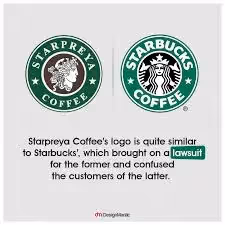
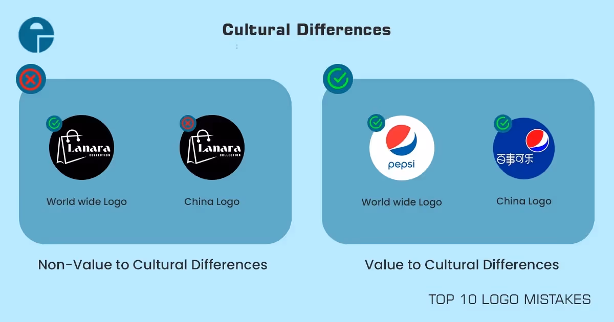
It’s easy to see why copying happens in logo design. There’s a certain comfort in looking at what’s already working for big brands or successful businesses in your industry. When you’re pressed for time or struggling for inspiration, borrowing a little too closely from popular logos might even feel smart. But the truth? It’s a shortcut that rarely pays off. Instead of helping you fit in, it usually leaves your brand looking generic—or worse, like a knockoff. Customers can spot “me-too” designs from a mile away, and even subtle similarities might trigger suspicion. Trust gets lost fast when your logo isn’t truly your own, so resist that urge to mimic.
Copying logos isn’t just a creative misstep—it can land you in serious trouble. Well-known companies fiercely protect their branding. If your logo looks even remotely similar to a major player’s, you risk legal action that can be costly, embarrassing, and time-consuming. Even if no one sues you, you’re still gambling with confusion. If customers mistake your business for another, you lose any chance to build real brand loyalty. Worse, you may accidentally send your clients straight to your competition. In today’s crowded marketplace, a logo that’s too similar to someone else’s is a problem waiting to happen.
Originality doesn’t mean you need the wildest, weirdest logo out there. Instead, it’s about finding what makes your business unique and building your visual identity around it. Start with deep research into your brand values, your audience, and what your competitors are doing. Then brainstorm elements—colors, shapes, symbols, or typefaces—that genuinely fit your story. Test your ideas with honest feedback and refine until your logo feels unmistakably yours. If you find yourself accidentally echoing another brand, pivot and rework the design. An original logo builds pride, attracts attention, and gives your business a real chance to stand out.
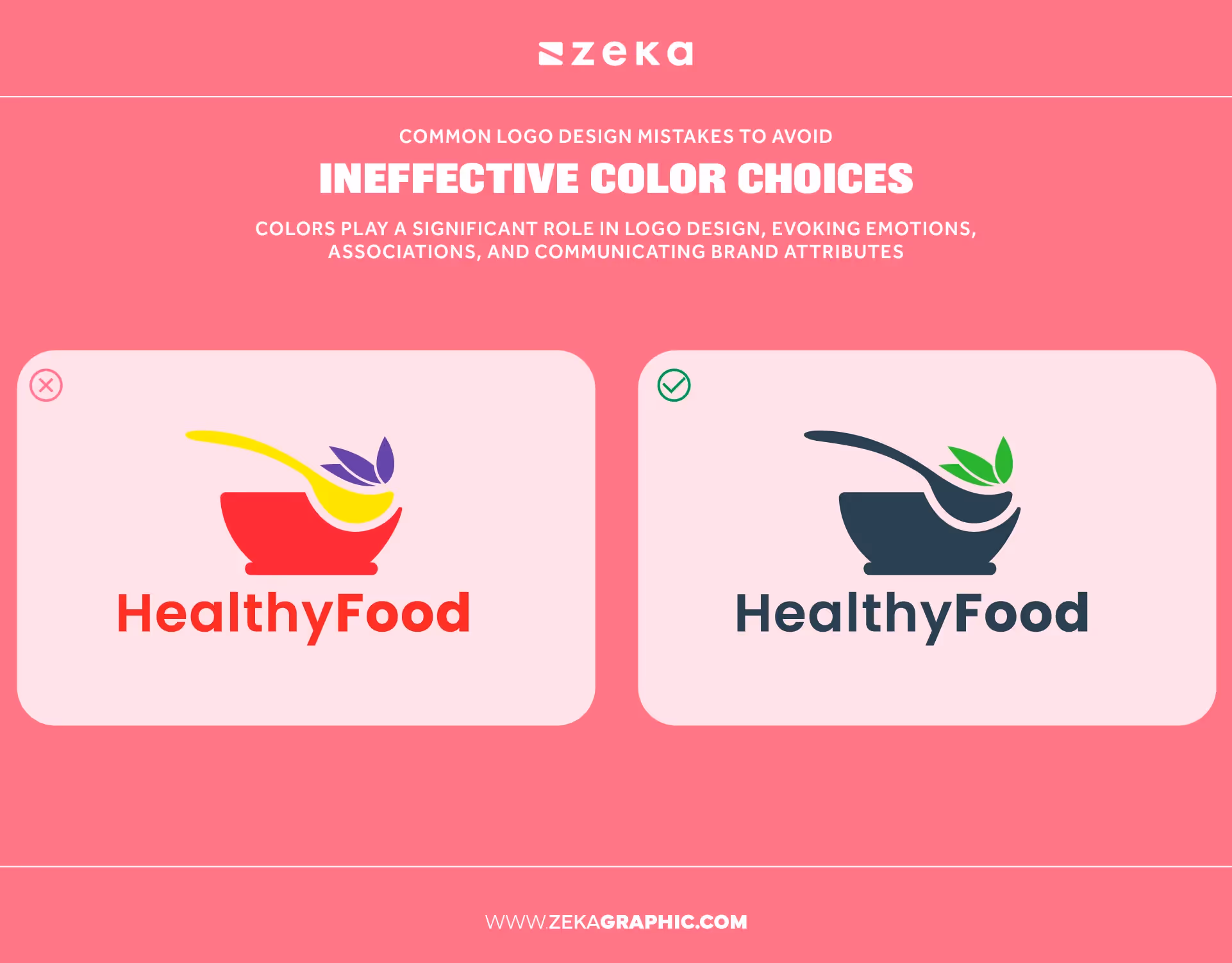
Colors speak louder than you might think. Before anyone reads your brand’s name, they notice the color palette. Different colors create instant reactions—blue suggests trust, green hints at growth, red brings energy, and black signals sophistication or boldness. Picking the right combination connects emotionally with your audience. But the wrong colors can turn people off, leave them confused, or make your brand feel out of sync with its message. Understanding color psychology helps you create logos that resonate and stick in people’s minds. The right color choice isn’t just about preference—it’s about communicating without saying a word.
A frequent slip-up in logo design is combining colors that don’t play well together. Clashing tints and shades can make a logo look messy or even painful to look at. For instance, pairing neon green with bright red might grab attention, but it’s rarely the right kind of attention. Busy backgrounds or gradients with competing hues create a chaotic vibe. If your logo looks harsh or hard to read, potential customers may just keep scrolling. A balanced palette helps your design feel inviting and professional. Before settling on colors, look at your logo on different screens and backgrounds to spot any issues.
Choosing colors just because you like them—or because they’re trendy—can backfire. Imagine a law firm with pastel pinks or a children’s brand using heavy grays and browns. The colors may look pretty, but they send mixed messages. Your palette should match your business’s core identity and the feelings you want to spark. Take some time to research what colors mean in your industry and among your target audience. Using the right colors builds a stronger emotional connection and helps customers remember you. When in doubt, always ask yourself if your color scheme matches your brand’s voice.
There’s a sweet spot when it comes to the number of colors in your logo. Use too many, and your design becomes cluttered and tough to reproduce, especially in black and white or on different surfaces. Go too minimal—like a single, uninteresting color—and your logo may fall flat or lack flexibility. The best logos typically use two or three main colors with an accent. This balance keeps things visually appealing and versatile. If your logo doesn’t work in both full color and simple monochrome, it’s time to revisit your palette. Remember, simplicity and consistency are your friends.
Stick to colors that represent your brand’s mission and personality. Test your logo against light and dark backgrounds to ensure clarity. If you’re unsure, build a palette from proven color combinations in your field, then customize it to make it your own. Trust your instincts, but back them up with feedback and testing. Thoughtful color choices are the backbone of a memorable and lasting logo.
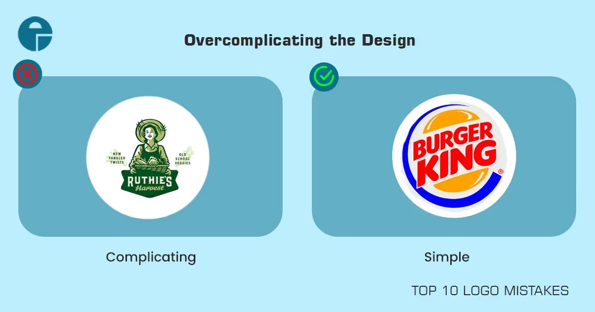
Simple logos stand out for a reason. They’re easier to remember, faster to recognize, and look great at any size. Think about some of the world’s best-known brands—their logos aren’t filled with tiny details or confusing shapes. Instead, they rely on clean lines and strong forms. Simplicity also means your logo stays legible whether it’s on a billboard or a social media icon. When you remove unnecessary elements, what’s left is the core of your brand. A straightforward design gives your business a modern, timeless feel. More importantly, it invites customers to recall your brand without effort.
A logo loaded with intricate graphics, tiny text, or too many symbols quickly becomes a blur. Complexity makes it hard for customers to understand or remember what they’ve seen. When shrunk down for web icons or print, details often disappear, turning your logo into a smudge. Overly busy logos can also seem amateurish, suggesting indecision or a lack of confidence in your brand’s message. If people need to squint or stare just to figure out your design, chances are they won’t bother. In branding, instant recognition is key—and that comes from stripping things down to the essentials.
Simplifying doesn’t mean removing everything that makes your logo special. It’s about focusing on what matters. Start by identifying the most important part of your design—is it a shape, a color, a symbol, or your initials? Use negative space and clean lines to let these features shine. Don’t be afraid to cut out decorative flourishes or extra icons that don’t serve a real purpose. Ask for feedback: can people describe your logo after seeing it for just a moment? If yes, you’re on the right track. Simple, well-crafted logos have the staying power that busy designs never achieve.
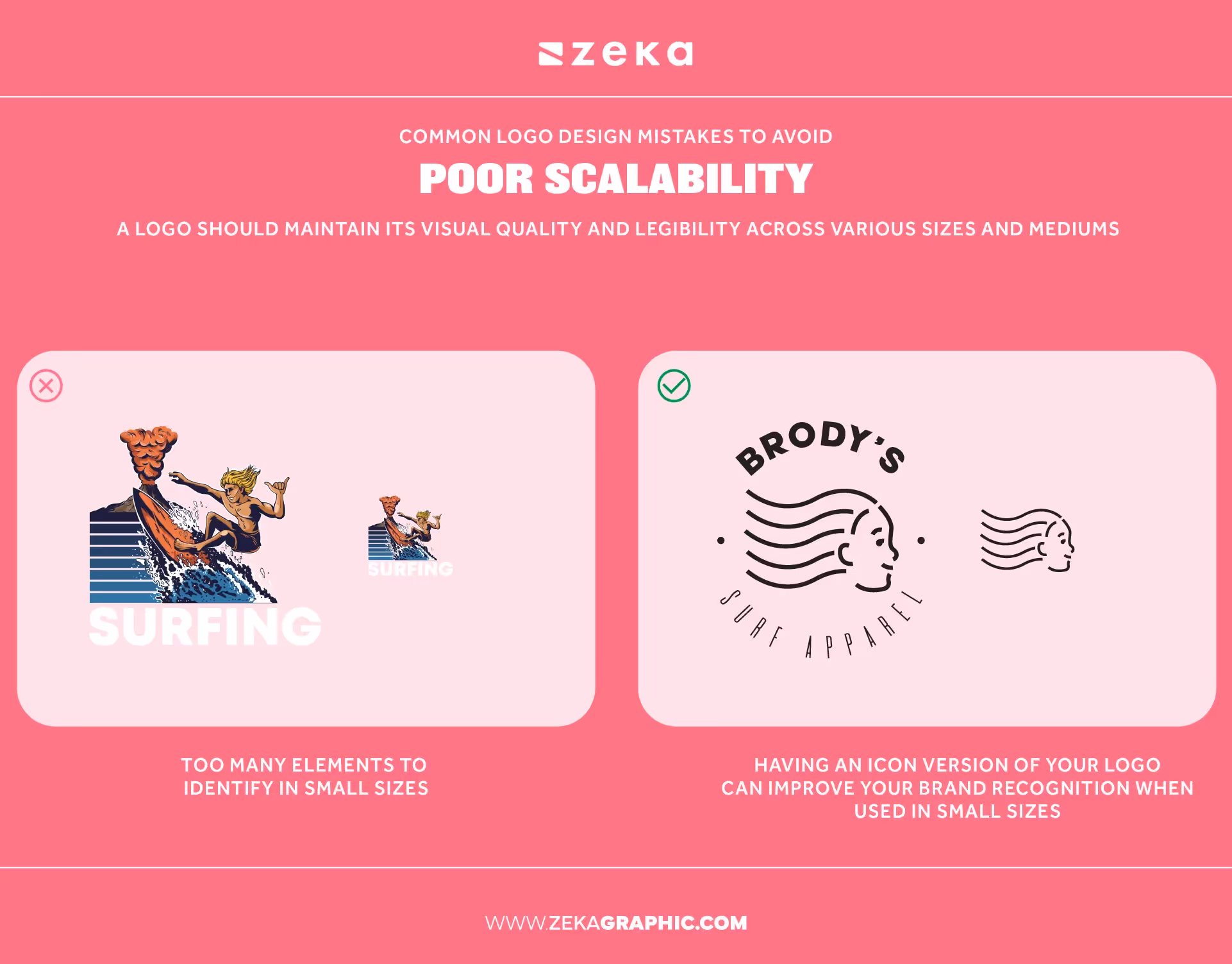
A great logo works anywhere—on a business card, website, t-shirt, or a massive sign. Scalability means your logo stays sharp and clear, no matter its size. If your design relies on thin lines, tiny text, or complex patterns, it may fall apart when shrunk down. On the flip side, a logo that looks fantastic in a huge format might lose impact when used in a small spot. When designing, always test how your logo holds up at both extremes. A scalable logo keeps your brand looking polished and professional, wherever people find you.
Logos are rarely seen in just one size. Maybe you print stickers, create embroidered patches, or want your brand on mobile app icons. If the logo’s details vanish at a smaller size, or if the text turns to mush, you’ll run into trouble. Conversely, when blown up, fuzzy graphics or pixelation can make your business look amateur. Complex gradients or shadows can muddy the design at different scales. The solution? Use vector graphics (not bitmaps), avoid unnecessary effects, and keep text readable at the tiniest sizes. You’ll save yourself endless headaches in production down the line.
An adaptable logo is like a trusty tool—it works wherever you need it. That means having versions that suit different uses: a full logo, an icon, a simple black-and-white version, or one for tight spaces. If your logo only looks good on your website but fails in print or social media, it’s time to rethink things. Ask yourself: does the logo maintain its identity without color or at low resolution? Prepare multiple file formats and test your logo in all the spots it will live. Flexibility is what keeps your branding strong and consistent everywhere.
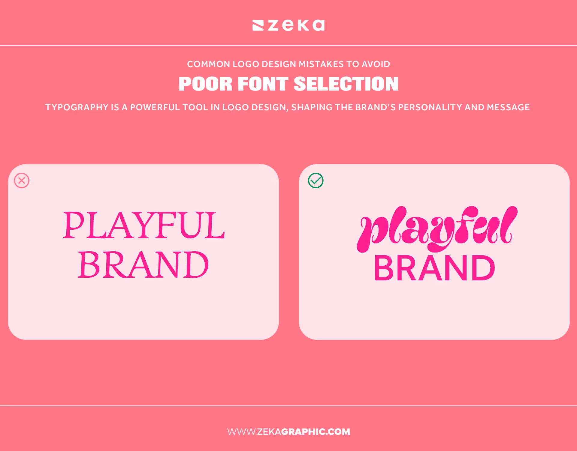
Typography is a huge part of logo design, even though it’s easy to overlook. The font you pick doesn’t just spell out your business name—it sends subtle signals about your style and values. A bold, blocky font can feel strong and reliable, while a script font may look elegant or creative. Choosing the right font means thinking about how you want people to feel when they see your logo. Do you want to project authority, friendliness, or playfulness? A font that matches your message makes your branding more memorable and helps customers connect with your story.
A logo that’s tough to read at a glance loses its power instantly. Fonts with fancy curls, tight spacing, or extreme thinness often look great at first but become a nightmare in practice. People won’t stop to decipher your logo—if they can’t read it quickly, they’ll move on. Another trap is using fonts that everyone else is already using, like certain scripts or generic sans-serifs. These overused fonts make your logo blend in instead of standing out. Always test your font in different sizes and settings. If anyone has to squint, rethink your choice.
Start by picking fonts that truly match your brand’s identity. Research typefaces in your industry to see what feels fresh but not forced. Don’t mix too many styles—using one or two complementary fonts keeps your design clear and professional. Pay close attention to legibility, especially in smaller formats. Consider custom lettering if you want something unique but can’t find the perfect fit. Above all, keep your audience in mind. Fonts set the tone for everything that follows in your branding, so give them as much care as your colors and graphics. Purposeful font choices lead to lasting recognition.
A logo that only looks good in full color or on a glowing screen can limit your brand’s reach. You’ll need a version that works in black and white, grayscale, and different backgrounds. Printing on fabric, paper, or merchandise brings challenges—colors may shift, details might get lost, and subtle effects could disappear. If your logo falls apart in these situations, you risk losing brand consistency. Always design with multiple applications in mind. Test your logo in print, on packaging, and even as a watermark. A truly versatile logo keeps its impact no matter where it appears.
Trends in design and technology change all the time, but a versatile logo never goes out of style. The more adaptable your logo is, the easier it becomes to use on everything—from business cards to billboards to Instagram profiles. A logo with too many effects, colors, or fine details will struggle to stay consistent across platforms. But a well-constructed logo keeps your brand looking sharp whether you’re handing out stickers or updating your website. If you can imagine your logo holding up in every setting, you’re building a brand identity that’s ready for whatever comes next. Versatility future-proofs your business and saves you from costly redesigns down the road.
Your logo is the visual handshake your brand offers the world. If it doesn’t align with your brand’s core voice and values, it creates confusion. For example, a playful, whimsical logo might suit a toy company but not a financial consultancy. Take time to define what your business stands for—serious or fun, traditional or edgy, luxurious or budget-friendly. Every color, shape, and font you use should match these qualities. A logo that authentically reflects your business gives customers a clear signal about what to expect, building trust and setting you apart from the crowd.
A logo that sends mixed signals will trip up your branding. Maybe you want to appear innovative but use old-fashioned design elements, or you aim for a youthful audience with a stale, corporate look. Using generic icons or copying the tone of bigger brands won’t help you connect with your target market. It’s easy to focus on trends or personal tastes instead of what fits your brand message. The solution: keep your audience at the center of your design decisions. The clearer your logo communicates your true identity, the stronger your connection with the people you want to reach.
Designing in a bubble is a common trap. After staring at a logo draft for hours, it’s easy to miss flaws that fresh eyes spot instantly. Feedback helps you catch confusing visuals, poor color choices, or details that don’t work in practice. Don’t just rely on your own judgment or the opinions of people close to you. Show your logo to a mix of potential customers, industry peers, and even strangers if possible. Honest feedback, especially from those who might actually buy from you, can reveal blind spots and push your design from “pretty good” to unforgettable.
Testing a logo isn’t just about asking if people “like it.” Try putting your logo in real-world situations: business cards, social media profiles, merchandise, and even mobile apps. Check how it looks in black and white, tiny sizes, or against different backgrounds. Ask testers what feelings or ideas the logo brings to mind—do their answers match your brand’s intentions? Run simple polls or A/B tests to see which version stands out or gets remembered. By making small changes based on genuine feedback, you’ll create a logo that connects and performs in the wild, not just on your designer’s screen.
Even the sharpest logo design can stumble over the tiniest details. Fine lines, intricate textures, or tiny graphic flourishes might look fantastic on a large display, but they can disappear or blur when printed small or viewed on a phone. Sometimes, subtle gradients or drop shadows add unnecessary complexity without adding value. When details vanish, your logo risks losing its identity or appearing sloppy. Always zoom out or print your logo at its smallest possible size. If you can’t make out every part of the design, it’s time to rethink those extra details.
Micro mistakes—like awkward spacing, inconsistent alignment, or fuzzy edges—can make an otherwise solid logo look unprofessional. Even tiny flaws in letter spacing or icon balance are more noticeable than you might expect. Double-check every element in your design, from the thickness of lines to the distance between shapes. Test your logo across different devices and formats, looking for areas that need cleanup. Paying close attention to these small fixes can transform a “good enough” logo into one that’s polished and built to last. Details matter, even if most people can’t put their finger on why.
Trendy logos pop up everywhere. From gradients and “flat” icons to quirky hand-lettered fonts, it’s tempting to jump on what’s popular right now. But trends move quickly, and a logo that looks cutting-edge today might feel outdated in a year or two. Worse, if your brand feels like a carbon copy of everyone else in your space, you lose your unique voice. A logo rooted only in trends can struggle to age gracefully. Instead of chasing every fad, ask yourself if the design fits your business for the long haul.
There’s nothing wrong with using fresh ideas, as long as you keep your brand’s identity front and center. Draw inspiration from current styles but filter them through what makes your business unique. Focus on simple, strong shapes and clear typography—these rarely go out of style. Update details as needed, but hold onto the parts that feel authentic. A logo that mixes a modern touch with classic fundamentals is easier to refresh in the future. Aim for designs you’ll be proud of years from now, not just what’s hot this season.
A memorable logo isn’t just about looking good—it’s about telling your brand’s story at a glance. The best logos are simple, flexible, and true to your business’s personality. By sidestepping common logo mistakes, you give your brand a real shot at making a powerful impression that stands the test of time. Don’t rush the process or settle for what’s “just okay.” Invest in a design that feels authentic, works everywhere, and grows with you. With care and a clear eye for details, you’ll build a logo that your customers trust and remember.
Many logo mistakes come from skipping research or rushing the process. Top errors include copying other brands, poor color choices, using too many details, unreadable fonts, and ignoring scalability. Some logos also fail by not matching the brand’s values or voice. Testing, feedback, and a clear sense of purpose go a long way toward avoiding these pitfalls and creating a design that sticks in people’s minds.
The sweet spot is usually two or three main colors, plus an accent if needed. Using too many shades can make your logo look messy and hard to reproduce, while too few may make it feel flat. Pick colors that fit your brand’s identity and test how they work in black and white. Consistency across different uses is key for strong, professional branding.
Avoid fonts that are difficult to read or overused, such as ultra-thin scripts or cliché typefaces like Comic Sans or Papyrus. Steer clear of trendy fonts that might date your brand or look generic in your industry. Choose typography that fits your message and feels unique to your business. Always test font legibility at different sizes and in different applications.
Test your logo by placing it on real-world materials—like business cards, websites, or merchandise—and seeing how it looks in various sizes and backgrounds. Ask for feedback from your target audience and industry peers. Use polls, A/B testing, or quick recall exercises. If your logo is clear, memorable, and matches your brand’s voice, you’re on the right track.


Discover how 500,000+ businesses and creators are using our AI logo maker in their Logo creation.


