A’s Logo
Explore the history, design elements, and usage tips of the A’s Logo in this concise guide. Learn color codes, typography insights, and official best practices.

Explore the history, design elements, and usage tips of the A’s Logo in this concise guide. Learn color codes, typography insights, and official best practices.


The A’s Logo isn’t just a pretty badge on a cap—it’s a century-old story stitched into every thread. From its humble beginnings in Philadelphia to its bold green-and-gold identity in Oakland, this logo has evolved alongside baseball itself. Fans see more than a stylized “A”; they see tradition, triumphs, and a community that spans generations.
In this guide, we’ll walk through every twist and turn of the logo’s journey. You’ll get the inside scoop on why that little apostrophe matters, how the elephant mascot became part of the family, and exactly which color codes make the green pop. We’ll also share pro tips on using the logo correctly—whether you’re designing fan art, setting up social posts, or crafting merchandise.
Grab your glove (or your sketchpad), and let’s dive into the ultimate story behind one of baseball’s most enduring emblems.
Dive into how a simple “A” and a cheeky elephant cartoon transformed into one of baseball’s most beloved emblems. Each chapter of this journey adds character, from city moves to color makeovers.
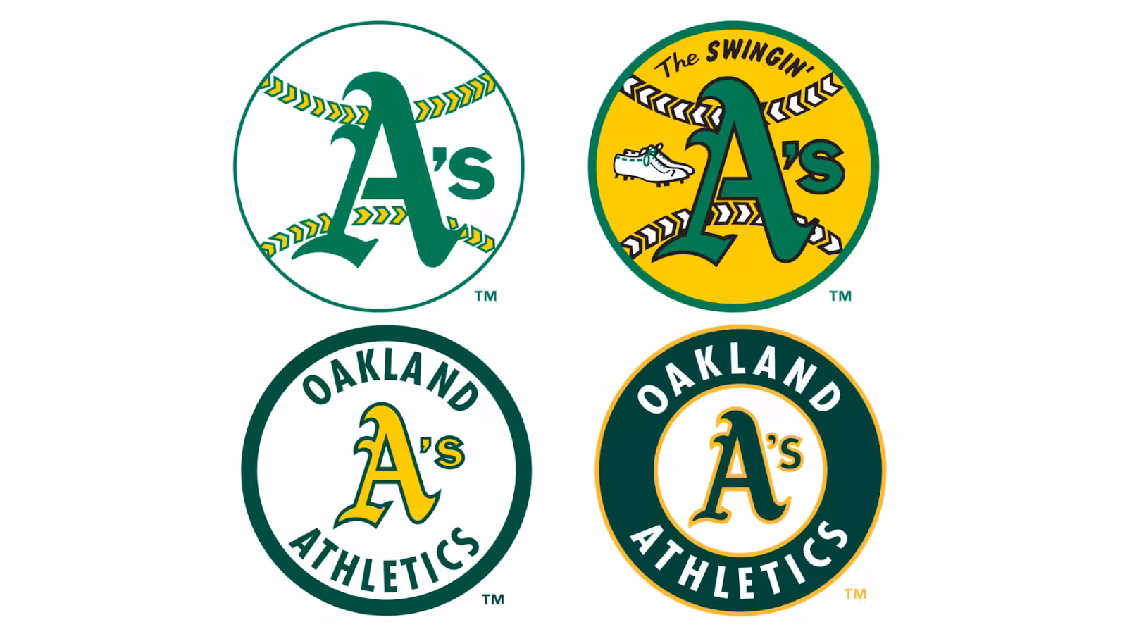
When the Athletics first took the field, their cap sported a block “A” or a full “Athletics” script. Around 1905, sportswriters poked fun with elephant cartoons—Charlie “Sea Lion” Riegels’ pitch inspired a trunk-wielding mascot. Fans loved it so much that the team unofficially adopted the pachyderm as a cheeky good-luck charm.
Moving west to Kansas City brought fresh energy—and a revamped elephant swinging a bat. The franchise also experimented with an Old English “A,” hinting at a more refined look. These mid-century tweaks made the logo pop on hats and programs, while keeping that playful elephant close at hand.
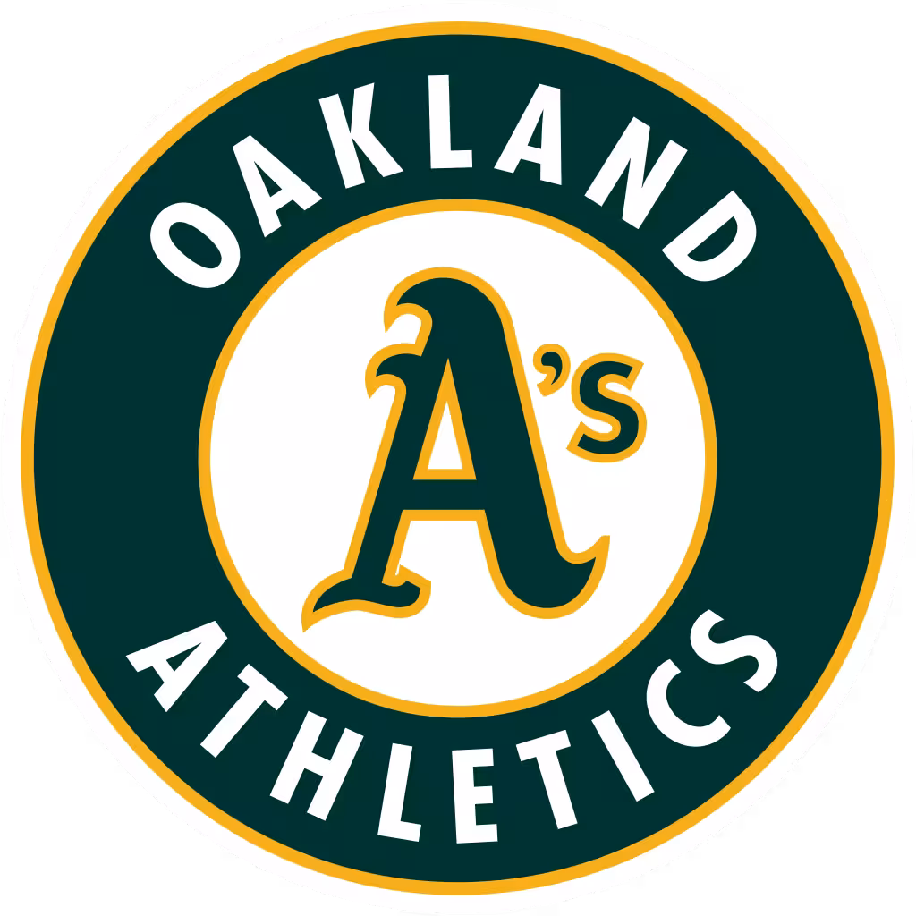
Landing in Oakland in 1968 ushered in the iconic “A’s” with its distinctive apostrophe. This was the first time the team’s shortened nickname appeared as the official mark. Alongside the script update, the colors shifted from navy and red to the now-famous kelly green and bright gold.
Since the early ’70s, designers have smoothed out letter curves, standardized the apostrophe, and polished the elephant for digital use. Alternate logos—like a black “A’s” on green or a standalone elephant—give fans fresh merch options. Yet the core script and palette remain instantly recognizable.
Let’s break down what makes this logo tick—its colors, its curvy script, and even that tiny apostrophe. Understanding these pieces helps you appreciate the art and replicate it correctly.
The A’s signature green (#0C3C0C) and gold (#FFB81C) pair for maximum pop. Green reflects the lush grass of the ballpark, while gold nods to championship glories. Accurate color codes ensure consistency across screens, print, and fabric.
That flowing “A’s” script blends tradition with motion. Its brush-like strokes echo classic hand-lettering, giving the logo personality and energy. Modern iterations smooth digital curves but stay true to the original hand-drawn charm.
This isn’t just punctuation—it’s the heartbeat of the team’s nickname. The wedge-shaped apostrophe balances the swoop of the “A,” making “A’s” instantly readable. It distinguishes Athletics from mere letter play.
The elephant leaps from field cartoons into merchandising lore. Its broad silhouette reads well on caps and jerseys. Over the years, designers refined its trunk and tusks, keeping the mascot playful yet recognizable.
More than a graphic, the A’s logo carries stories of loyalty, community, and playful pride. Fans connect through shared memories—each color and curve sparks a flashback to summer nights at the ballpark.
When you see that green “A’s” script, you instantly recall pennant races and epic comebacks. It’s a badge of honor for long-time followers who’ve cheered through dry spells and celebrated World Series dreams. The logo unites generations under one dugout flag.
Initially a poke at the team’s weighty reputation, the elephant became a symbol of strength. Today, fans slap the elephant on hats and shirts to show they’ve got heavyweight heart. That big-eared icon whispers, “We’re underdogs with tusks”—and people love it.
From streetwear collaborations to music videos, the A’s emblem pops up in unexpected places. Designers riff on the script for city murals, while indie bands tuck the elephant into album art. It’s more than sports—it’s a piece of pop-culture swagger.
Knowing the rules keeps the logo looking sharp and protects its legacy. Follow these guidelines to avoid distortions or color mishaps whenever you’re slapping it on shirts, websites, or social posts.
Always maintain a clear space around the logo—no text or graphics should crowd it. Use vector files (EPS or AI) for resizing to prevent pixelation. When printing on fabric, ensure the green and gold match the official color codes for a crisp, authentic look.
For web use, SVG files offer scalable clarity on any screen. PNGs with transparent backgrounds work best for overlays on photos. Stick to full-color on light backgrounds or single-color (white or black) on dark backgrounds to keep legibility.
Don’t stretch or skew the script—lock proportions when resizing. Avoid swapping the green and gold roles; green is dominant. Never place the logo over busy patterns that obscure details. Always reference the official brand kit before you post or print.
Making the A’s logo clear for every fan means more than good looks—it’s about inclusion. In this section, we’ll explore how color vision differences affect logo perception and offer simple tweaks to keep the mark vibrant and readable for all audiences.
About 8% of men and 0.5% of women have some form of color vision deficiency. Red-green colorblindness can blur the contrast between the A’s green and gold, making the script and background blend. Recognizing these challenges is the first step toward a logo everyone can enjoy.
Start by increasing contrast: shift the green slightly darker or the gold slightly lighter. You can also add a white outline around the script to separate it from the background. These tweaks preserve brand identity while boosting legibility under colorblind conditions.
Use free simulators like Coblis or Color Oracle to preview your design in various colorblind modes. Test on real devices under different lighting, too. Always compare your accessible variant side-by-side with the standard logo to confirm both remain unmistakably “A’s.”
Before you splash the A’s logo on merch or marketing, you need to know who holds the reins. This section walks through ownership, licensing steps, and smart fan-art practices to keep your projects firmly in the clear.
Major League Baseball and the Oakland Athletics jointly hold federal registrations on the script mark and elephant icon. These registrations grant exclusive rights nationwide, while team and league common-law rights cover additional uses. Always assume the logo is fully protected.
To license the A’s logo, contact MLB’s licensing department with your project details—print run, distribution channels, and usage duration. Fees vary by scope and product, and lead times can run six to eight weeks. Educational or nonprofit uses sometimes qualify for reduced rates.
Noncommercial fan art often falls under “nominative fair use,” but you must clearly credit the A’s and avoid suggesting official endorsement. Limit your work to personal blogs or social posts. Selling items without a license crosses the line into infringement.
Steer clear of blending the A’s logo with other trademarks or misleading taglines. Don’t use outdated or altered versions that aren’t in the official brand kit. If you receive a cease-and-desist, pause distribution and consult legal counsel before reissuing.
Want to riff on the A’s style for your own projects? These pointers help you capture that classic flair without stepping on trademark toes.
Head to MLB’s brand site or the Oakland A’s media kit to grab high-resolution logo files. Always use the approved EPS or SVG versions—never recreate from a low-res screenshot. That ensures crisp lines and correct colors in your creations.
Feel free to celebrate the A’s through illustrations and posters, but keep commercial use in check. Don’t sell anything with the exact script or elephant unaltered. Instead, build on the spirit—tweak layouts, add your own patterns, and credit the A’s brand.
Balance tradition with a modern edge by playing with negative space around letters or icons. Keep your palette simple—two or three colors max—and test readability at small sizes. Study the A’s curves: notice how thick and thin strokes guide the eye.
See how the A’s mark stacks up against its big-league peers. These contrasts highlight what makes it unique—and give you ideas if you’re crafting your own team-inspired designs.
Unlike the Yankees’ rigid serif or the Dodgers’ bold script, the A’s lettering flows with playful loops. The light, brush-like strokes feel more casual and dynamic, matching the team’s underdog attitude.
Most MLB teams lean on red, navy, or black. The A’s green-and-gold combo stands out like fresh spring grass under stadium lights. It’s a color callout that screams “Oakland” as much as the Bay Bridge does.
Few teams sport an apostrophe in their primary mark. That tiny punctuation turns “A” into “A’s,” giving the logo personality and clarity. It’s a small twist that packs big branding power.
The A’s logo is more than ink on fabric—it’s a living emblem of baseball history, community pride, and design ingenuity. From its early elephant gags in Philadelphia to today’s sleek green-and-gold script, every curve and color tells a story fans carry in their hearts.
Armed with this guide, you can honor that legacy—whether you’re crafting official merch, designing inclusive variations, or simply showing your team spirit online. Follow the design and legal pointers here to keep the A’s mark shining bright for generations to come.
The flowing “A’s” script represents the team’s nickname, Athletics, blending tradition with a sense of motion. It evokes over a century of baseball history and deep fan connection.
The apostrophe shortens “Athletics” to “A’s,” making the mark concise and instantly recognizable. This design choice first appeared in 1968 when the team moved to Oakland.
The primary palette features Forest Green (#0C3C0C) and Gold (#FFB81C). Green reflects the lush ballpark grass, while gold celebrates the franchise’s championship legacy.
A standalone “A” debuted in 1902 for the Philadelphia Athletics. The apostrophized “A’s” wordmark we know today appeared in 1968 with the team’s Oakland relocation.
A 1905 newspaper cartoon mockingly called the team a “white elephant,” but fans embraced the symbol as a mark of strength. Over time, the elephant became an unofficial mascot and later an official part of the brand.


Discover how 500,000+ businesses and creators are using our AI logo maker in their Logo creation.


