Walmart Logo Evolution
Take a closer look at how Walmart’s logo has transformed over time and what each redesign reveals about its growth, branding strategy, and customer perception.

Take a closer look at how Walmart’s logo has transformed over time and what each redesign reveals about its growth, branding strategy, and customer perception.


Few logos in the world are as instantly recognizable as Walmart’s. Today, it represents affordability, accessibility, and convenience on a global scale. But the Walmart logo wasn’t always this refined or iconic.
The Walmart logo evolution tells a deeper story—one of growth, experimentation, and strategic transformation. From a basic black wordmark in the early 1960s to a modern, digitally optimized identity, each redesign reflects a shift in how Walmart positioned itself in the market.
As Walmart grew from a single discount store in Arkansas into one of the largest retailers in the world, its logo evolved alongside it. These changes weren’t just aesthetic—they were deliberate decisions tied to branding, customer perception, and business strategy.
In this article, we’ll explore how Walmart’s logo has changed over the years, what each version represents, and what brands can learn from this evolution.
Before diving into the timeline, it’s important to understand why Walmart’s logo journey is worth studying.
A logo is more than a visual identity—it’s a reflection of a company’s values, mission, and positioning. Walmart has always stood for low prices and accessibility, and its logo has consistently communicated that message.
Each redesign aligns with a specific stage of the company’s growth:
What makes Walmart’s evolution particularly interesting is its balance. The brand has changed enough to stay relevant but not so much that it loses recognition.
Walmart’s logo journey reflects more than just visual updates—it captures how the brand evolved from a small discount retailer into a global powerhouse. Each phase highlights a shift in strategy, identity, and customer perception, showing how thoughtful design changes can support long-term growth and brand recognition.

When Walmart was founded in 1962 by Sam Walton, branding wasn’t a priority. The business model was simple—offer lower prices than competitors and attract customers through value.
The original logo reflected this mindset. It was a plain black wordmark with no embellishments, no symbol, and no distinct typography.
This logo wasn’t designed to impress—it was designed to exist.
At this stage, Walmart was focused on operations, not identity. The simplicity aligned with its cost-cutting philosophy, where even branding was kept minimal.

As Walmart began expanding, it started experimenting with its visual identity. This phase is marked by inconsistency, but it played a crucial role in shaping the brand’s direction.
During this period, Walmart introduced variations like “Wal-Mart” with a hyphen, different font styles, and boxed layouts.
This was a phase of exploration. Walmart was growing rapidly but hadn’t yet defined a consistent brand identity.
The variations reflect a company testing different visual directions while focusing primarily on expansion rather than branding.
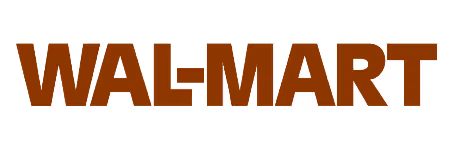
In 1981, Walmart took a more structured approach to its branding. The logo became more consistent and recognizable, featuring bold typography in a brown color palette.
This redesign marked Walmart’s transition from a regional player to a national retailer.
The brown color gave the brand a grounded, approachable feel, while the bold typography added authority and stability. It was a step toward building a recognizable identity.
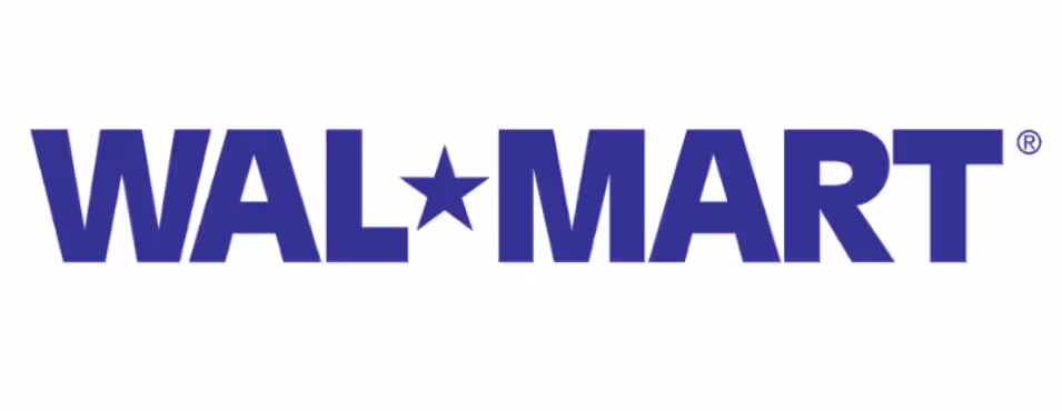
The 1992 redesign introduced one of the most iconic elements in Walmart’s history—the star.
The logo now read “Wal-Mart” with a star symbol replacing the hyphen, and the color shifted to blue.
This was a defining moment in Walmart’s branding.
The blue color conveyed trust and reliability, aligning with Walmart’s growing reputation. The star symbol added uniqueness and made the logo more memorable.
During this period, Walmart became the largest retailer in the world, and the logo reflected that scale.
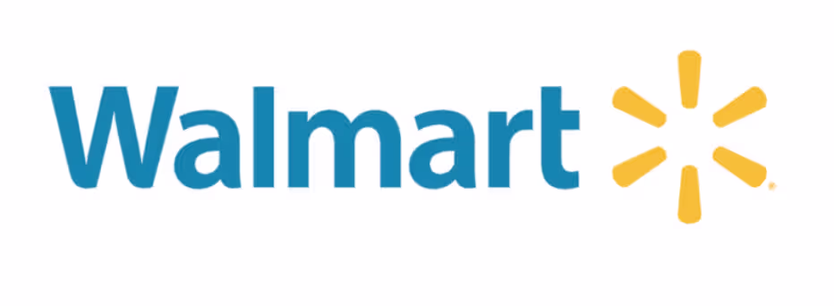
In 2008, Walmart introduced a major redesign that shaped its current identity.
The hyphen was removed, transforming “Wal-Mart” into “Walmart.” Alongside this, the brand introduced the now-famous yellow spark symbol.
This wasn’t just a design update—it was a repositioning.
Walmart wanted to move away from being perceived as purely “cheap” and instead emphasize value, experience, and customer connection.
The lowercase typography made the brand feel more friendly and approachable. The spark added warmth and energy.

In 2025, Walmart introduced a subtle but meaningful update to its logo. Rather than a complete redesign, the company refined its existing identity to better align with modern digital platforms.
This reflects a broader trend in branding—evolution over reinvention.
Instead of changing everything, Walmart chose to improve what already works. This ensures continuity while staying relevant.
Walmart’s logo stands out because of its carefully chosen design elements, from color and typography to its iconic spark. Each component plays a role in shaping how the brand is perceived globally.
Walmart uses two primary colors:
This combination creates a balance between professionalism and approachability.
The current logo uses a clean, sans-serif font with rounded edges.
This choice makes the brand feel modern and accessible, while also ensuring readability across all platforms.
The spark is one of Walmart’s most distinctive elements.
It adds personality without overwhelming the design. It also serves as a visual cue that enhances brand recognition.
Over time, the spark has become a symbol of Walmart itself.
Walmart’s logo evolution offers valuable insights into how strong branding works over time, showing the importance of consistency, simplicity, and adapting to changing market expectations.
Walmart’s logo stands out because of its balance.
While competitors focus heavily on symbols or typography, Walmart combines both effectively.
Walmart sits in the middle, making it versatile across different contexts.
Walmart’s logo isn’t just visually appealing—it reinforces its brand promise.
The design communicates:
This alignment between design and messaging is what makes the logo effective.
If you’re building your own brand, Walmart’s approach offers clear guidance.
Creating a logo like Walmart’s requires both creativity and strategy. This is where Logome becomes useful. Logome helps you:
Instead of spending weeks designing, you can create a high-quality logo in minutes.
The Walmart logo evolution is a powerful example of how branding evolves alongside business growth.
From a simple wordmark to a globally recognized symbol, Walmart has consistently adapted its identity while staying true to its core values.
The key takeaway is clear—successful logos are not static. They evolve with the brand, reflect changing market dynamics, and remain consistent enough to build trust.
For businesses and creators, the lesson is simple: focus on clarity, stay adaptable, and build a logo that can grow with your brand. And if you’re starting your own journey, tools like Logome can help you create a logo that’s not just visually appealing—but built for long-term success.
The Walmart logo represents affordability, trust, and accessibility. Its blue color conveys reliability and stability, while the yellow spark adds a sense of energy and optimism. Together, these elements reflect Walmart’s mission to provide value to everyday customers.
Walmart updated its logo to align with its growth and changing brand perception. As the company expanded, it needed a more recognizable and modern identity. Each redesign helped improve trust, clarity, and relevance in a competitive retail market.
The spark symbolizes energy, innovation, and value. It also represents Walmart’s core values and commitment to making shopping easier and more accessible. Over time, the spark has become a key visual element that strengthens brand recognition.
Walmart last refreshed its logo in 2025 with subtle improvements to typography and color. Instead of a complete redesign, the update focused on enhancing clarity and making the logo more suitable for digital platforms.
The simplicity of Walmart’s logo makes it easy to recognize, scalable across platforms, and adaptable over time. A clean design ensures clarity on everything from store signage to mobile screens, helping maintain consistent brand visibility.


Discover how 500,000+ businesses and creators are using our AI logo maker in their Logo creation.


