History of the TikTok Logo
Discover the evolution of the TikTok logo from its origins to the current iconic design. Learn how it transformed into a global symbol of creativity and entertainment.
Discover the evolution of the TikTok logo from its origins to the current iconic design. Learn how it transformed into a global symbol of creativity and entertainment.
TikTok, the social media giant that has taken the world by storm, is not just a platform for viral videos—it is a cultural phenomenon. Central to its success and recognition is its logo, an iconic symbol that has evolved alongside the app’s meteoric rise. Initially launched as Douyin in China, the app rebranded and expanded globally, becoming TikTok, with a logo that underwent several transformations to reflect its growing influence in the digital space. The TikTok logo, with its simple yet striking design, has become synonymous with creativity, entertainment, and social media innovation.
This article takes you on a journey through the evolution of the TikTok logo, from its early days as a musical app to its current iteration as a global brand. By examining the design elements and symbolism behind the logo, we’ll explore how TikTok has used its visual identity to connect with a diverse audience and solidify its place as a leader in the digital age.
The TikTok logo’s journey began in 2016 with the launch of Douyin, a music-focused app for the Chinese market. The initial design was vibrant and minimalist, emphasizing the app's connection to music and creativity. As TikTok expanded globally in 2017 and merged with Musical.ly in 2018, the logo evolved to appeal to an international audience. With refined design elements and a more dynamic color palette, the TikTok logo captured the platform’s essence as a space for self-expression, creativity, and fun, establishing its global presence.
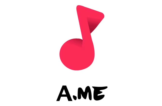
TikTok's journey began in 2016 with the launch of Douyin, a short-video platform developed by ByteDance for the Chinese market. Initially, Douyin's logo featured a minimalistic design with a letter ‘d’ that resembled a musical note, which was intended to emphasize the app’s core feature—music. The logo's color palette included neon hues that evoked the energy of live music performances, signaling the platform’s association with music, rhythm, and creativity.
The original design was a clean, simple emblem, featuring a vibrant use of neon colors that gave it a futuristic feel. The logo design was not just about representing music; it was about capturing the pulse of the app—lively, dynamic, and ever-changing, much like the videos it hosted. The inclusion of a musical note was symbolic, given that the app's primary feature was short music videos, with users lip-syncing or dancing to their favorite songs. This early version of the logo, with its bold use of colors and musical connotation, laid the foundation for what would eventually become TikTok.

The next major milestone in TikTok’s logo evolution came with its international expansion. In 2017, ByteDance launched TikTok in global markets, and in 2018, it merged with the popular lip-syncing app Musical.ly. This merger provided the platform with an even wider global user base and, naturally, necessitated a brand overhaul.
TikTok's logo during this phase retained the essential elements from Douyin but saw significant changes to appeal to a more diverse, international audience. The original musical note was now integrated into a more modern, fluid design, becoming the core of the logo. The most notable change, however, was the addition of the ‘TikTok’ wordmark. This update made the logo more recognizable and tied it directly to the app’s brand name. The platform’s new wordmark was designed using a bold, sans-serif font that made the text clear and easily legible on smaller screens, particularly on mobile devices where TikTok was gaining traction.
The updated TikTok logo introduced a refined color palette that included black, cyan, and fuchsia. These neon shades were not only visually striking but also helped differentiate TikTok from other platforms. The use of black added a sleek and modern touch, while the cyan and fuchsia brought in elements of youthfulness, energy, and creativity. These colors resonated with the platform's young demographic, aligning perfectly with the app’s mission to provide a space for creativity, self-expression, and fun.
The logo now captured the essence of TikTok's global presence: vibrant, engaging, and inclusive, appealing to creators from various backgrounds. Whether it was a dance challenge, a lip-sync performance, or a comedy skit, the new logo visually communicated the platform’s dynamic and lively environment.
As TikTok's popularity soared worldwide, its logo underwent a further transformation. The most recent iteration of the logo, which we see today, was introduced around 2019. This version of the logo is much more streamlined, with a more polished design that focuses on simplicity and recognizability.
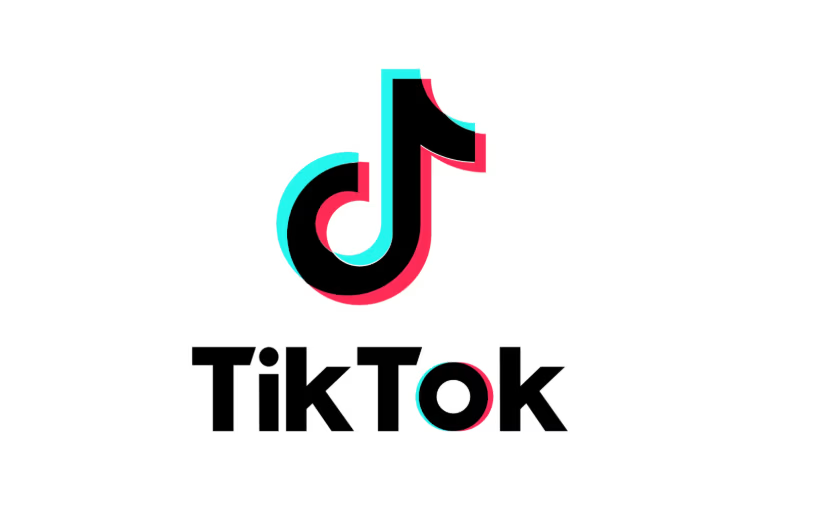
The most significant change in the current logo is the simplification of the musical note. Instead of the 3D effect used earlier, the note was made two-dimensional and more symmetrical, ensuring that it looked clean and professional on all devices. This new design emphasized the modern, sleek nature of TikTok as a tech-savvy, globally influential platform.
The wordmark also underwent slight adjustments, becoming even more minimalist, with the font becoming slightly thinner and more refined. This helped improve legibility while maintaining a sense of elegance. The result is a balanced logo that resonates well on both large billboards and tiny mobile screens, ensuring consistency across all platforms.
The color palette was also streamlined to focus primarily on black and white, with the cyan and fuchsia accents still visible but toned down. This simplified design has allowed the TikTok logo to maintain its visual appeal across various platforms, especially as TikTok continues to grow in both the influencer and business sectors. The black and white color scheme offers greater versatility, enabling the logo to work seamlessly in a variety of contexts—whether in digital spaces, print, or merchandise.
The current TikTok logo, with its sleek lines, simplified design, and iconic color scheme, reflects the platform's evolution. It embodies the platform’s transformation from a youthful, music-focused app to a dynamic, creative hub for all types of content. It speaks to TikTok’s position as a platform that encourages diverse creators to express themselves, whether through music, comedy, education, or lifestyle.
The TikTok logo is much more than just a design—it's become a symbol of creativity, self-expression, and global connectivity. Over the years, this logo has evolved to reflect the platform’s journey from a music-based app to a powerful social media hub. Its simplicity, paired with modern design elements, allows it to stand out amidst the crowded digital space while remaining instantly recognizable. Today, TikTok’s logo is synonymous with viral trends, creativity, and the ever-changing landscape of social media, making it a global icon.
TikTok’s influence extends far beyond just the design of its logo—it has sparked a cultural revolution. The app has empowered millions of creators worldwide to showcase their talents, making it a platform for self-expression across multiple genres. Whether it’s viral dance challenges, comedy skits, or educational content, TikTok’s impact is visible across different cultural spaces, from Hollywood celebrities to students in high school classrooms.
In addition to entertainment, TikTok has contributed to the rise of the creator economy, allowing influencers to build careers, secure brand deals, and gain financial independence. The logo, with its clean and minimalist design, reflects TikTok's user-centric approach, where the focus is on the creators themselves. This alignment between the logo and the platform’s ethos has helped foster a community-driven space where anyone can share their story, talent, or knowledge.
TikTok’s growth is nothing short of staggering. As of 2025, the app has over 1.5 billion monthly active users, making it one of the most downloaded and frequently used platforms globally. This explosive growth is a clear indication of the strength and recognition of its brand identity. The TikTok logo plays a central role in this success. Its simplicity and boldness help the brand maintain strong visibility in the global digital landscape, making it easily identifiable no matter where you are in the world. The logo has become an essential tool for TikTok to connect with an ever-growing, diverse user base.
The design of TikTok’s logo aligns seamlessly with the platform's mission: to offer a creative space for people of all ages to express themselves freely. From its early days of vibrant neon hues and musical notes to its current sleek and minimalist design, the logo has evolved in tandem with TikTok’s transformation. This transformation mirrors the platform's expansion from a niche music app into a global leader in short-form video content.
Whether you’re on TikTok for entertainment, business, or education, the logo serves as a symbol of authenticity and creativity. It represents a modern platform that remains professional yet accessible to everyone, and its clean design speaks to the simplicity that TikTok values. More than just a brand symbol, the TikTok logo is a reflection of the platform's role in shaping the future of social media and content creation. Its influence continues to grow as it evolves with the changing needs of its global audience.
As TikTok has evolved into a global powerhouse, so too has its visual identity. The TikTok logo is a reflection of the platform's ability to adapt to new trends, user expectations, and the shifting digital landscape. Each iteration of the logo—from its early design with Douyin to the current minimalist icon—has mirrored the platform's growth, technological advancements, and changing cultural relevance.
In its early days, the logo was vibrant, with neon colors and a prominent musical note that immediately linked the app to music and creativity. As TikTok expanded globally, the logo underwent a rebranding, simplifying its design and adding the wordmark to make it more identifiable on a global scale. This change signified the platform’s transition from a niche music app to a broader social media hub catering to a diverse range of content creators.
Today, TikTok's logo is a sleek, modern symbol of simplicity, which speaks to the app’s current identity: an entertainment platform where users can express themselves through short-form videos. The minimalist design aligns with the current digital aesthetic that favors clean, easily recognizable logos. TikTok’s ability to evolve its visual identity in response to its growth and cultural impact has been key to its success, enabling the brand to remain fresh, relevant, and engaging to users across the world.
The history of the TikTok logo is a fascinating reflection of the platform’s evolution and global impact. From its origins as a music-centric app called Musical.ly to its current status as a powerhouse in the social media landscape, TikTok’s logo has undergone several transformations. Each change in the logo’s design corresponds with TikTok’s expansion from a niche music-sharing platform to a broad, inclusive space for creative expression, allowing users to share everything from comedy skits to educational content.
As TikTok continues to dominate the social media landscape, its logo will undoubtedly remain a powerful symbol of the platform’s cultural influence. It has become an emblem of creativity, community, and global connectivity, uniting millions of users who share in the platform's ability to break boundaries and trends. If you're looking to create your own memorable logo, consider using Logome to design a unique and professional brand identity that stands out in today’s digital space.
TikTok's logo evolved to reflect the platform's growth and expansion. Initially tied to its music focus, the logo became more streamlined and modern as TikTok transitioned into a broader creative platform for all types of content, from dance challenges to educational videos.
The colors in TikTok's logo—black, cyan, and fuchsia—symbolize energy, youthfulness, and creativity. The black gives the logo a sleek, professional look, while the cyan and fuchsia add vibrancy, capturing the dynamic and playful nature of the platform.
The original musical note in the TikTok logo symbolized the app’s roots in music and lip-syncing videos. It connected the platform to the idea of rhythm and performance, reflecting its early focus on music-based content.
The TikTok logo has played a key role in the brand's recognition and success. Its simplicity and modern design make it easily recognizable and adaptable across various platforms, contributing to TikTok’s global identity and appeal.
The current TikTok logo was inspired by the need for simplicity and recognition across digital platforms. Its minimalist design focuses on clarity and adaptability, making it perfect for small screens and global use. The design evolution reflects TikTok's shift from a niche music app to a mainstream platform for all types of content creators.

%20Anything.avif)

Discover how 500,000+ businesses and creators are using our AI logo maker in their Logo creation.


