The Best Cafe Logo Design Trends for 2026
Check out the best cafe logo design trends for 2026. We also show you the best AI logo makers to use for making such logo types.

Check out the best cafe logo design trends for 2026. We also show you the best AI logo makers to use for making such logo types.

Are you just starting up a coffee shop or thinking of coming up with inspiring and unique cafe logos? Lucky for you, we've got your back. Before you even design a logo, you should get an idea of what kind of aesthetic your customers love.
A good coffee logo speaks to your clients. It paints a good picture or visual of your brand. Your logo represents you. So you don't want something dorky. You actually want to get it down and nail it right. Whether you want to boost your brand's presence, customer loyalty, or simply market and sell your coffee products better, good cafe logo designs can help you out.
It doesn't matter what your use cases are. In this guide, we are going to walk you through some of the best cafe logo design trends. You can steal them if you like, or take inspiration. Now let's get started. They will also give you an idea on how to make a tasteful, stylish, and memorable cafe brand.
Here are popular cafe logo designs and types that are trending online, on social media, in real life, and everywhere else. These are the main ones to watch out for:
You see these everywhere right now. A linework logo uses clean, single-weight strokes to draw out a coffee cup, a bean, or some abstract steam shape. Nothing too fussy. It looks good small on a cup sleeve and just as sharp blown up on a window decal. This style fits the current cafe logo trends because it feels hand drawn without looking like a messy sketch on a napkin. You get precision without losing the human touch.
I walked into a spot last month that had this exact style on their takeaway bags. Just a thin outline of a pour over dripper. It told me the place cared about the details before I even tasted the espresso. If you run a small roastery or a minimalist espresso bar in a busy downtown alley, you should look hard at this direction. It cuts through visual noise better than a neon sign. When you browse cafe logo design trends, you will notice linework translates well onto cafe logo mockup images for apparel and cafe logo png files for websites. If you are opening a tiny 400 square foot spot where the coffee is the main event, this approach keeps the focus on the brew.
Emblems are the opposite of that whisper thin linework. These logos sit inside a container: a circle, a shield, or a crest. Think of it as a badge of honor for your shop. You see this in older, established cafes or new places trying to channel a sense of permanence. If you are taking over a corner spot in a residential neighborhood and you want to be the local hangout, an emblem signals that you plan to stick around.
This style works if you want to sell a lot of merchandise. A good emblem looks right at home on a heavyweight hoodie or a trucker hat. People want to rep their local spot, and an emblem gives them something substantial to display.
I am a big fan of this for places that serve as the living room for the block. Just watch the detail level. If you cram six different coffee cherry illustrations and a map of the town inside that circle, you will lose legibility when it prints small on a printable and customizable cafe logo templates file. Keep it to two or three core elements max. Simplicity inside the badge is what separates a classic mark from clip art clutter. When you are looking for logo designs for cafes that feel like a club you want to join, the emblem is your move.
Sometimes the name of the joint is the whole vibe. You do not need a picture of a coffee bean next to the word "Coffee." The typeface itself does all the heavy lifting. Typography logos are huge in cafe logo trends for right now, specifically those chunky, slightly condensed sans serifs that feel like they are leaning forward. Or you get the tall, skinny serif that tells people you serve natural wine and avocado toast.
You have to be careful with this one because a bad font choice makes you look like a front for a tax shelter. But a good font is unforgettable. I am seeing a lot of shops take a standard wordmark and tweak one letter slightly. Maybe the crossbar on the "A" is an espresso bean or the bowl of the "P" is a coffee cherry. That little wink is enough to make it memorable. You also avoid the issue of having a literal icon that gets dated when latte art styles change in five years.
If you want a cafe logo design for a modern coffee bar in a new high rise, a clean wordmark looks right at home on the frosted glass door. Just make sure the spacing is tight. Nothing ruins good cafe logo fonts like letters that look like they are social distancing from each other.
There is a specific look creeping up that combines the emblem style with a worn in, almost postal service feel. You will see circles with dashed lines around the border or a "stamp" effect where the edges are not perfectly smooth. It gives the impression the logo was pressed onto the bag with a real stamper. People eat this up because it feels analog. If your cafe is inside an old warehouse with original brick walls and creaky wood floors, this is your category.
We’ve pulled some of the best stuff floating around right now. These aren't just random doodles; these are the kinds of marks that make anyone want to walk across the street just to see what's inside. Let's tear into them. Here are the ten best cafe logos for your design inspo and why they’re trending.
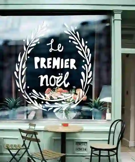
You'll notice this one leans hard into the vertical stack. "Le" sits small up top, "PREMIER" dominates the middle in a wide, confident serif, and "noel" rounds out the bottom in a script. The placement creates a pillar effect. It feels sturdy, like a stone building in an old French quarter. The contrast between the architectural serif and the handwritten "noel" is the secret sauce. It's not just a coffee logo; it promises a specific kind of pastry case and maybe some checkered floors. You can almost taste the butter. For a bakery-cafe hybrid, this structure is a cheat code for looking both grand and welcoming.
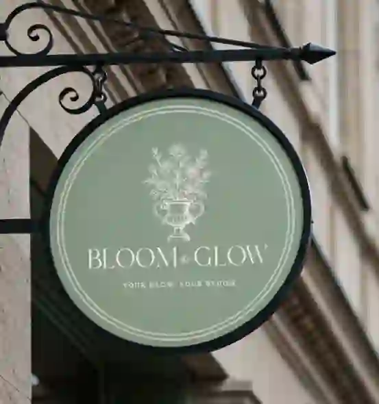
This one ditches the clutter entirely. "BLOOM&GLOW" runs right through the middle in a clean, open sans serif with wide letter spacing. Underneath, the tagline "YOUR GLOW. YOUR BLOOM" sits in a much smaller, thinner font. What works here is the breathing room. The design doesn't beg for your attention; it assumes it has it already. This speaks directly to the wellness and matcha crowd. It would look insane on a matte pastel cup. The simplicity makes it incredibly versatile for cafe logo mockup placements on skincare-adjacent products or clean lifestyle apps. It proves you don't need a literal coffee icon to sell the vibe of a modern cafe.

This one is a vertical word stack that reads like a recipe. "LOVE" in all caps, then "Coffee" in a lighter script, followed by "SUGAR-" and "SWEET." The dash hanging off "SUGAR-" is a great detail. It's a little visual hook that implies there's more to the story. The mix of a heavy sans serif with the delicate script is a classic move that keeps cafe logo ideas fresh. It feels like the kind of place that has mismatched vintage teacups and a register that still makes a loud ka-ching sound. The layout is tall and narrow, which fits perfectly on a window decal or the spine of a small menu.
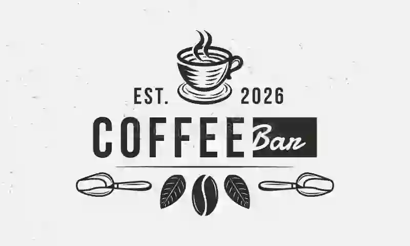
The stacked "EST. 2026" in a small, tight sans serif immediately gives it weight. Then the word "COFFEE" comes in large and bold, with wide tracking. But the real kicker is "Ban" at the bottom, hanging out in a playful, rounded script. This is a prime example of mixing fonts without making a mess. The uppercase block letters contrast with the lowercase flow of "Ban." It uses cafe logo fonts effectively to signal two things: We are professional about our roasting ("COFFEE"), but we don't take ourselves too seriously ("Ban"). It's friendly without being goofy. I'd expect this shop to have a solid playlist and baristas who remember your order.
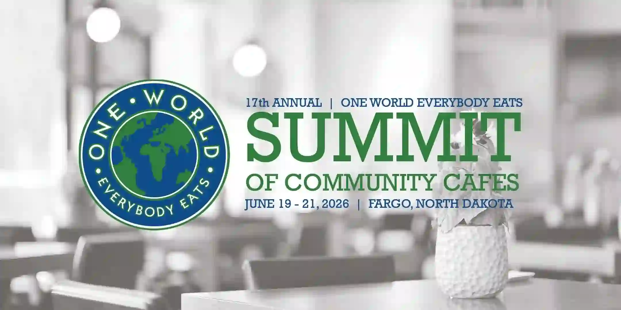
This is a more complex, event-focused logo, but there's a lesson here for cafes hosting pop-ups. The word "ONEWORLD" sits in a clean, slightly stretched font, but "EVERYBODY EATS" underneath it in a very thin, wide sans serif creates a beautiful tiered effect. The star icons flanking "SUMMIT" tie it together. Notice the use of the thin line to separate the location and date at the bottom.
If you run a cafe that has a lot of information to convey (like "Coffee and Kitchen and Events"), this is how you get organized, visually at least.
The hierarchy is clear: Big idea on top, supporting detail in the middle, logistics at the bottom. It's a masterclass in information stacking.
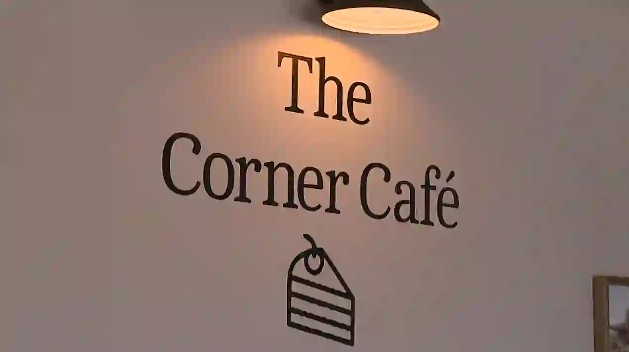
This is a classic sign painter's layout. "The" sits small and tucked up top in a serif. "Corner" dominates with a sweeping, elegant script that looks like it was drawn with a brush in one fluid motion. "Café" anchors the bottom in a wider serif with that nice accent on the 'e'.
This logo doesn't need a single picture of a coffee cup. The shape of the word "Corner" is the logo. It evokes a sense of place without drawing a street map. If you're designing for a specific neighborhood spot, letting the name's typography do the heavy lifting—especially with a beautiful, custom-looking ligature on the 'C' or 'r'—beats any generic icon.

Who doesn’t like engineering and coffee? Engineers sure do! Since they stay up late nights.. The word "Engineering" in a heavy, technical, mono-weight sans serif suggests precision. The word "COFFEE" underneath is smaller, almost like a subtitle. The logo has a slight slant or italics to it, giving it forward momentum.
It doesn't look like a cozy living room; it looks like a place where extraction yields are taken seriously. This is a great example of unique cafe logo ideas for roasters who want to appeal to the home barista market or the science-minded coffee nerd. The all-caps treatment and tight kerning signal that this is a laboratory, not just a lounge.
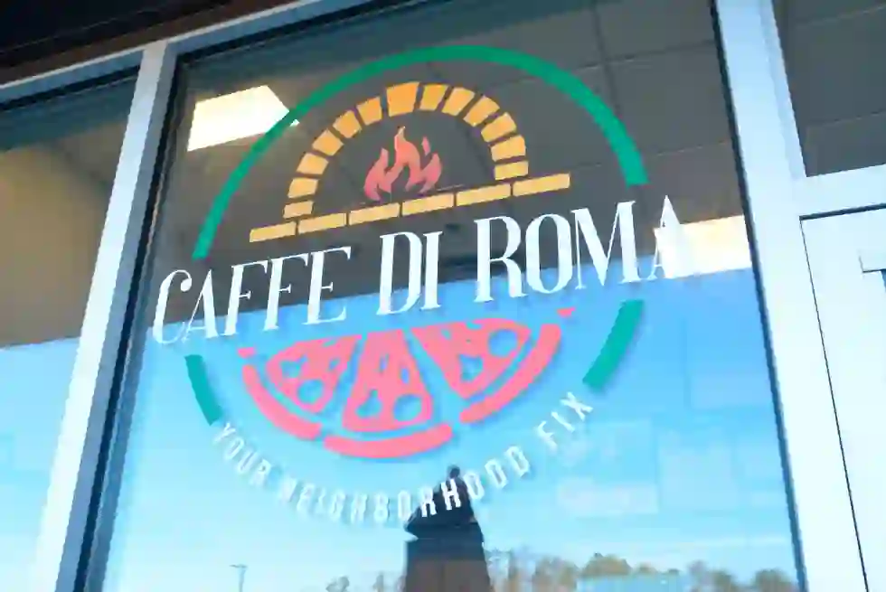
The arch. You see this shape in Italian logos constantly, and it works every single time. "CAFFE DI ROMA" follows the curve of the top arch, with "YOUR" tucked neatly in the negative space below. It implies a canopy, an awning, or the entrance to a grand piazza. The serif font choice is bold but not too fussy.
The whole shape feels like a welcoming gesture. When you see a logo shaped like this, your brain expects to walk under it. It's incredibly effective for storefront signage. Even though it's just letters on a curve, it gives the brand architecture. You feel like you're sitting outside, even if you're just looking at the logo on your phone.
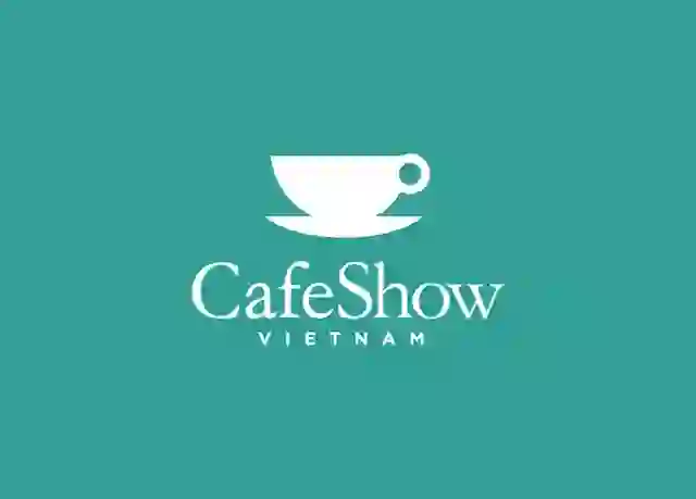
This one uses a circular badge but with a modern, almost athletic twist. "CafeShow" sits on a slight curve or angle within a circle or diamond shape, with "VIETNAM" anchored at the bottom.
The contrast between the casual word "Cafe" and the formal "Show" creates a nice tension. But the star element for me is the little coffee branch or leaf detail integrated into the lettering. It's subtle. It's a good reminder that if you want to use a cafe logo transparent background version of your design, a badge like this holds up incredibly well. The circular shape makes it perfect for social media avatars and app icons where you need a contained, compact visual.
You don't need to drop a grand on a fancy agency. If you're bootstrapping and you know what you like, you can get a sharp looking mark using free tools. The key is knowing where to start so you don't waste three hours trying to draw a coffee bean with a trackpad. Here are some great tools we suggest for making cafe logos for your coffee shop:
Logome helps you make stunning brand logos with AI. It features over 100+ fonts in various styles. You get access to premium color schemes, solids, and gradients.
Make 3+ website templates in various styles, they will be fully customizable. 100% responsive on both mobiles and tablets. Brands like CyclingPro, LockerPro, Better Bulders, and many others are already designing great logos with the AI. This AI logo maker is free so you can try it out. It is one design bundle for all your needs. You can generate logos and icons for websites, social media, posters, and there are brand kits too to help you out.
Looka uses an AI engine to spit out a bunch of options based on your shop name and preferred colors. You type in "The Corner Cafe" and pick a few icons you like, and it generates dozens of different layouts. You can tweak the spacing and font weight right there in the browser. The free preview lets you see exactly how it looks on a cup and a bag before you pay a dime. For someone who knows they want a modern cafe logo design but can't articulate the difference between a serif and a stroke, this tool does the heavy lifting. You just act as the creative director saying "yes" or "no."
Canva has a huge library of printable and customizable cafe logo templates. You don't start from a blank page. You start with something like that "Premier Noel" stack we looked at earlier and then you just swap in your own name. You can change "PREMIER" to "SUMMIT" and keep that same elegant layout. The drag and drop interface means you can add a little star or remove an unwanted line in two clicks. I tell people to use the "Styles" tab to browse pre-made font pairings. That removes the guesswork of figuring out which fonts look good together. It's a solid way to generate cafe logo design ideas without needing a graphics degree.
This one flies under the radar but it's perfect for small cafe logo design trends because it's built for online selling. Hatchful asks you a few questions about your industry and vibe, then spits out entire brand packages. You get a logo, a color palette, and social media covers all at once. If you plan on selling beans online, this tool aligns the cafe logo design with the rest of your store's visual identity instantly. The outputs are clean and optimized for small screens. It doesn't give you the weird, abstract shapes that other free generators sometimes cough up. You get a usable, professional mark in about five minutes.
Before you touch any software, draw a bad version of your idea on a napkin. I'm serious. The best coffee logos often start as a crude doodle that a designer later cleans up. If you can't draw it with a dull pencil, it's too complex for a 32-pixel favicon anyway. This step forces you to simplify. Take that napkin sketch to one of the tools above and use it as your guide. It keeps the design grounded in your vision rather than letting the AI randomly add a steam swirl just because it's in the dataset.
A logo sets the tone before the steam hits the cup. The cafe logo trends for 2026 lean toward clean lines, confident typography, and a sense of place. You don't need to overthink it. Pick a style that feels true to your actual space and the people you want to serve. Whether it's a chunky emblem for a merch drop or a thin linework sketch for a quiet corner spot, the goal is recognition. Don't let the hunt for perfection stall your opening. Pick a direction from the ideas above, use a free tool to rough it out, and get back to what actually matters: pulling good shots and keeping the pastries stocked. Check out Logome today!
Clean, geometric sans serifs with high x-heights dominate the scene right now. Fonts like Montserrat or Poppins (or their free equivalents) give you that readable, friendly look on cups and screens. Pair a bold weight for the main name with a thin, wide spaced font for the tagline to create instant visual contrast without clutter.
You can skip it. The strongest cafe logo designs in major cities often rely purely on a distinctive wordmark. If you do use a cup, make it abstract. A simple line drawing of a dripper or a minimalist bean shape works better than a realistic, shaded illustration of a latte with a heart on top. Keep the icon simple enough to use as a social media avatar.
Stick to two. A primary dark color like espresso brown or charcoal, and a secondary accent like cream or rust orange. A two-color palette keeps printing costs low for cups and aprons. It also forces you to focus on the shape and layout of the design instead of relying on a rainbow to look interesting.
You can trademark a name used in a free logo maker, but you typically cannot copyright the specific graphic design assets provided by those generators. Read the license of the tool you use. Some allow commercial use but retain rights to the design elements. You own the name, but the specific clip art arrangement usually stays within the tool's ecosystem.
You likely saved the file as a JPEG or a small PNG. You need a vector file format (SVG or EPS) for sharp scaling. Vector files use math instead of pixels, so they stay crisp at one inch wide or ten feet wide. Ask the tool or designer for an SVG version. That file type is what you give to sign makers and screen printers.
They chase a trend that doesn't match their actual shop. If you serve blue collar regulars and quick drip coffee, a fragile, ultra-thin script font with pink watercolor splashes will confuse everyone. Your logo needs to match the energy of the room. A mismatch between the visual brand and the actual experience erodes trust faster than a bad batch of cold brew.


Discover how 500,000+ businesses and creators are using our AI logo maker in their Logo creation.


